Poor paper. It’s in that ironic category where those who love it the most are the ones trying their hardest to replace it.
Case in point: Sony and reMarkable, a pair of companies as unalike as you’re likely to find, yet with the shared mission of making a device that adequately serves the same purpose a few sheets of paper do. They have experienced mixed success, each working and failing in different ways; but these devices left me optimistic about future possibilities — while at the same time clinging tenaciously to my notebook and pen.
Both tablets rely on e-paper displays, most commonly seen in Amazon’s Kindle devices but which have found niche uses outside the e-reader world as they have improved in contrast and response time.
Both support a stylus and fingertip for input; both have an unlit monochrome screen; both are refreshingly thin and light (350 grams, 6-7mm thick); both have their own dedicated app; and both aspire to replace printed documents and scrolling through PDFs on your laptop. (Both are also rather expensive.)
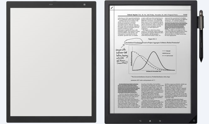
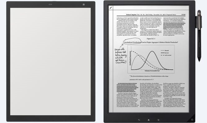
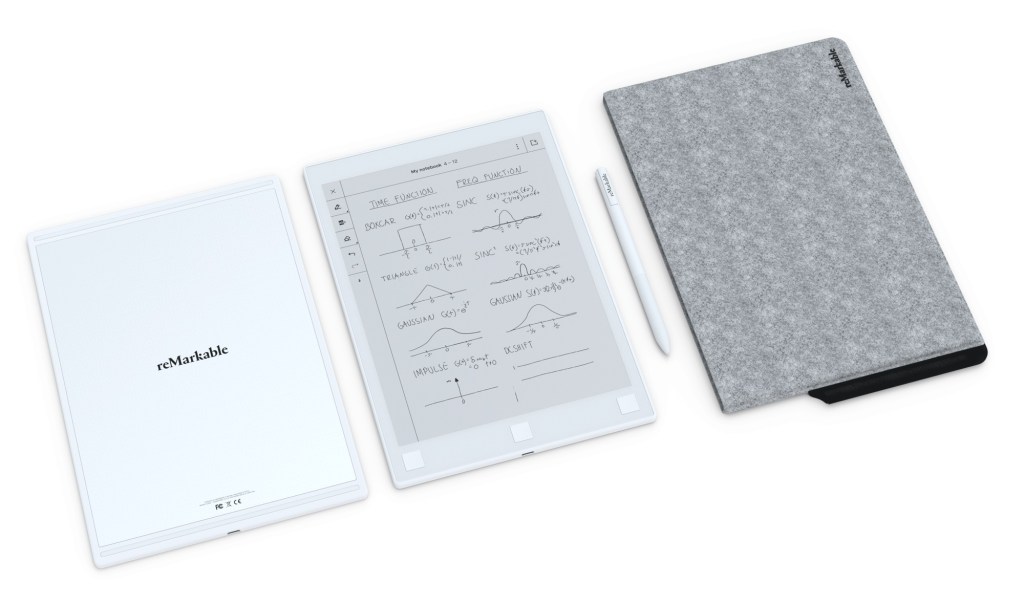
Yet there are clear differences between the two: Sony’s Digital Paper Tablet DPT-RP1 (I’ll call it the DPT) is the size of an A4 sheet of paper, which combined with its lightness makes it somehow alarming. It’s hard to believe it’s an actual device. The reMarkable, on the other hand, is smaller (about 10″x7″) and a triplet of buttons on its lower bezel invite interaction. It’s equally light, but doesn’t give off that “how’d they make this thing” vibe. At least, not yet.
The short version of each device’s story:
Sony DPT-RP1

- 13.3″ 1650×2200 screen
- 16GB internal storage, PDF support
- $700
This handsome devil is the sequel to one I remember handling at CES years ago, and it has been given a significant, if not radical, upgrade. The latest version got a much-improved screen, plenty of internal storage (16GB doesn’t fill up too fast when you’re mostly looking at documents) and better handwriting and note-taking capability.
It’s specifically aimed at people who have to handle lots of wordy documents and are tired of doing so on a laptop screen, LCD-based tablet or small e-reader. Think scientists reviewing studies, lawyers going over case files and so on.
reMarkable

- 10.3″ 1872×1404 screen
- 8GB internal storage, PDF/ePub support
- $600
The reMarkable (and yes, they do the camel caps thing) is the sort of crowdsourcing success I like to see. An original and ambitious idea accomplished with hard work and ingenuity, and at the end of it all, a viable product.
The team was simply enamored of the idea that an e-reader-type device should be more interactive, allowing you to sketch, annotate documents and share them live. To that end they worked for years, eventually even consulting with E-Ink, which makes the displays in question, to produce a screen that not only looks like a printed piece of paper, but feels like it when you write on it.
And now to judge the two devices on the three R’s: reading, writing and interaction. What? Only one of the other three R’s starts with an R.
Reading
As far as providing a superior platform on which to read through documents that are mostly monochrome — studies, lawsuits, books — both devices succeed admirably. Neither has as good a screen as a Kindle Oasis or Kobo Aura One, but they’re more than good enough — and anyway, it would be excruciating reading an academic paper on a Kindle.
If I had to give the edge to one of the devices strictly in display quality, it would have to be the DPT. Slightly whiter whites and better contrast give it the edge, even though technically the reMarkable has a higher DPI (226 versus 206). A grid on the screen is just visible when you look close, but rarely bothered me when reading from a normal distance. Text is rendered slightly better on the Sony to my eye, though it’s hardly a blowout.

But one also has to consider that the Sony’s screen is gigantic. The reMarkable and its bezel fit comfortably within the screen area of the DPT. Not everyone actually wants to read on such an enormous device, and documents not intended for that size can blow up to comical proportions. E-books, as well, end up looking like either children’s stories if you bump the text size up, or impenetrable walls of text with frequent carriage returns if you don’t.
This objection applies to the reMarkable, as well, but less so. (Sony does address this problem with the ability to show two portrait mode pages at once while the device itself is in landscape mode.)
 If I had to choose between one size and the other, I would go with the reMarkable in a second. It fits in more bags, doesn’t feel so awkward and it’s not so much smaller that a full-page PDF looks crammed onto it; you hardly notice after a while.
As for build quality, both devices are extremely well-made, and in particular reMarkable touts the near indestructibility of their device. The Sony doesn’t feel flimsy at all, but as I mentioned before, its great size does make it feel like a liability, like a passing biker will clip the corner while you’re reading it in the park. I do, however, approve of its extra-minimal design, while the reMarkable’s silver back and multiple buttons make it rather the more gadgety of the two.
One other place where the DPT schools the reMarkable is in on/off quickness. One of the great things about e-paper devices is you can switch them on and a second or two later you are back in your book or article. The DPT is no exception to that, and it will maintain a charge for weeks and still turn on in a snap.
The reMarkable will do that when it’s in sleep mode, but it goes from sleep mode to fully off after some relatively short amount of time that you can’t modify. From being off, it takes 15-20 seconds or more to turn on — an eternity these days! No doubt this is to improve the battery life, but it’s annoying as hell. This is something that can and likely will be adjusted (or hopefully made adjustable) in a software update, but for now it’s a pain.
Writing
Here at least we have a solid winner. Writing on the reMarkable is a pleasure, and while it’s still not quite like pen on paper, it’s a hell of a lot better than active stylus on glass.
The near-instant response time of the reMarkable’s e-paper screen (it’s around 50 milliseconds) makes writing feel natural, not like a device catching up to something you did half a second ago. This is absolutely critical, as the feedback of what you see affects how you write — when you stop crossing that T or dragging out the descender of that y. The team was obsessive in getting the latency down, and succeeded to a greater extent than, honestly, I expected was possible on this kind of display. E-Ink itself, they told me, was incredibly impressed.

Above, the reMarkable; below, the DPT.

But not only does the line follow the tip of your stylus with a quickness, there is a world of expressiveness available should you choose it. The tablet doesn’t just track the tip, but also the pressure and orientation of the stylus. So with the pencil tool, you can make a thin, light line by holding the stylus nearly perpendicular to the screen and barely touching it, or make wide brushlike strokes by angling it down and pressing harder. This isn’t always useful, and it takes some time to get used to, but it really is amazing that it’s possible on an e-paper device, and I can see it being adopted by plenty of sketchers and note takers.
Furthermore, the tablet ships with a number of templates — grids, lines, etc. — and supports multiple layers, which you can export as Photoshop files.
Certainly it impressed the TechCrunch crew. I had it with me for note-taking (and showing off) purposes at Disrupt SF, and everyone who touched it and wrote on it fell in love, asking how they could get one. These are people who see state of the art tech all day, every day.
I didn’t have the DPT with me, but I think it would have elicited a more polarized response. It’s so big — but once you get over that, you start thinking how nice it would be to run through SEC filings or Pew studies with this instead of on a laptop.
You can write on the screen of the DPT as well, but despite Sony’s best efforts it’s not nearly as responsive as the reMarkable. It’s close, sure, and way better than the devices I’ve seen before, but as they say, close only counts in horseshoes and hand grenades. In this case, it’s close enough that I wouldn’t mind doing a few annotations of a long document, but I can’t picture-taking notes with it or drawing anything but the simplest shapes. The lag and resulting feel that things are slightly off what you intended is just enough that you notice it.
Unfortunately neither supports handwriting recognition now, though it’s on the horizon.
Interaction
Here we have what is really the Achilles’ Heel of both devices. The fact is that at present, they’re just too limited in the content you can put on them, how you can edit and annotate it and how you navigate it.
The DPT has the benefit of simplicity. It’s very straightforward: load items (probably PDFs) on it via the associated desktop app, and they appear in a list on the tablet. Open it up and you have the now-familiar touchscreen controls: swipe left or right to change page, or tap the edges of the screen; tap the center to open view options, change the pen style, etc. You can also quickly zoom in on an area, though considering the size of the thing I never felt the need to do this. A single button at the top opens a small, straightforward menu with recent documents and the option to return home.
 The reMarkable, on the other hand, throws all kinds of things at you from the beginning. You still add your documents from a desktop app — and here I may as well mention that you need to set up a free, simple account on the site to do so, and to enable web-based syncing of documents (it was quick and seems harmless). Once they’re on the device, you navigate via a busy home screen that lists all docs, or just PDFs, or just e-books, or your notebooks, of which you can create as many as you like: one for sketches, another for work notes, another for to-dos, etc.

Inside documents, you’ll use the three buttons at the bottom of the device to go forward, back or return home. Disappointingly, you can’t swipe or tap to go to next or previous pages. I much preferred the DPT’s simplified controls; buttons may be useful on a dedicated e-reader, where page turning is by far the most frequent action, but the reMarkable is meant to be like a piece of paper and the buttons seem at odds with that idea.
The real issue I have, however, is one I have with both. You’re very limited in what you can do with the documents. Reading them is great. But neither device is good at exporting the actions you take off the device. For example, if you find a portion of a document you want to remember, what can you do?
On the DPT, you can highlight it, but then what? On the reMarkable, you use the highlighter pen to mark it, but then what? The DPT has a clever system where you can put a star or other symbols on certain pages, then easily re-find those points later — but then what? The reMarkable lets you add annotations to any page in a trice — but then what?
All these actions end up staying on the device or facing some convoluted export process. Why can’t I select some text on the reMarkable and have it be copied to a clipboard in the app? Why can’t I drag out a rectangle and have it save a screenshot? Why can’t I have the starred paragraphs of the PDF on the DPT automatically highlight in the original document?
Ultimately you mostly interact with content by drawing on a transparent layer on top of it. That’s great for some stuff, but not particularly flexible. You can build a workflow around either one of these, but it won’t be pretty.
Furthermore, the content I can access is extremely limited. No time-shifting services like Pocket or Evernote are supported, even in a limited fashion. Only PDFs and ePub files can be read, or certain archives. Both devices have Wi-Fi, but neither one has even a rudimentary or text-only web browser. I would love to have any of these things, but for now the use cases for these devices are limited to “reading files you already have, and making a few limited changes to them.”
Long live specialty devices
Compared to something like the Surface or an iPad Pro, the DPT and reMarkable may seem somewhat limited. But that’s kind of the point.
You’re not supposed to be able to write a novel on your DPT, or play some complex 3D game. These are devices designed with a few very specific purposes, and they fulfill those purposes — pretty well, as you have seen. They’re light, they’re durable, they’re pleasant and quite simple to use.
The fact is that this is a pretty new product category, or at least a long-neglected one (RIP Kindle DX) and I think it’s fantastic that companies big and small are interested in doing something different.
On the other hand, they’re still figuring out exactly what these products should be capable of. Sony has a firm idea and is making its play for the scientific and legal markets where long documents are common and a handful of markup tools are sufficient. reMarkable has a broader vision and a technical solution for achieving it: more and faster interaction, better integration with existing services.
While I can say that the Sony has achieved its purpose, that purpose is intentionally limited and as such makes it attractive to a rather narrow slice of people. The reMarkable is potentially attractive to far more people — orders of magnitude more, I think — but it has yet to achieve its vision.
Fortunately, reMarkable is aware of this and mainly just wanted to ship a working product. The road map for the next year has lots of interesting features on it, ones that will make the device more versatile and reliable.
That reMarkable has sold tens of thousands of its extremely niche device and Sony hasn’t given up on the DPT while letting its other e-readers die is promising. There’s a place for devices like these in my house and, increasingly I hope, many more.

