![]()
I don’t usually go the negative Nellie with anything photo related, sometimes it’s best to keep your mouth firmly shut. But I’m not going to take it anymore, I’m as mad as hell, and I’m going to lean right out the window and shout it to the world, enough, I’m done with rubbish samples of film technology on the Web.
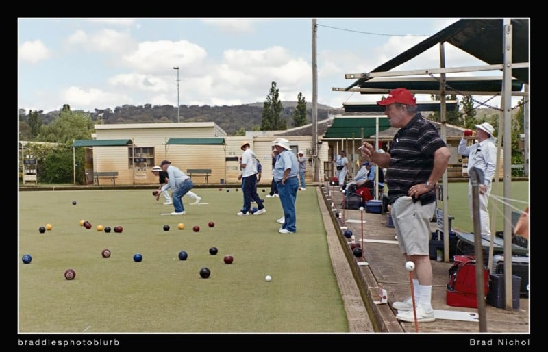
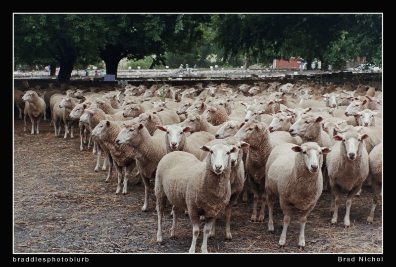
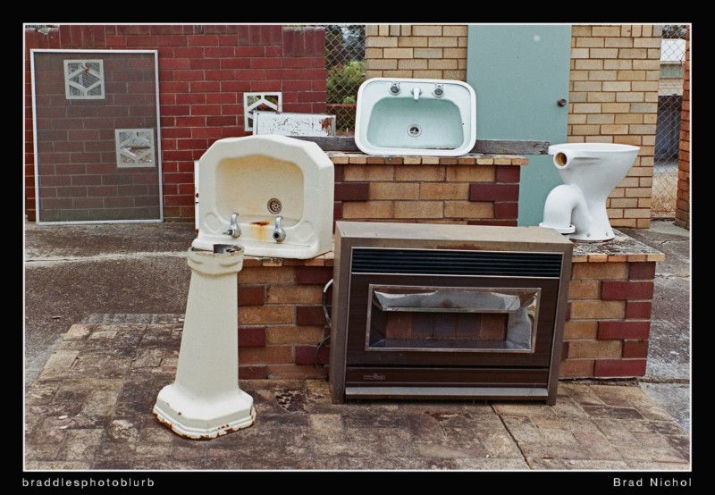
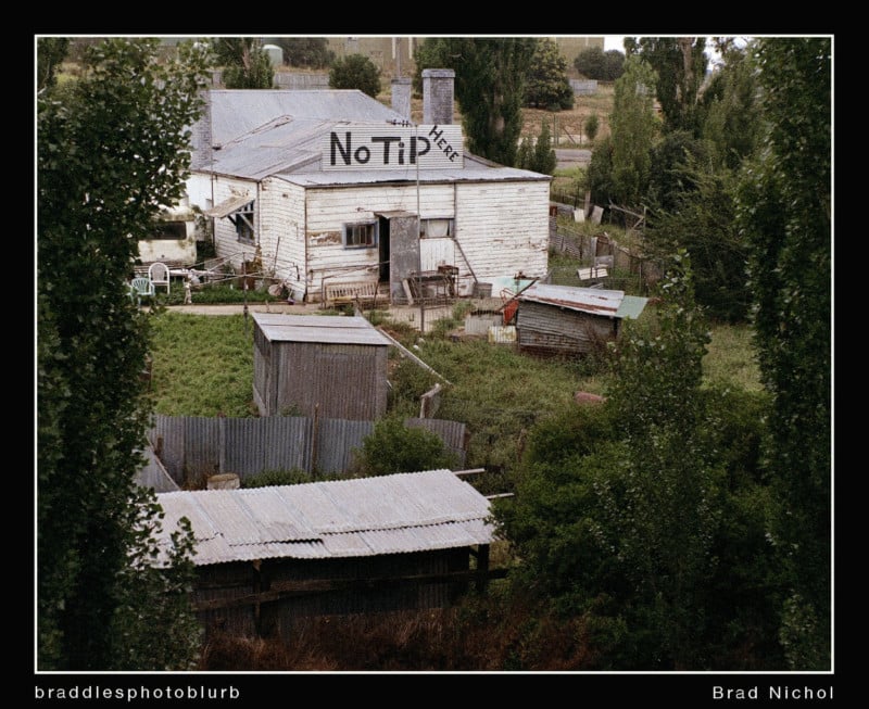
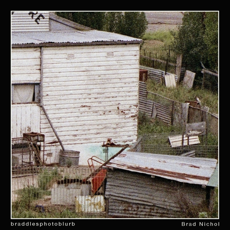
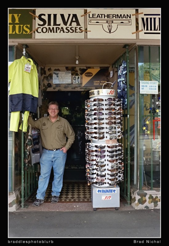
The samples I have in this article are not what I’d class as fine art, but I hope they demonstrate a few points along the way.
Backstory For These Pics
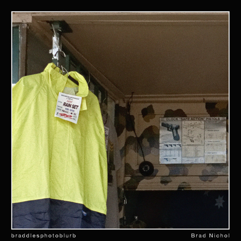
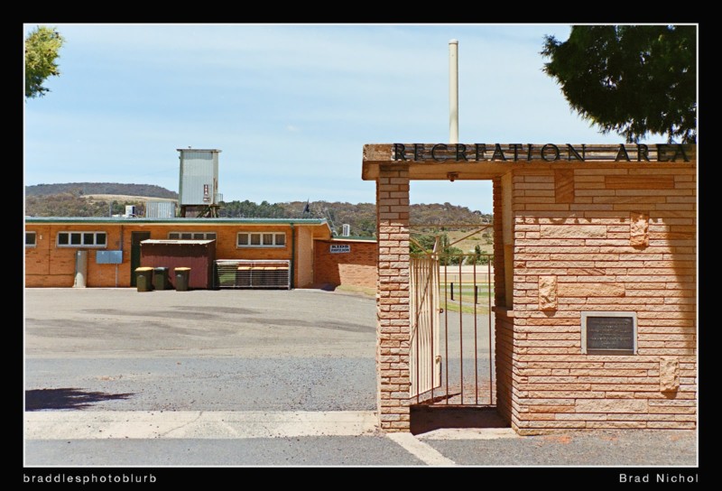
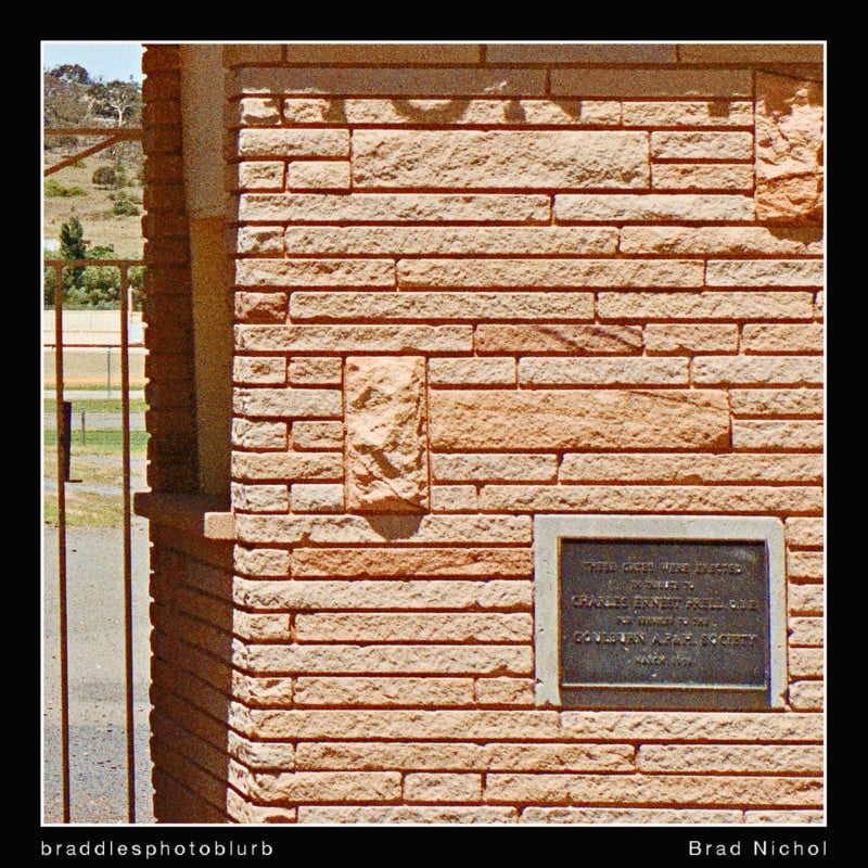
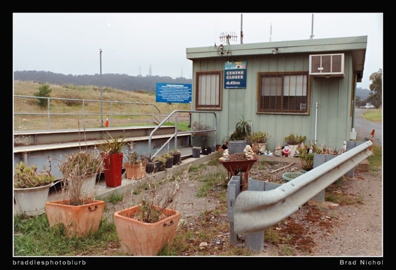
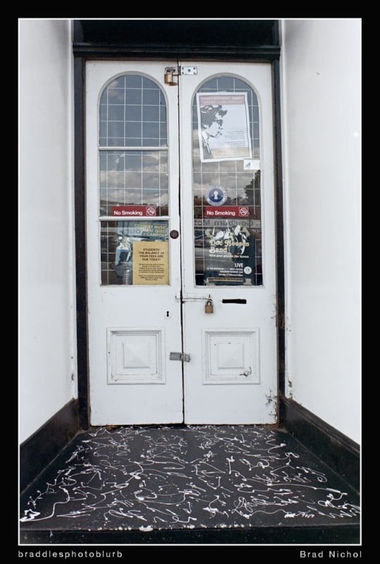
A few years ago I decided to take a series of photos of locations around my hometown which I believed would disappear or be radically changed within the next few years, there were around a hundred pics in the set. Indeed it was more of a historical record, something I encourage my students to do in their own hometowns. I decided for artistic reasons that I wanted to shoot the set on color neg film, I was particularly after the subtle color and granularity for printing purposes and also for posterity it meant I had a collection of negatives as well as digital files.
In the interim period pretty much all the things I shot are now gone, sadly so are quite a few other locations I hadn’t the foresight to record.
The film was 35mm Fujicolor X-Tra 400, so nothing special at all, probably not a film ever regarded for its ultra-fine grain. The scans were done with a custom rig I built using my Sony A900 and a Nikkor Micro 55mm f2.8. I use modern mirrorless cameras now as I can get better focus and overall results, so these results are nowhere near the limit. The A900 Sony’ 12-bit files were always an issue for this task having a tendency to posterize in some situations when working the neg inversions.
The Rant
Before I launch into my rant, I need to make some things really clear. I don’t want to be taken out of context, though I’m sure the trolls will charge headlong from beneath whatever bridges they’re living under to flog me mercilessly with their wisdom and wit (probably not much wit, but if you do want to lash me, do with a smile and joke).
So before you launch back, bear in mind these six things.
Thing number 1. I think color neg film is lovely stuff, I shot with it professionally for 25 yrs, I’ve nothing at all against the stuff.
Thing number 2. Film does have a charm of its own, especially color negative film and it’s a beautiful option for artistic expression. Slide film really doesn’t float my boat, it lacks dynamic range and looks too much like, ah, digital.
Thing Number 3. I know intimately what great prints and enlargements should and will look like when shot on neg film, and I know how to create them, I spent years processing and printing color neg professionally both for my work and other photographers.
Thing number 4. The film stocks we have on offer today are somewhat more limited than in the past, but the quality of them is as good as it’s ever been, if there’s a quality issue it’s not the film.
Thing number 5 This rant has nothing to do with peoples’ choice of subject, artistic merit or any of that stuff, I’m talking about the technical aspect of processing/scanning/editing/printing. Its got nothing to do with who makes the prettiest pictures or the best doco shots etc.
Thing number 6. No, I am not about to give you a lesson in how to do all this stuff, I just want folks to be aware that things are currently a bit crook yet can be so much better, I guess I want to spurn you onto to better results. However, you may pick up some tips from this, and I have added some choice links at the end.
So Why Am I So Flipping Aggravated?
Well, every now and then for entertainment sake, and just because I get a little nostalgic, I like to have a look at what happening in the film sphere. I should know better because when I do, I just come away feeling all grumpy and out of sorts.
What’s the Problem
Almost every time I view at a film review, test, insight, samples shots etc, (Including those on some of the better-known sites, and no, I will not name names) I am absolutely dumbstruck and disappointed by the lack of any decent skills regarding scanning and post-editing film images.
Now I know that color neg film is hard, it’s much more challenging to work with than digital, there’s much to know. I could sit down with you for a year of coffees and shoot the breeze on film and its intricacies, so I understand that it may well prove challenging for many shooters to get reliable results, especially those who are digital natives.
But!
Notice that exclamation mark….
BUT!
Neg Film is not meant to be “color shifted, golf ball size grain infested, shadow-blocked, highlight-clipped, out of whack crap”! And I bet I’m not the only old codger that feels this way.
Seriously guys, if I or any of my professional contemporaries of the film era had produced the sort of technical results that are often passed off on the interweb today as examples of the “wonderful visual healing power of film” we would have been forced into the darkroom to drink a pint of bleach-fix as punishment, and then had film clips clamped on our nipples while we were flogged with an enlarger cord.
Guys, guys, you’re giving neg film a lousy wrap, seriously, many of you need to lift your game. It can be so much better and honestly, and if you do it right, you will LOVE color neg film.
The images I see all over the Web, on reviews, Flickr, etc are almost all examples of how color neg film looked when we seriously f-ed up! Color neg is impressive stuff, and the actual prints are lovely, and just in case you had forgotten it’s intended to be printed, hell we used to call it “color print film”.
If you had a color shift problem, it might mean you hadn’t nailed the filter pack on the enlarger, but more likely you processed the film at the wrong temp or for too long, maybe you used depleted chemicals or contaminated your print developer.
Yes, much could, and did go wrong.
But here’s a little factoid for you, when something went wrong, we didn’t pass it off as “the finished product” to our clients and then call it art as a subterfuge. Nope, we sorted the chemicals or whatever the issue was and re-did it, which sometimes meant re-shooting, unfortunately.
Oh and by the way, with color neg film, “if your highlights ain’t singin, your technique’s gone swinging”, I just needed to get that in there, grrrrr.
So just why is it that almost all these so-called test shots are technically compromised?
No, no, no, I don’t want to hear that, “but Brad, I did it that way cause I wanted a certain filmy look” stuff. I’m onto you.
Basically, most latter-day filmies just don’t know how to work with this material. And sadly perhaps those of us that do or at least did, just don’t care enough to tell you “youngsters” how. After all, we wouldn’t now shoot neg film on a commercial job at all, it’s just too bothersome and expensive. Yes, yes I know some of you souls do, which is fine if you’re into making your commercial life harder than it needs to be.
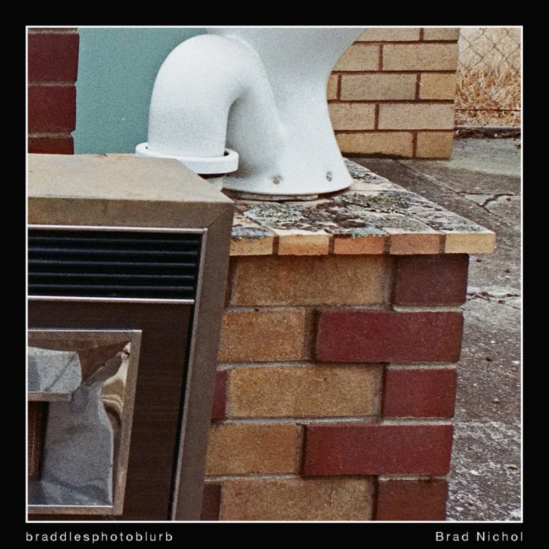
So it’s one thing to rant, but let me try to be at least a little bit helpful, here are 12 home truths about color neg film for those of you who think you might like to try it or do a better job with it.
1.) First and foremost, yes, it is hard stuff to work within the digital realm, that color mask is a pain in the rectum and neg film is seriously low in contrast, and that’s before we start talking about dealing with aged negatives and processing anomalies. You need extra effort to work around these issues.
2.) It was always meant to printed, the paper and the negative are two peas in the same pod, one compensates for the other, and when it’s all in balance, we get magic. Sadly it’s very hard these days to get high-end optical images made, on the other hand, most of the newer films do scan better than the older ones as the film producers know there will now be a digital step in the middle.
3.) Contrary to popular belief, color neg film is not monstrously grainy, in most cases if you have “runaway grain” you messed up the exposure/processing or more likely the scanning method and or settings.
4.) Color neg film does not inherently create images that are blurry and lacking resolution, again the scanning process has a significant impact on this. In fact, color neg film can be very sharp and detailed.
5.) Correctly exposed and printed color neg images do not produce prints that have a cyan color cast, red shadows, bleached highlights and muddy mid-tones, (I realize some of you new age hipsters might find that hard to believe) but poor scanning and editing certainly can.
6.) You absolutely must edit your neg files after scanning. It’s possible with excellent scanning software such as Silverfast to get results that look quite reasonable straight up. However, excellent results will always require a wide array of curves, levels, HSB, selective color, noise control and output sharpening adjustments to make the most of what’s on offer. If you want a simple workflow, shoot JPEGs on a decent digital camera.
7.) If you want to use film to get cross-processed, fogged, bleached, high contrast transparency looks and other so-called “artistic filmic” renderings, you’d be far better starting with a digital original and filtering.
8.) On the other hand, if you really want a lo-fi look (and I well understand why you might) then go for Holga style camera options, in this case, it’s the camera more so than the film that defines the look.
9.) Even 35mm 400-800 ISO color neg is capable of holding good levels of detail, the scanning is more often the limit.
10.) Scan resolution is a topic of great and often uninformed debate. Usually, the resolution used is wrong! To control grain, you either have to go low or very high on the resolution. There’s no middle ground, most scanning resolutions alias the grain, making it look far more pronounced than it really is. Low res scans can smooth over the grain, very high res scans can reproduce the granularity but in a very accurate, tight and inevitably beautiful way. Few home scanners even approach having enough resolution to do the latter. But, a high res digital camera like the Nikon D850 working in 14 bit will.
11.) Lots of film toting digital natives seem to get uneven results due to camera movement and poor focus. Take this to the bank, modern digital shutters and their flipping mirrors, IS and focus systems are far better than anything on your old Pentax SP etc. We old farts struggled with technical aspects every day and you will too, basically if you want reliable results, you’ll need to pay a lot more attention to your shooting techniques than you would be used to with your modern digital camera. Fluffing the technique end of things does not automatically make it art!
12.) Finally, the advantages of film are genuinely only realized in prints. Screen resolution/pixel pitch and a bunch of other things make the digital display of neg film images always less than ideal. If all you want to do is display your film images in low res on Facebook, Instagram or on your smartphone, you’d be far better off shooting digital and applying filter effects such as those super cool ones from VSCO.
But, yes, yes, I get it that some of you just want to have the experience of shooting with a film camera, I sometimes do so myself. And if you want top shoot any real medium or large format you won’t have any choice. NO, I don’t think that the digital version of medium format is medium format, it’s just a slightly emancipated version of full frame, 6×7 and 6×9 cm is what I consider the real deal.
Delving Just a Little Deeper
It is quite hard to accurately edit color neg images, and the problems you’ll face are entirely different to what you’ll find with digital capture. What you’re editing is a digital file, but the image characteristics are a long, long way removed from those you get with a regular digital camera.
Ponder this, color neg film has a lovely low saturation, low contrast look, it lives and breathes by its grain, it potentially renders highlights in the most attractive way, it looks beautifully, wonderfully organic in print if well done, it has a sort of 3D feel to it.
In other words, there’s a lot to love, but if you treat it like a native digital file, you’ll probably kill all that analog goodness stone dead. For example, executing the grain with blur tools will instantly defeat the whole point of color neg, though it might well look better on your iPad etc.
You just don’t apply tone curves and levels in quite the same way with color neg edits, you need to be very subtle with HSB adjustments, you definitely don’t sharpen the image in the same way and treating grain as you’d treat noise is sure to court potential image quality disaster.
Film is meant to look like film, not some half-baked digital rendering and certainly not like some poorly processed analog abomination either.
![]()
![]()
Summing Up
Guys, we can do better, way better. Sadly, there are very few articles that I’ve come across which offer reliable and useful insights; however, the ones below are well worth the clicking. I encourage you to accept that there’s no smooth pathway to excellent results from color negs, you’ll need to work at it, but I urge you to do so, the final print results can be really rather fantastic.
About the author: Brad Nichol was an early digital adopter. The opinions expressed in this article are solely those of the author. Nichol’s not quite yet into his dotage, teaches photography in rural NSW and the ACT, is the author of “Ultimate iPhone DNG”, and is a regular photo blogger and addicted tinkerer of pixels. You can also check out his Instagram pages @bradnichol9186 and @zerooneimaging (the latter is iPhoneography). This article was also published here.

