It looks like Twitter, the oft-beleaguered social network that’s still worth more than Snap, will still hold that status for a little longer after delivering a stronger-than-expected quarter this morning.
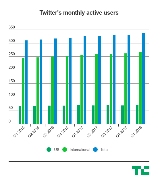
Twitter’s monthly active users barely grew — though it did, indeed, grow — by around 3% worldwide year-over-year, and is now at around 336 million monthly active users. That isn’t crazy growth or size in the scope of how large Facebook is, but it still means that Twitter isn’t losing those users. It’s going to be re-entering a critical time heading into another year of elections. All this is going to be critical to its story as it tries to sell a turnaround on Wall Street, where it at one point was worth more than double it is now.
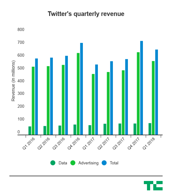
The company beat out Wall Street’s expectations by delivering $655 million in revenue, leading to a small spike in the stock this morning by about 5%. Here’s the final scorecard:
- Monthly active users: 336 million, up 3% year-over-year and compared to around 334 million expected
- U.S. MAUs: 69 million, about flat year-over-year
- International MAUs: 267 million, up 4% year-over-year
- Q1 Revenue: $665 million, compared to $608 million Wall Street estimates and up 21% year-over-year
- Q1 Earnings: 16 cents per share, compared to 12 cents per share estimates
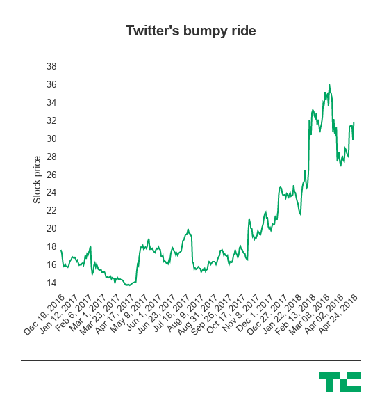
While all of this looks pretty strong, Twitter had a pretty bumpy but somewhat positive 2017 on Wall Street toward the back end of the year. It’s been making significant moves to try to curb abuse and harassment and has actually been tweaking the product in some ways, even if they don’t particularly feel earth-shattering. Expanding the character count from 140 to 280 characters might not seem like a lot, but it does compress more information into that small space, and any bit of engagement helps Twitter in the long run sustain itself.

Late last year, Twitter passed Snap in market cap. While this is largely symbolic, it’s kind of a snapshot of the pressure both networks are under to show that advertisers are actually interested in a platform beyond Facebook. Both companies are pretty volatile and have to sell Wall Street on growth stories. Twitter has often been slammed for being difficult to use and having a lot of problems related to harassment and abuse, and it’s spent much of the last year trying to fix those problems.
(Interestingly, Twitter’s stock-based compensation expense — an expense that’s been hounding Twitter for some time — increasingly seems to be getting under control. It’s down to around $73 million in the first quarter, compared to $117 million in the first quarter last year.)
While it won’t be the size of Facebook, Twitter has to position itself as a unique spot where advertisers can reach an audience that is in a different kind of behavioral mode than they are on Facebook. Twitter has sought to specialize in a live feed of information, whether that’s trying to rejigger the timeline to surface up important information or investing more in video. That, theoretically, means that Twitter could sell itself as a platform with a higher level of engagement in certain activities — something that Snap has done in order to position itself in a positive way for Wall Street.

All this has given Twitter a way to show that while its revenue is not the scale of Facebook, it’s a different kind of revenue, and one that might have a lot of value for advertisers. If it can do that, and continue to scale up its user base over time and then move into significant news events like an elections cycle, it might be able to pick up more and more advertisers. There was a point when we were talking about how its advertising revenue had completely stalled and was headed into a tailspin, but it looks like it’s actually gotten that under control.

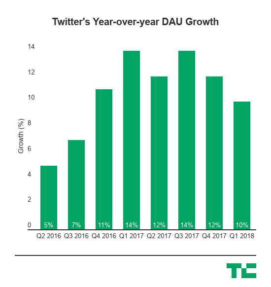
That’s also why Twitter loves to show this chart and talk about it on its quarterly earnings releases, which has only one of the two required axes in order to be a chart. The chart shows year-over-year daily active user growth, but the company doesn’t like to offer some kind of basis for how many of its users are actually super-active DAUs. But, nonetheless, here it is in all its glory:


