Just over a year after Skype introduced a colorful, Snapchat-inspired makeover which included its own version of “stories,” the company says it’s now going to refocus on simplicity – and it’s ditching stories along the way. The redesign had been met with a lot of backlash. Skype had clearly wanted to appeal to a more youthful demographic with its update, but in doing so, it cluttered the user experience with features no one had asked for or needed.
One of these was “Highlights,” a feature that was very much Skype’s own take on Snapchat’s or Instagram’s Stories. With Highlights, Skype users were able to swipe up to pull up their smartphone’s camera, then snap a photo or record a video that could be decorated with typed or handwritten text, as well as with Skype’s own set of stickers. This could then be shared with individual Skype users, groups, or posted to the Highlights section of the app.

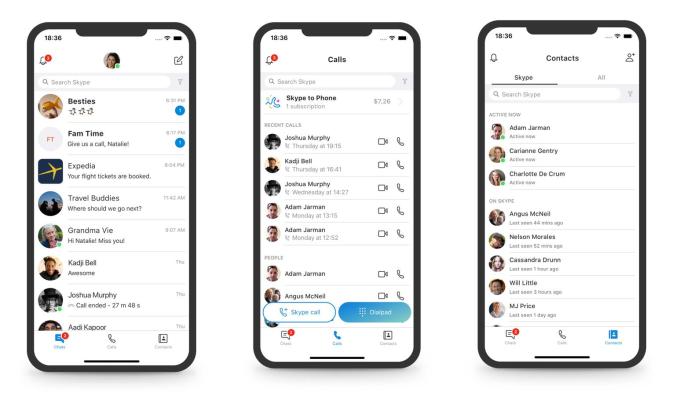
Above: Skype on mobile
The company had argued at the time that the rise of stories across social media meant it was something that all social apps would adopt. And because it was the way people were used to interacting now, Skype needed to include the feature in its own app, too.
But stories, as it turns out, may not be as ubiquitous or as in-demand as a “news feed” interface – there are places it makes sense, and those where it does not. Skype is the latter.
In its announcement, Microsoft admitted that the changes it had introduced weren’t working.
“Calling became harder to execute and Highlights didn’t resonate with a majority of users,” wrote Peter Skillman, Director of Design for Skype and Outlook.

Instead, the app is introducing a simpler navigation model where there are now just three buttons at the bottom of the mobile app – Chats, Calls, and Contacts. Highlights and Capture are both gone. (If you actually used Highlights, you have until September 30 to download them to save them before the feature is removed).
There were already some hints Microsoft was planning to dial back its design changes. It recently announced it was keeping Skype Classic (Skype 7) around for an extended period of time, after its plans to shut the app down was met with overwhelming user outcry. It said then that it would gather more feedback to find out what it is that people wanted before forcing the upgrade to Skype 8.0.
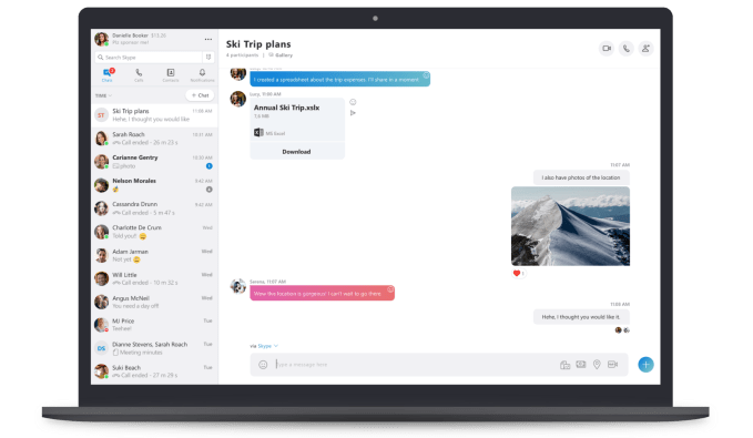
With the new desktop version of Skype, the company now says it’s moving the Chats, Calls, Contacts, and Notifications to the top left of the window to make it easier for long-time Skype users to understand.
Skype also toned down its over-the-top use of color in the app and introduced a Skype “Classic” blue theme adjusted for contrast and readability. It yanked out some of its goofier decorative elements, as well, like the notifications with a squiggle shape cut out, which it admits “weren’t core to getting things done.” (Ya think?)
Below: Squiggles

While it’s good that Skype is now listening to users – it says it’s testing new prototypes across global markets and it launched a UserVoice site – it’s concerning that it had not done enough listening beforehand. If it had, it wouldn’t have released a version of its app that bombed.
Skype should embrace its “classic” status, and not feel the need to play catch-up with teen chat apps like Snapchat, or social media trends like stories. People use Skype to get things done – calling faraway friends, placing work calls, and even recording podcasts. Being a simple and stable voice and video calling app is one that can retain loyal users over time, and attract those who need to communicate across platforms without all the fluff found elsewhere.
The latest design is available in Skype version (8.29) for Android, iOS, OS X, Linux, and Windows 7, 8 & 8.1 operating systems.

