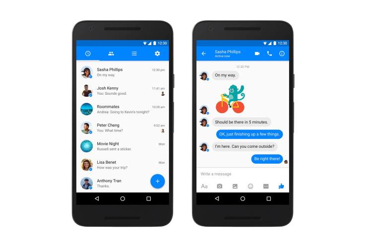

Confirming reports from earlier this year, which spoke of a forthcoming revamp of the Facebook Messenger application for Android devices, Facebook today began rolling out a new, Material Design-styled version of Messenger on Android to all users worldwide. The updated application now features a bright blue navigation bar at the top of the screen with buttons to access chat, groups, settings and more. Meanwhile, in place of the bottom blue bar with separate buttons for composing new chats, search and making phone calls, there’s now a new floating action button that appears instead at the bottom-right of the screen.
This button, when pressed, lets you take those common actions, including search, adding contacts, making a call, writing a message, and so on.
Material Design, by way of background, is the design language that Google first introduced back in 2014. The idea was to give Android apps a more universal look-and-feel, by way of various guidelines that encouraged bold colors, polished motion graphics and animations, intentional use of white spaces and more.
That being said, the Messenger for Android makeover itself is not overly dramatic, as it doesn’t present an array of new features or functionality for end users to learn. It’s more of a visual overhaul to the app with subtler changes that may even go unnoticed by irregular Messenger users.
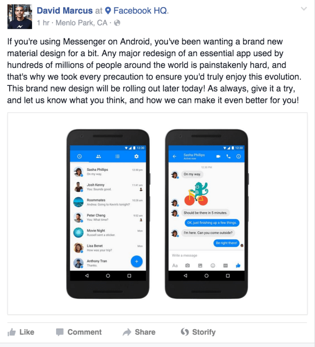
The update was first announced on Facebook itself by Messenger head, David Marcus.
Addressing why the update took so long to arrive, he wrote that: “Any major redesign of an essential app used by hundreds of millions of people around the world is painstakenly [sic] hard, and that’s why we took every precaution to ensure you’d truly enjoy this evolution.”

Marcus also confirmed in the comments of his post that the update would be available to all users later today.
A number of Android users, however, already received the update as Facebook had been testing its release ahead of today’s news. Leaks from January and February pointed to this redesign being in the works, though it was unclear at the time when all users would receive the update, as well.
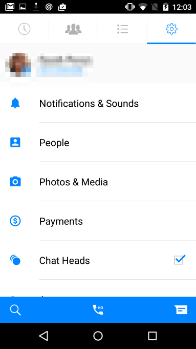
For reference, below is the current version of Messenger, displaying the bottom blue bar and the white background for the top navigation.


