It’s been a busy few weeks for smart speakers. Amazon kicked things off in late September with newer, rounder versions of both the Echo and Echo Dot. Less than a week later, Google updated the Home, after four years, with the rebranded Nest Audio. And then, last week, Apple unveiled the long-awaited $99 HomePod Mini, finally delivering an affordable version of its Siri speaker.
Amazon, for its part, has easily offered the most regular refreshes of the three. Both the Echo and Echo Dot are currently on their fourth iterations. The Echo Dot with Clock is only on its second (having just been introduced), but for all intents and purposes, the device is basically an Echo Dot — but, you know, with a clock.
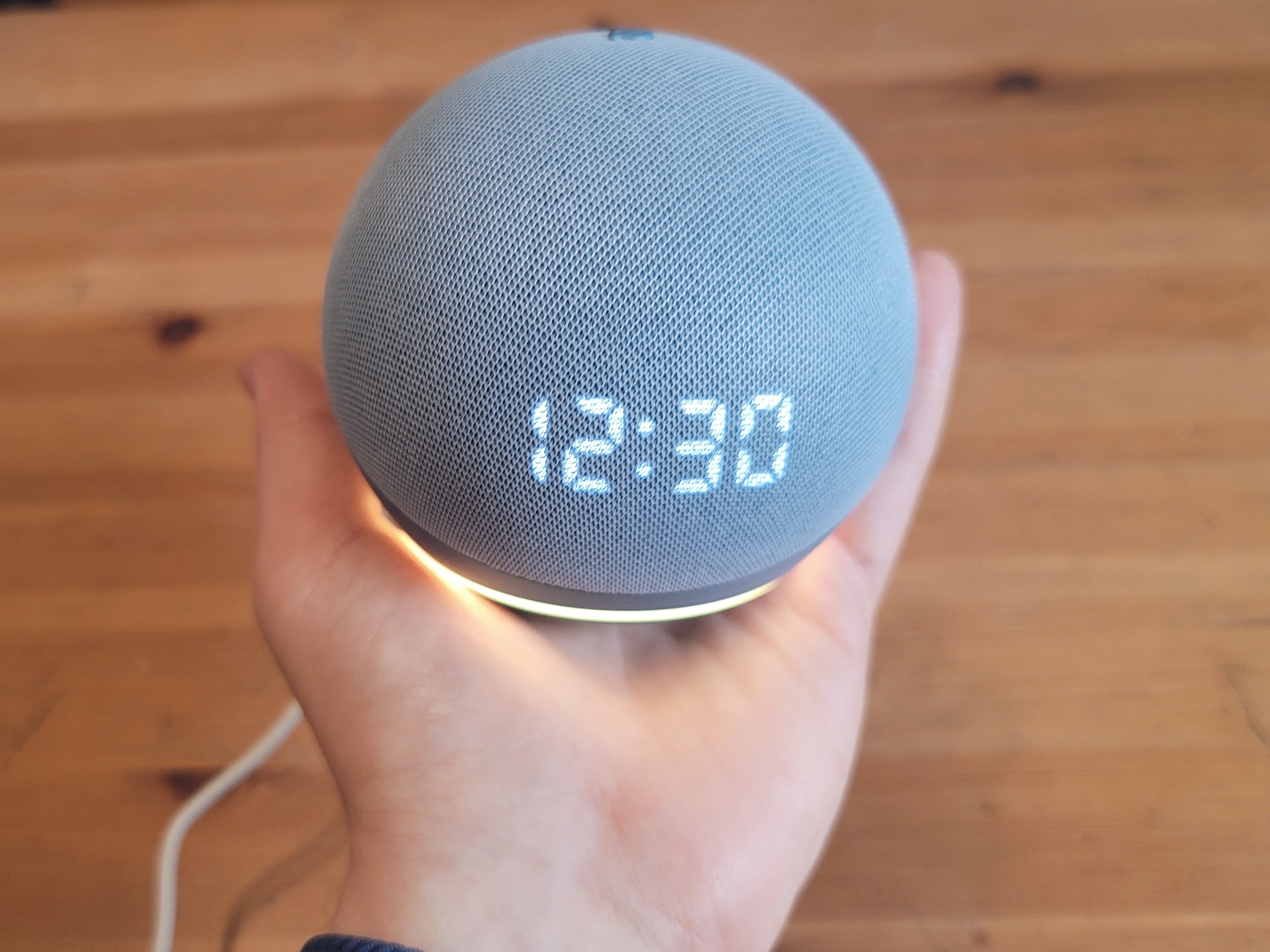
The latest update to the line finds the company offering a kind of design uniformity across the smart speakers. The Dot really does look like a diminutive version of the standard Echo. I wasn’t entirely sure how large a difference there would be between the two products, but it’s definitely pronounced. The Echo is the size of a large grapefruit and the Dot is essentially the size of a softball.
The Dot’s size lends it a good deal more flexibility in terms of placement. I could definitely see placing them in nooks and crannies throughout my place to create a kind of makeshift sound system (though the in-box cable is on the short side, so you’ll likely need an extension if you’re not close to an outlet).

Image Credits: Brian Heater
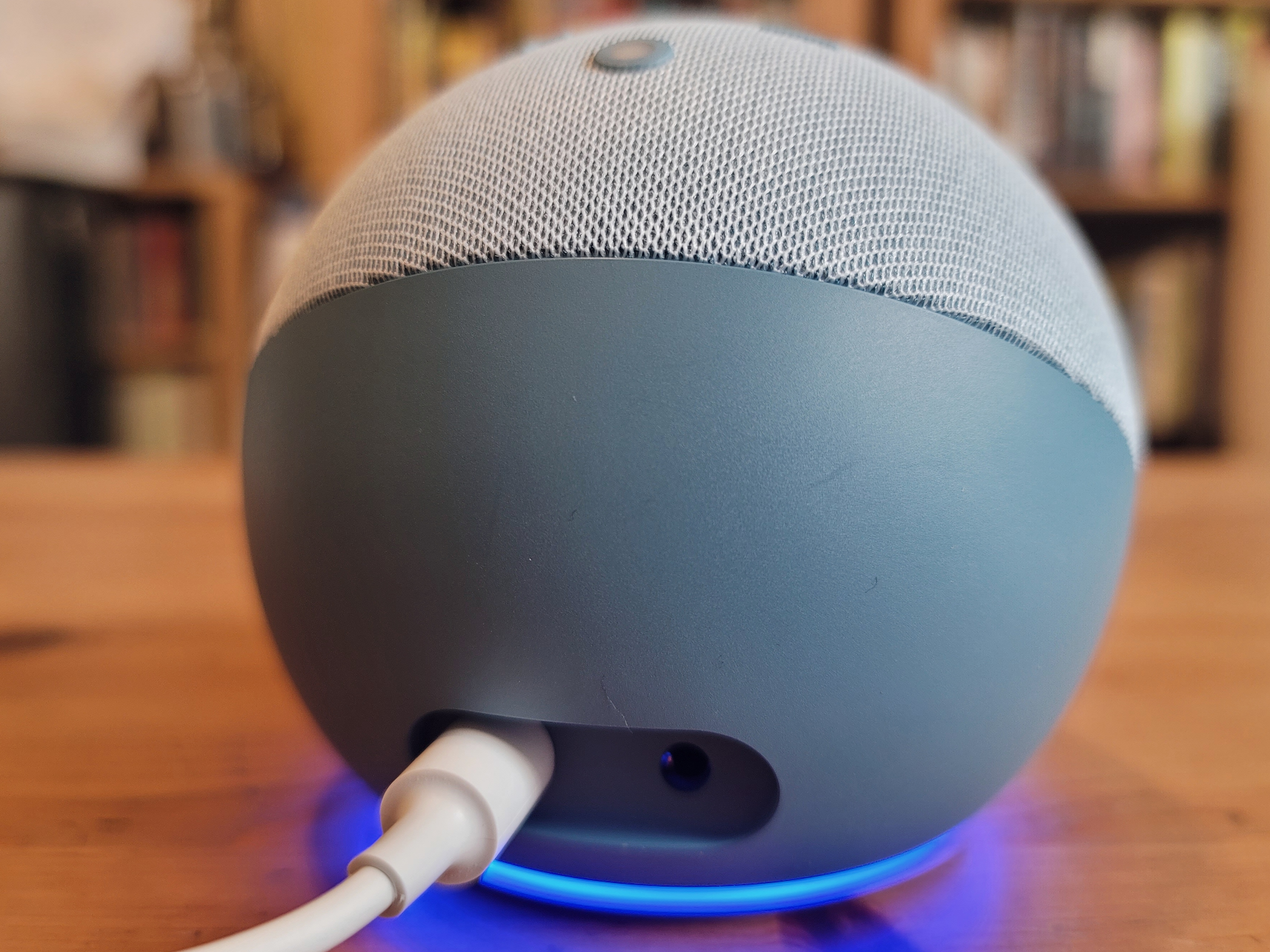
The majority of the speaker is covered in fabric, though the hard plastic bottom arcs up on the back of the device, occupying a large portion of the back. This allows for the inclusion of two ports (power and auxiliary audio out), though it also limits the speaker surface area on the device, restricting a full 360 approach unlike the older hockey puck design. As such, the speaker is just front-facing, in spite of the round design.
The new Echo devices, it’s worth noting, are one in a growing number of devices from big companies that are included as part of a push toward climate consciousness. I won’t really address Amazon’s larger overall carbon footprint here, but it’s nice to see some of that trickling down into these products. According to the company, the plastics are 50% post-consumer recycled, while the fabric and aluminum (including the capable and adapter) are both 100%.
The setup process is as simple as ever. Tap a couple of buttons on the connected Echo app and you should be up and running. The status light ring has been moved to the bottom of the device — that seems to be more of a practical choice than anything. After all, the standard light ring wouldn’t really work at the top of a round, fabric-covered device.

Image Credits: Brian Heater
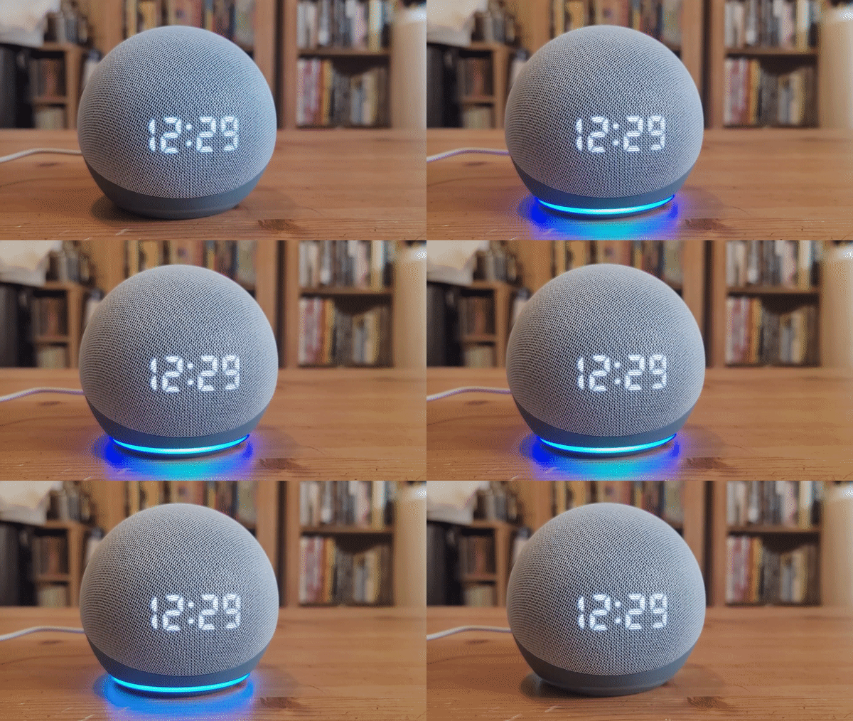
Whether that’s a net positive kind of depends on where you put the Echo. If it’s around eye-level, great. If it’s below that, it moves the ring out of view, and you may have to rely on seeing how it reflects off the surface it’s sitting on. For my own use, it’s a small step in the wrong direction. The digital clock (the big differentiator between the two Dots) is also a bit low on the ball, leaving a lot of blank surface area up top.
Again, I think Amazon is anticipating people will stick it around eye level, which is certainly the case if you primarily use the clock while lying in bed. The clock itself is plenty bright. And honestly, it’s nice just having a simple digital display sometimes, versus a full-on smart screen. That’s especially the case if you plan to stick it near your bed. That, after all, is supposed to be a kind of refuge from screens. That’s doubly important these days when we’re seemingly never not in front of one.

Image Credits: Brian Heater
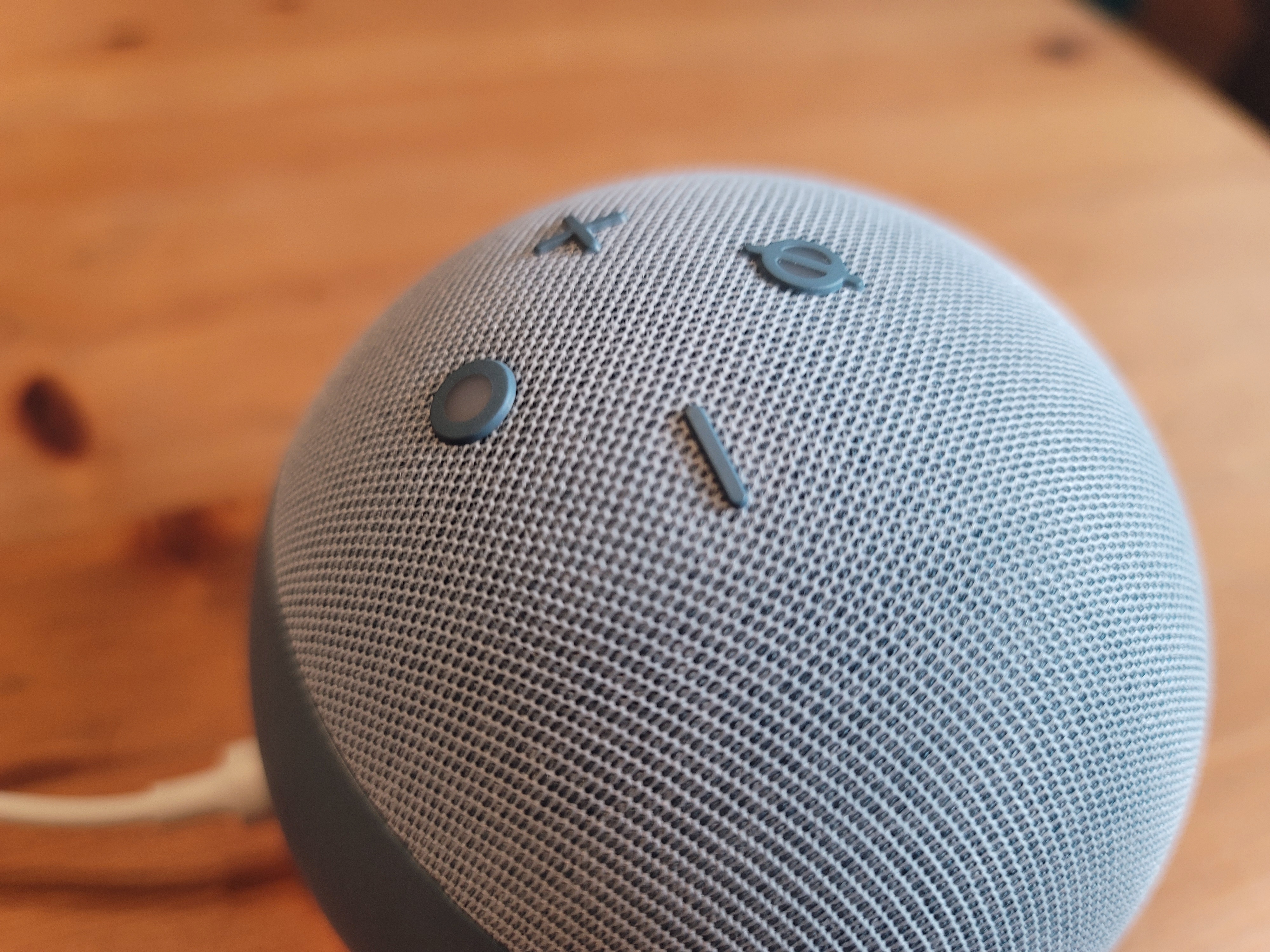
That said, the uses for the face are pretty much limited. You get a “Hello” at launch, the time (naturally), the weather when prompted and the volume level. That last bit can be adjusted with voice or with a pair of physical buttons up top. Those are joined by the Alexa button, which fires up the assistant and the always-important microphone off. That turns red when you tap it, along with a red ring on the bottom of the device to let you known the speaker has stopped listening until it’s reenabled.
The sound quality is basically the same — which is to say, kind of what you’d expect from a $50 to $60 smart speaker. It’s good for all of the voice functionality you need, but I certainly wouldn’t rely on it as my default home speaker — even with a couple of them paired up. As an alarm clock, however, sure, go for it. It certainly beats the speaker on your phone.

Image Credits: Brian Heater
The $10 price difference between the Dot and Dot with Clock is a bit of a weird one. I’d anticipate in future generations, Amazon will just combine them into one product, priced the same as the standard Dot. For now, however, telling time at a glance is going to cost you a little extra.
The new Echo arrives October 22. The Dot with Clock won’t be available until November 5.

