The Galaxy S21 is a tank. It’s a big, heavy (8.04 ounces versus its predecessor’s 7.7), blunt instrument of a phone. It’s quintessential Samsung, really — the handset you purchase when too much isn’t quite enough. In fact, it even goes so far as adopting S-Pen functionality — perhaps the largest distinguishing factor between the company’s two flagship lines.
In many ways it — and the rest of the S21 models — are logical extensions of the product line. Samsung hasn’t broken the mold here. But the company didn’t particularly need to. The line remains one of the best Android devices you can buy. It’s a product experience the company is content to refine, while saving more fundamental changes for the decidedly more experimental Galaxy Z line.
Samsung certainly deserves credit for going all in on 5G early. The company was ahead of the curve in adopting next-gen wireless and was among the first to add it across its flagship offerings. 5G became a utilitarian feature remarkably fast — owing in no small part to Qualcomm’s major push to add the tech to its mid-tier chips. In fact, the iPhone 12 may well be the last major flagship that can get away with using the addition of the tech as a major selling point.
With that out of the way, smartphone makers are returning to familiar terrain on which to wage their wars — namely imaging. S-Pen functionality for the Ultra aside, most of the top-level upgrades of this generation come on the camera side of things. No surprise there, of course. The camera has always a focus for Samsung — though the changes largely revolved around software, which is increasingly the trend for many manufacturers.

Image Credits: Brian Heater
There are, however, some hardware changes worth noting. Namely, the new S models represent one of the bigger aesthetic updates in recent memory. I’d mentioned being kind of on the fence about them in my original write up of the news, owing largely to that weird wrinkle of 2020/2021 gadget blogging: not being able to see the device in person. Now that I’ve been toting the product around the streets of New York for several days, I can say definitive that, well, I’m mostly kind of okay with them, I guess.
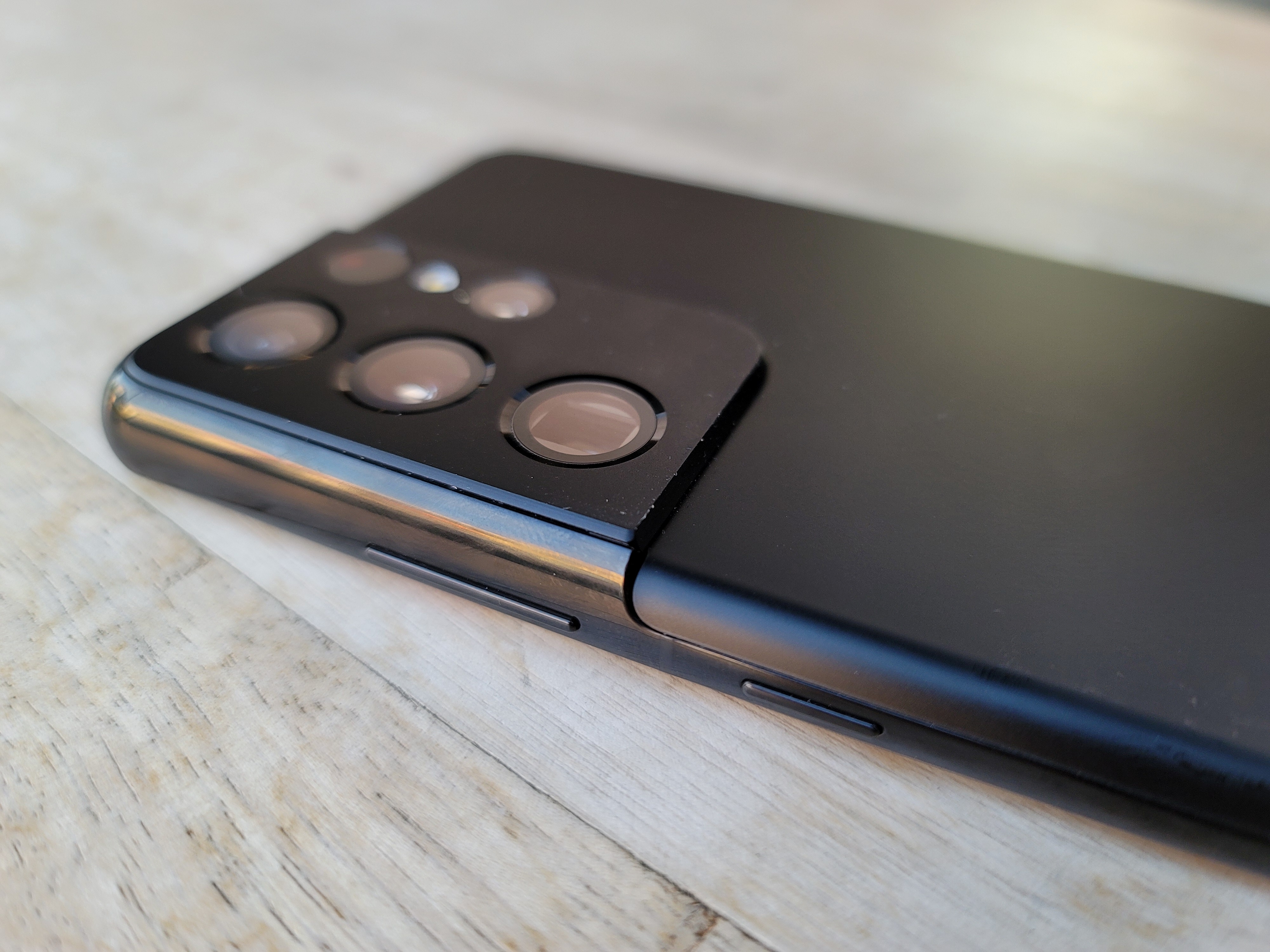
The big sticking point is that massive contour cut camera housing. Pretty sure I used the word “brutalist” to describe it last time. Having used the product, I’d say it’s fairly apt. There’s something…industrial about the design choice. And it’s really pronounced on the Ultra, which sports four camera holes, plus a laser autofocus sensor and flash. It’s a big, pronounced camera bump built from surprisingly thick metal. I suspect it’s owed, in part, to the “folded” telephoto lens.
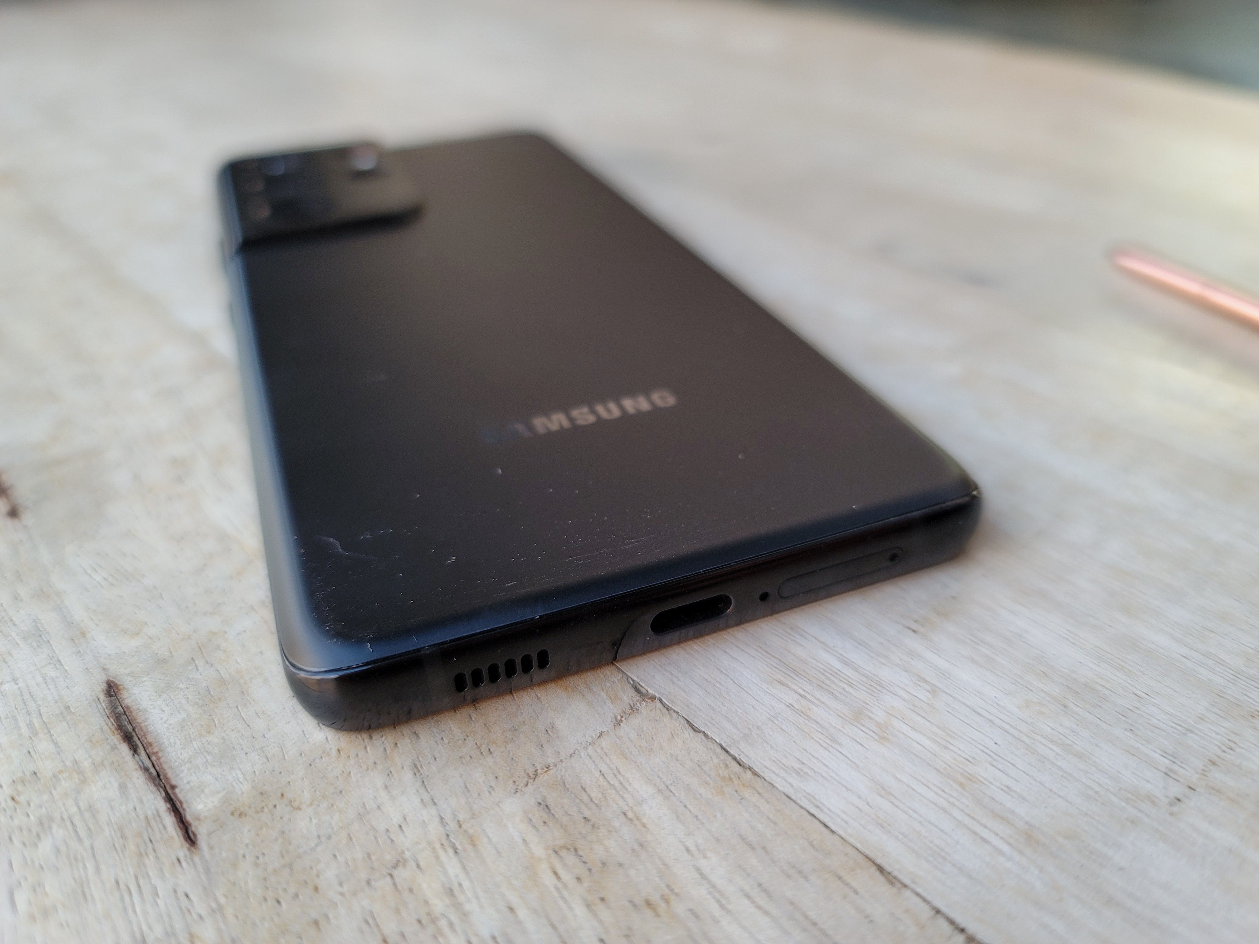
Samsung sent along the Phantom Black model. The color was something the company devoted a surprising amount of stage time to during the announcement. It was the kind of attention we rarely see devoted to something as inconsequential as a color finish, outside of some Apple bits. Here’s a long video about it if you’re curious. I don’t know what to tell you. It’s nice. It’s matte black. I do dig the new metallic back; even with Corning on your side, a glass back really feels like an accident waiting to happen.
The curved screen looks nice, per usual, accented well by the round corners. The screen itself is striking — Samsung’s displays always are. The screens on the S21, S21+ and S21 Ultra are 6.2, 6.7 and 6.8 inches, respectively. Those are all unchanged, save for the Ultra, which is, strangely, 0.1 inches smaller than its predecessor. It’s not really noticeable, but is an odd choice from a company that has long insisted that bigger is better when it comes to displays.
Eye Comfort Shield is a welcome addition, adjusting the screen temperature based on time of day and your own usage. If you’ve used Night Shift or something similar, you know the deal — the screen slowly shifts toward the more yellow end of the white balance spectrum, reducing blue light so as to not throw your circadian rhythms out of whack. It’s off by default, so you’ll have to go into settings to change it.
The company has also introduced a Dynamic Refresh Rate feature, which cycles between 46 and 120Hz, depending on the app you’re using. This is designed to save some battery life (a 120Hz along with 5G can be a big power hog). The effect is fairly subtle. I can’t say I really noticed over the course of my usage. I certainly appreciate the effort to find new ways to eke out extra juice.
The new era of Samsung is equally notable for what it left off. The new S models mark the end of an era as the company finally abandons expandable storage (following in the footsteps of the Z line). I mean, I get it. These devices range from 128 to 512GB of storage. For a majority of users, the microSD reader was superfluous. I certainly never needed to use it. Per the company, “Over time, SD card usage has markedly decreased on smartphones because we’ve expanded the options of storage available to consumers.”
Of course, expanding the built-in memory is going to cost you. Mostly, though, it’s always a bit of a bummer to say farewell to a long-time distinguishing factory. Speaking of, the company also ditched the in-box headphones and power adapter, notably deleting some ads in which it mocked Apple for recently doing the same. It’s the headphone jack all over again.

The company offered up a similar sustainability explanation in a recent statement. “We discovered that more and more Galaxy users are reusing accessories they already have and making sustainable choices in their daily lives to promote better recycling habits.” As a consequence, the box is nearly half as thick as those from earlier S lines, for what that’s worth.
As mentioned above, the cameras are remarkably similar to their predecessors, with a few key differences. The S20 Ultra sported an 108-megapixel wide lens (f/1.8), 12-megapixel ultrawide (f/2.2) and 48-megapixel (f/3.5) telephoto (4x zoom), while the S21 Ultra features a 108-megapixel wide (f/1.8), 12-megapixel ultrawide (f/2.2), 10MP (f/2.4) telephoto (3x zoom) and 10MP telephoto (f/4.9) (10x zoom). The dual telephoto lenses are the biggest differentiator.

Image Credits: Brian Heater
The device will switch between telephotos, depending on how much you zoom in. The device performs a lot better than many competing handsets at distances requiring around 10x. Though, while the ability to zoom up to 100x is an extremely impressive thing for a phone to do on paper, the images degrade really quickly at higher levels. At a certain point, the image starts taking on the style of an impressionist painting, which isn’t particularly useful in a majority of cases.
Once Samsung (or whoever) can properly crack the code on translating that noise into signal, it will really be a breakthrough. Still, Zoom Lock is a nice addition in helping to minimize hand shake while zooming. Accidental movements tend to increasing exponentially the tighter you get in on an image. The Super Steady, too, has been improved for video recording.
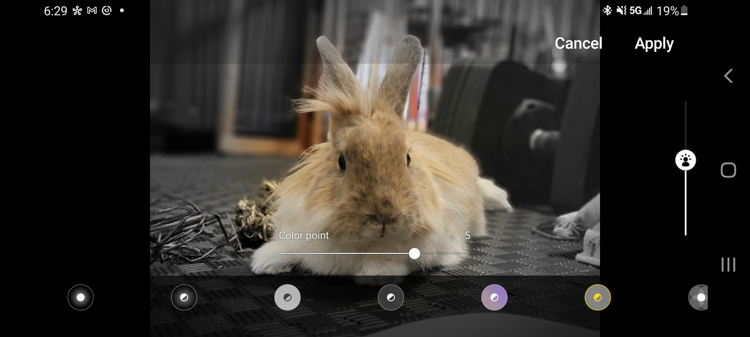
Portrait mode has been improved. There still tends to be trouble with more complex shapes, but this is a problem I’ve run into with pretty much all solutions. Samsung gets some points here for offering a ton of post-shot portrait editing, from different bokeh levels, to adjusting the focal point to other effects. As with much of the camera software, there’s a lot to play around with.
Other key additions include 8K snap, a nice addition that lets you pull high-res images from a single frame of 8K video. There’s also Vlogger Mode, which shoots from the front and back simultaneously. Someone will no doubt find some social use for this, but it feels a bit gimmicky — one of those features a majority of users will promptly forget about. Additional options are generally a good thing, though the camera software has gotten to the point where there are a ton of menus to navigate.
I get the sense that most users want a way to quickly snap photos and shoot videos. The lower-end S21 entries are great for that. The hardware is strong enough to give you great shots with minimal effort. If you’re someone who really enjoys drilling down on features and getting the best images on-device without exporting to a third-party app, the Ultra is the choice for you. In addition to being a kind of kitchen sink approach, the high-end device is all about choice.

Image Credits: Brian Heater
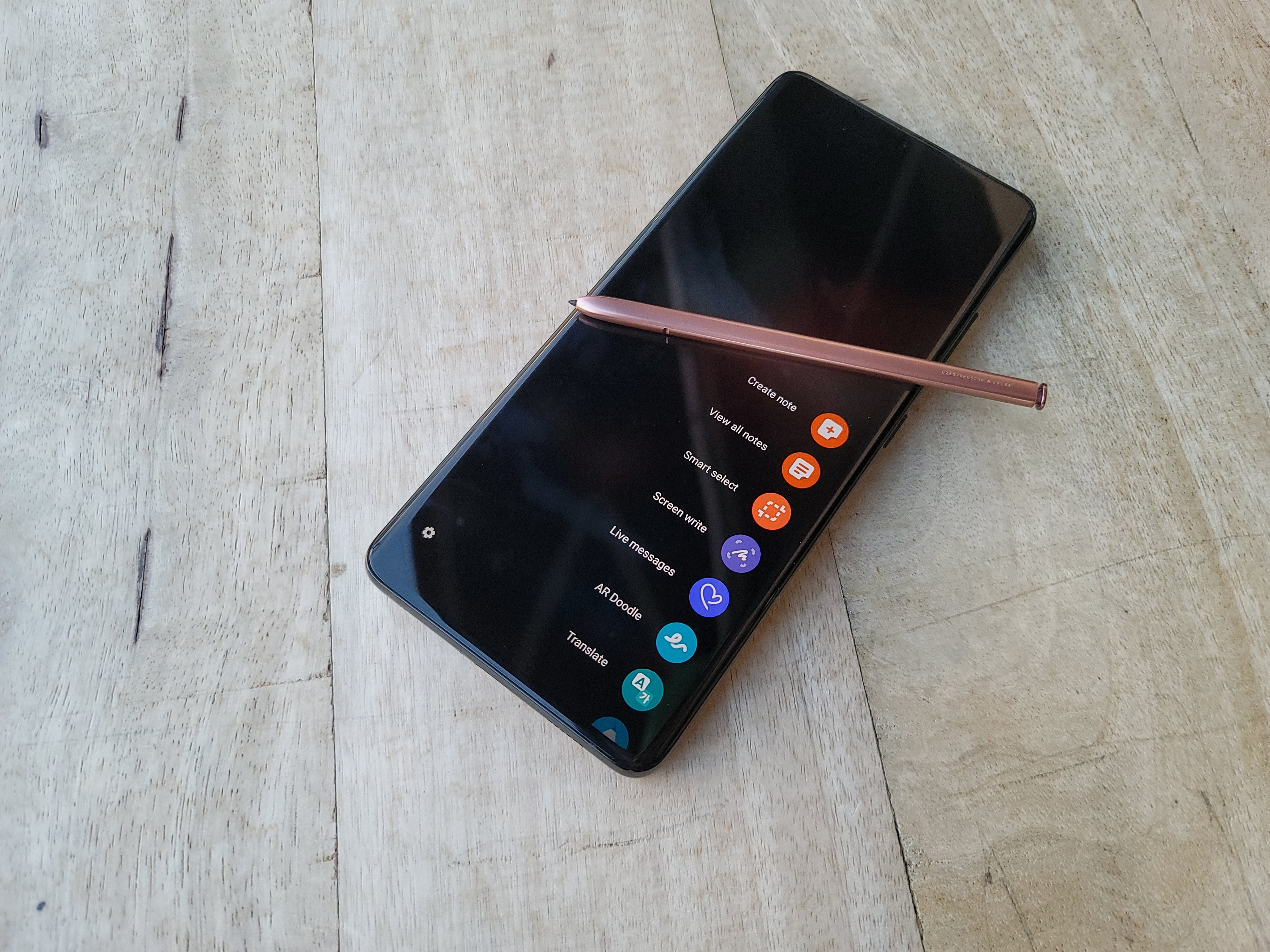
The addition of S Pen functionality is probably the most notable — and curious — thing the Ultra has going for it. On the face of it, this feels like the latest — and most pronounced — in a series of moves effectively blurring the lines between the company’s two flagships. Perhaps Samsung will make a move to further differentiate the next Note, or maybe the company is content to simply let the device meld over time.
There is one major difference off the bat, of course. Namely the fact that there’s no pen slot on the S21. This means that:
- The stylus is sold separately.
- You need to buy a case with an S Pen holder (also sold separately, naturally) if you’ve got any hope of not losing it.

Image Credits: Brian Heater
I happened to have a Note S Pen lying around and found the experience to be pretty smooth. I’ve been upfront about the fact that I’m not really a stylus person myself, but Samsung’s done a good job building up the software over the years. The S Pen is a surprisingly versatile tool, courtesy of several generations of updates. But I would say if the peripheral is important to you, honestly, just buy a Note.
The components are what you’d expect from a high-end Samsung. That includes the brand new Snapdragon 888 (in some markets, at least), and either 12 or 16GB of RAM and 128, 256 or 512GB of storage on the Ultra. The battery remains the same as last year, at 5,000mAh. In spite of 5G and a high refresh rate, I’ve gotten more than a day and a half of moderate use on a single charge.
In the end, the S21 isn’t a huge change over the S20. It’s more of a refinement, really. But it does represent a big change for Samsung. The company has implemented a $200 price drop across the board for these products. The S21, S21+ and S21 Ultra start at $799, $999 and $1,199, respectively. None are what you would call cheap, exactly, but $200 isn’t exactly insignificant, whether it means easing the blow of getting in on the entry level or taking the pain out of going for a higher-end model.
It’s a clear reflection of a few years’ worth of stagnating smartphone sales, exacerbated by some dire numbers amid COVID. It’s nice to see a company take those issues — and concern around spending $1,000+ on a smartphone — to heart beyond simply offering up a flagship “lite.”

