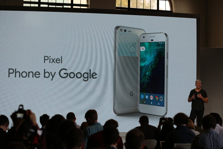

Google’s just-revealed Pixel smartphones will feature a new user interface designed to make it easier to access Google’s Assistant – the now smarter, virtual helper that aims to one-up Siri. Part of this revamp includes the introduction of the Pixel Launcher, the company announced.
At the Google hardware event this morning, the head of the software management team for Pixel, Brian Rakowski, showed off how the Pixel Launcher worked, focusing mainly on the power of the Google Assistant to respond to queries, launch apps, answer questions, and more.
With prior Android interfaces, access to Google Now was available just a swipe away – and that continues, but the Pixel Launcher also features a tab labeled “G” which allows you to tap into the power of the Google Assistant. You can long press on the home button to launch the Google Assistant, too.
Long presses work on app icons, too. Similar to iPhone’s 3D Touch, this will reveal shortcuts. But what’s different is that these shortcuts can actually be dragged to the homescreen, as well.
In addition, the Pixel Launcher changes the way the user interface for Android will look and feel.
Specifically, Pixel Launcher features round icons and access to apps “a swipe away,” said Rakowski. That is, you can now pull up on the now, more faded-looking icon dock to reveal all your apps – with no need for an “app drawer” icon. You can also slide down to get to your notifications, or slide down on the Pixel’s fingerprint sensor to do the same.
Rakwoski also described the Pixel Launcher as having a “clean” and “polished” look, which references the more subtle changes to the interface, which has been updated to better fit in with the style of the newer, sleek, aluminum and glass Pixel smartphones.

