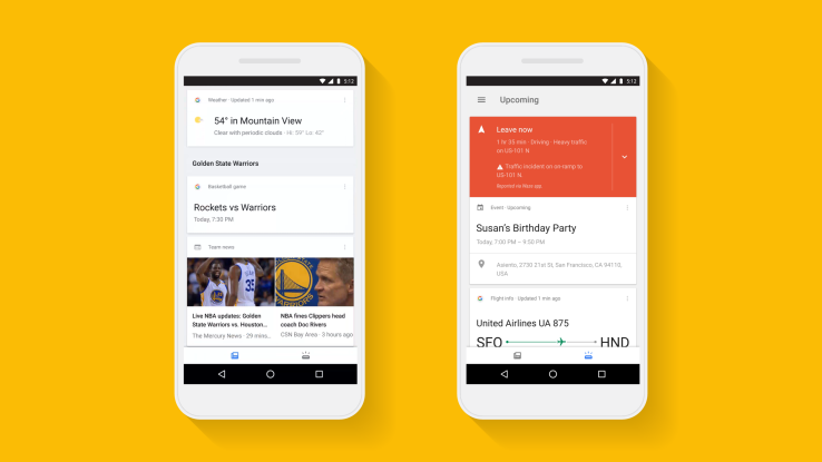

Google’s flagship mobile application is getting a big makeover today, with a focus on making it easier to separate the things you need to know about – like upcoming appointments or flights -from the things you’re interested in, like news, sports, and entertainment. The app still maintains its previous card-style design, but it now offers two different sections to better organize its content: your feed, and the “upcoming” section.
In the upcoming section, which is accessed by tapping on the bottom-right icon, Google will present you with information about your day, like your schedule, travel time for your commute, package delivery details, flight info, boarding passes, and more. This is the same sort of information that the intelligent assistant Google Now has been pulling into the app for years by leveraging data pulled from other Google services you use, like your Gmail, Calendar, or Google Maps, for example.
Interestingly, Google has decided to make the news feed the default feed instead of the ‘upcoming’ feed with your personal agenda. With the revamped app, this personal feed now becomes the app’s main section, and will be filled with info on your favorite sports teams, people of interest, music and other news stories. This means that more mission-critical information is now no longer buried in the same feed where you’re keeping up with the other things you care about, but it’s also not visible by default either. You have to tap into the ‘upcoming’ feed now and it doesn’t look like there’s a way to change this.
You can continue to customize this feed as before, by heading into the app’s settings. Here, you can tell the app which stocks to track, which sports teams you like, and so on. In addition, Google says that this feed will become more personalized and relevant over time, the more you use Google and the app.
The idea here is clearly to make the feed feel more organized and ensure that vital information doesn’t get lost in what could at times be a messy list of disparate items. It’s easy enough to toggle between the two section, but the choice of defaulting to the news feed seems odd.

While Google’s app has excelled at being a stepping off point to the larger web, and a useful utility when it comes to things like planning your commute or checking your schedule, it hasn’t been as successful as a personal assistant that knows what you care about.
Unless you’ve explicitly programmed in things in the settings (e.g. your stocks, your teams, etc.), the app seems to rely too much on your prior Google Search history when presenting news articles to read.
With the redesign, Google’s aim, apparently, is to put the “interests” section front-and-center, which could increase users’ interactions with its content. This, in turn, could better personalize the feed and increase its relevancy, when before it seemed to be more of an echo of past searches.
In addition, Google is releasing another new feature that will help to program the feed better.
Starting in the U.S. it will show a card right within the feed that lets you select from topics of interest that you want to see more stories or information about. This helps to solve the “cold start” problem for those who haven’t spent as much time using the app or placing relevant searches on Google.
The update is rolling out, starting today with the Google app on Android and iOS.

