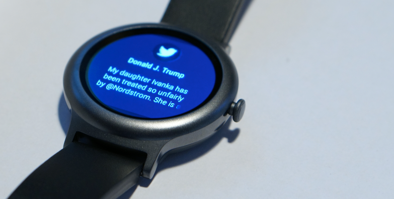
Google is officially launching Android Wear 2.0 today — the biggest update to the company’s wearable operating system since its launch in 2014.
If you’re not a Wear aficionado who has been patiently waiting for this release, you probably remember Wear 2.0 from its Google I/O announcement last May. Even though in day-to-day use, the updated version feels very much like the next logical evolution of Wear, it took Google far longer than expected to launch it.
“The approach that we took as we got started was to build an ecosystem of partners — so not just do a one-size-fit all solution,” David Singleton, the head of the Google Wear project, told me. “But build an ecosystem of partners to create a diverse set of styles and sizes. We felt strongly that it was time to work with our traditional — but also non-traditional — partners to create this ecosystem.”
While the overall outlook on the market doesn’t always look positive, Singleton argues that Google saw double-digit growth in activations year-over-year. Only looking at the holiday season, Google says it saw 70 percent year-over-year growth.
Today, however, Wear 2.0 is launching with two new flagship watches from LG: the gargantuan, feature-rich LG Watch Sport and the comparatively demure and pared-down LG Watch Style. You can find our respective reviews here and here. A number of existing Wear watches will also get this update in the coming weeks and months.
Even though it took Google a few months longer than expected to roll out Wear 2.0, which meant its partners missed the ever-important December shopping season, the final version that’s launching today still sticks to the basics Google announced last year. New features include support for standalone apps, Android Pay, dials and — of course — the Google Assistant.
As Singleton stressed, the idea behind all of this work was to take what the team learned from how people used the previous version and focus on making exactly those things easier.

The one thing Singleton and his team seemed to be especially excited about was the ability to quickly change watch faces in Wear 2.0. In earlier versions, you had to perform a long press on the watch face to switch faces. Now you can simply sweep left or right to change them. I admit that I don’t fully share their enthusiasm for this feature, but, to be fair, it does make switching between a work-centric watch face with your calendar and a fancier one for after work a bit easier.
As far as the watch faces go, though, the one feature I definitely was able to get excited about is that the new designs now have slots for showing data from third-party applications. Maybe you want to see your battery life there, or your steps from Google Fit, or how much water you drank from Lifesum, or the outdoor temperature based on data from the Weather.com app. This is now a deep, built-in feature of Wear 2.0 that allows third-party services to make this data available on the watch face. It’s up to the designers to decide how they want to display this info, and the new LG watches already show a couple of different options for this.
 Before any of this, though, the first thing you’ll notice when you get a 2.0 watch is the overall update to its design — both in terms of the overall look but also the user experience. The look of Wear 2.0 now skews closer to Google’s Material Design guidelines. While the overall look will still feel familiar to Wear 1.x users, the update put a stronger emphasis on cards, for example. This means every notification now gets a full screen to show its preview and you can use the watch’s dial to scroll through them (assuming your watch has a dial, of course. — otherwise you can obviously still use the touch screen to scroll).
The other marquee feature of Wear 2.0 is support for standalone apps that don’t need a companion app to run on your phone. That means developers can write apps that are purely geared toward the watch and they can then publish it on the Google Play store, which is now also available directly on the watch. That sounds more useful than it is — unless you plan on getting an LTE-enabled watch and leave your phone at home. That’s an option now that you could run Hangout or Google Music directly on the watch, but, except for runners, that’s likely not a typical use case. At the end of the day, the most important use case for a smartwatch remains dealing with notifications. Everything else often feels like an unnecessary complication.
 For the most part, the standalone apps that are available right now aren’t all that exciting either. There also aren’t all that many available right now. Some of the apps Google promised for the launch include Foursquare, Robin Hood, Runkeeper, Runtastic, Strava, Todoist, Nest and Uber. The team specifically singled out Google’s own Fit app, too, which now supports more exercises than before, in addition to an interactive coaching experience.
To be fair, Wear 2.0 does make it easier to use these apps. To get to them, you only have to push the watch’s dial. In addition, you also can use the dial to scroll through them. Instinctively, I assumed that I could then start an app by pressing the dial again, but that just takes you back to the home screen.
Still, the additional support for dials and buttons is an admission on Google’s part that smartwatches should have some kind of physical button. The Wear 1.0 launch device — the LG Watch — famously didn’t have any physical buttons (not even to turn it on). The new LG Watch Sport however has two buttons and a dial and Wear 2.0 makes it easy to assign various functions to them, too. That makes using these watches easier at times, but it’s not exactly a revolutionary breakthrough.
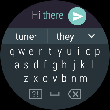
Android Wear now also features a keyboard. That may sound like an insane idea, given how small these watches’ screens are, but because it uses Google’s predictive technology, it works surprisingly well. You wouldn’t want to use if for typing long messages, and it’s really more about swiping than pecking for individual letters, but if you’re in a place where using voice input isn’t an option, it’s a good alternative.
 Wear has gotten significantly smarter, though. It now features support for the Google Assistant and smart replies. The Assistant on the watch works just as well as on any other device, including the Google Home or the Pixel. There really isn’t much more to say here. Google Now on Android Wear was already pretty useful, too, after all (and where Now ends and the Assistant starts isn’t always clear anyway). It would be nice if you could also type questions so that you could use the Assistant in a quiet room. Singleton says that’s something the team is thinking about.
Smart Replies may actually be the more exciting feature here. It looks at your conversation and then suggests possible replies based on its understanding. I never found that very useful in Inbox, where this made its debut, but on the go, it sure makes answering messages easier. Singleton told me that the algorithms for Smart Replies actually run right on the watch.
It’s an evolution
Looking at the list of features, this may not sound like a major update and more like a series of incremental updates to existing parts of Wear 1.x. We also ran into our fair share of bugs while testing the new LG watches. After first setting the LG Watch Style up, for example, we got stuck in tutorial mode and didn’t receive any notifications until we reset the watch. An emergency patch Google released over the last weekend fixed most of these issues, however, so I assume the final version that rolls out to consumers won’t have these issues.
The new LG watches are interesting in their own ways and they showcase the new features of Wear 2.0. The LG Watch Sport, especially, feels like Google and LG wanted to show off every possible feature of Wear 2.0, but that doesn’t necessarily make for a great watch. The smaller and cheaper LG Watch Style, on the other hand, shows a more restrained approach.
The Android smartwatch market could use a revolution to kickstart what now occasionally feels like a moribund ecosystem. Wear 2.0 doesn’t feel revolutionary. It is, however, a perfectly adequate update that addresses many of the issues with Android Wear. It also puts it on parity with its competitors, like Apple’s watchOS or Samsung’s Tizen. It does also introduce some new use cases for LTE-enabled watches, but I can’t help but feel that this will remain a niche category. Much, however, will depend on Google’s hardware partners who will now have to bring Wear 2.0 to life.


