![]()
Actress and UN Women Goodwill Ambassador Emma Watson spent International Women’s Day hiding feminist books around NYC while she wasn’t giving a speech at the HeForShe Arts Week launch.
Dropping off books at Gertrude Stein statue in NYC✊📚 #IWD #IWDOurSharedShelf #ADayWithoutAWoman @the_bookfairies https://t.co/kJhmZfvBzw pic.twitter.com/rb81acPFkn
— Emma Watson (@EmmaWatson) March 9, 2017
Not so surprisingly, her photo shoot for Vanity Fair with Tim Walker sparked some controversy by critics who claimed she was a hypocrite for posing in a revealing outfit. So before we talk about photos, let’s remind everyone that feminism is about the equal treatment of men and women, not about what we choose to wear for a magazine shoot. So, there!
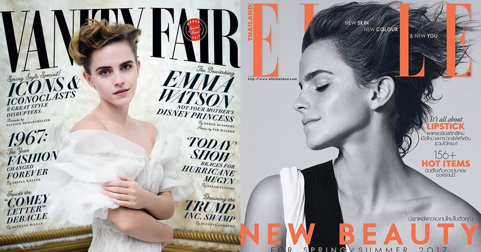
Anyway, about that Tim Walker cover. Here it is:
![]()
Of course, it can be difficult to separate our image of the child star from Harry Potter from the actual 26-year old. She still looks incredibly young and youthful, and I thought it was an interesting styling choice to not try to block out her freckles. So natural! And super diffuse lighting to match.
Also, look at how the typography mirrors the angle of the set piece—everything is directed towards Watson. There are a lot of light tones, but no blown highlights; in fact, even the brightest part of her sleeve still has a bit of headroom (RGB values are around 245). This is very typical for Walker’s portraiture, which often has an almost muted effect from the modest use of contrast.
And since you were wondering, here’s the “controversial” photo with the British Watson wearing the Burberry.
![]()
Over on Elle Thailand, Watson appears on the cover with an image taken by Kerry Hallihan.
![]()
The image is actually from a shoot that Hallihan did for Elle UK in the prior month. Here’s that cover:
![]()
I personally think the Elle Thailand cover is the superior image—maybe I’m a sucker for that jawline, but I just find everything from the lighting to the styling to the post to be more interesting. And it’s a single light set-up! All three magazine covers prominently feature Watson’s freckles, leading me to believe that the natural look is in this season.
Ok, this one was pretty easy for me. I’m not sure I get the whole vibe of the Vanity Fair cover (fairytale-ish?), and I’m just in love with Hallihan’s image and the contemporary vibe. So Hallihan gets my nod!
About the author: Allen Murabayashi is the Chairman and co-founder of PhotoShelter, which regularly publishes resources for photographers. Allen is a graduate of Yale University, and flosses daily. This article was also published here.

