
Google’s Android Wear smartwatch platform launched more than two years ago and it’s now supported by more than a dozen brands and runs on more than 100 watch designs. Today, the company took the wraps off version 2.0 of Android Wear, the biggest update of the platform yet.
Google will release the developer preview of Wear 2.0 at I/O, but it’ll take until the fall before this new version will roll out to all users.
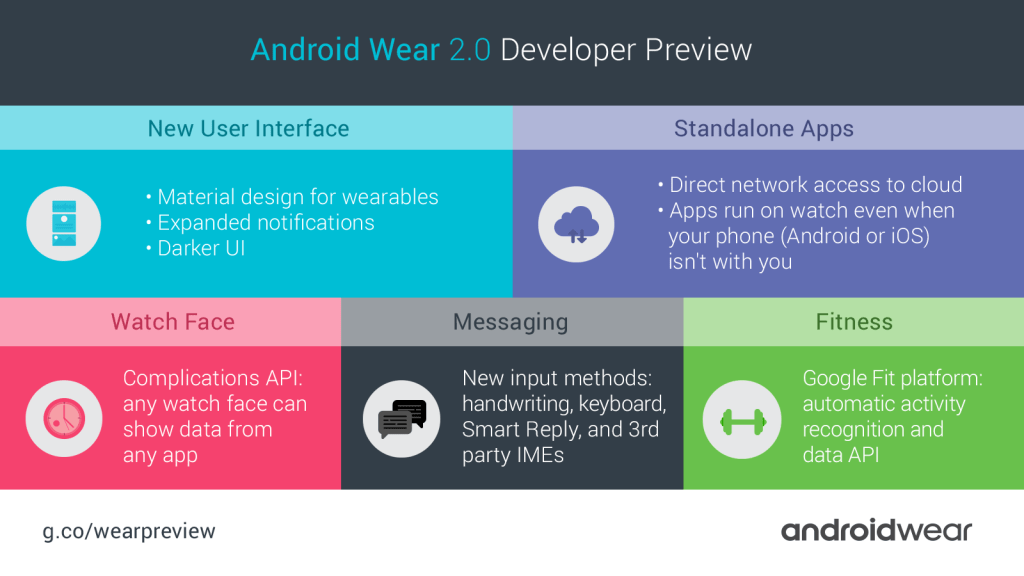
As Google VP of Engineering for Android Wear David Singleton told me, the team took a closer look at how people are using their watches now that they have been on the market for a while and focused on improving those features. The new version, he said, represents a “holistic pass across the design of the whole system” and focuses on providing users more glanceable information, improved messaging tools (including support for keyboards, handwriting recognition and smart replies), as well as new fitness and wellness features.

Maybe the most immediately noticeable change the team made is to bring even more of Google’s Material Design philosophy to Android Wear.
Thanks to this, the design now looks more polished, but, as Singleton noted, the idea here wasn’t to simply take the Material Design guidelines from other platforms and apply them to Android Wear. Instead, the team made adjustments when necessary. In practice, this means Android Wear lists on round Android Wear watches now curve along the side of the screen, for example.
By default, the navigation drawer is now also always at the top of the screen and notifications show up at the bottom — putting the information at the center.
The update also puts a stronger emphasis on color (the notifications use the primary color of the app that created them, for example).
Watch faces, too, are getting an update in Wear 2.0. Thanks to the new Complications API, watch face developers will now be able to use a unified API to include data from other applications on their watch faces. Today, these developers have to build one-off integrations with other applications like the calendar, Google Fit, Strava or Spotify. Now, they will be able to designate a number of spots on their watch faces for these third-party integrations and users will be able to tweak them according to their needs. App developers will be able to choose which data you want to share with watch face developers.
Singleton noted that the API also allows for pulling in images from Google Drive, Microsoft’s OneDrive and other services.
While watch faces are interesting, though, Singleton told me that when the team looked at how people used their watches, interactions with messaging was “off the charts.” With Wear 2.0, the team focused on making interacting with messages a significantly better experience.
In the current version of Wear, messages tend to hide in an expandable panel at the bottom of the page. Now, when your watch buzzes, you will see the message full screen and you can interact with it right away (and if you don’t, you’ll see the person’s avatar on the watch face the next time you wake the watch to remind you of the incoming message).
The biggest changes, though, have been reserved for how you respond to messages. Before, you had to swipe to the side to reply, for example. Now, you simply tap on the message and Wear will drop you into a mini-app that shows you more data and possible actions.
The team added three new features for responding to messages, too, in addition to the existing voice and emoji replies. Just like in Inbox by Gmail, you can now use Google’s Smart Replies, which use machine learning, to automatically provide you with three possible answers to an incoming message.
In addition, Wear 2.0 offers support for keyboards. Given the size of these watches, we’re talking about some seriously small keyboards here, so it remains to be seen how useful this feature will be. Google itself is offering its own swipeable keyboard, but Singleton tells me we’ll also see third-party keyboards for Android Wear.
He also noted that Google had experimented with this when it first launched Wear two years ago. At the time, though, neither the software nor the watches were fast and reliable enough. Now, thanks to Google’s advances in machine learning, it’s often enough to just type a word or two and then have the keyboard guess the next word, making prolonged typing on your watch unnecessary.
When Google first tried this feature, most users were only able to type a few words per minute. Singleton tells me this number is now up to the “tens of words per minute” and that Google’s testers report that it feels pretty fast. I don’t quite see myself using these small keyboards all that much, but I’ll reserve judgement until I’ve actually used this new feature.
Also new in Wear 2.0 is handwriting recognition, which works just like you would expect it to. You can write single letters or join them together to form full words. The technology here is based on the same tools Google built for its handwriting input on Android.
Like virtually all smartwatch platforms, Android Wear puts an emphasis on offering its users fitness metrics. “People want their watch to be a great coach,” Singleton told me. “Great coaches pay attention to what you’re doing and provide the right info at the right time.” To do this, Android Wear now has a better understanding of what you’re doing, thanks to the new Fit Platform Activity Recognition API, which can tell whether you are walking, running or cycling, for example. Based on this data, the watch can then automatically start the right application. If you start cycling, for example, it can automatically start Strava for you.
This sounds like a handy feature, given that it saves you a few taps and ensures that you track your exercises with a bit more rigor than before.
While messaging, fitness and the new design are the main new features of Wear 2.0, the team also added a bunch of other smaller features across the board. Applications can now directly access the network for example, without having to go through a phone. This means apps can now be installed right on the phone, too. If you have an Android Wear watch with built-in LTE support for example (like LG’s latest Watch Urbane), you could now start Spotify on the watch and stream music from the cloud right to your Bluetooth headset without having to bring a phone along when you go for a run (though I would worry about battery life…).
That’s useful, but the main benefit here in the short run is for iPhone users, given that most Wear apps previously depended on the phone for their full functionality and that the differences between Android and iOS often made this an issue.

