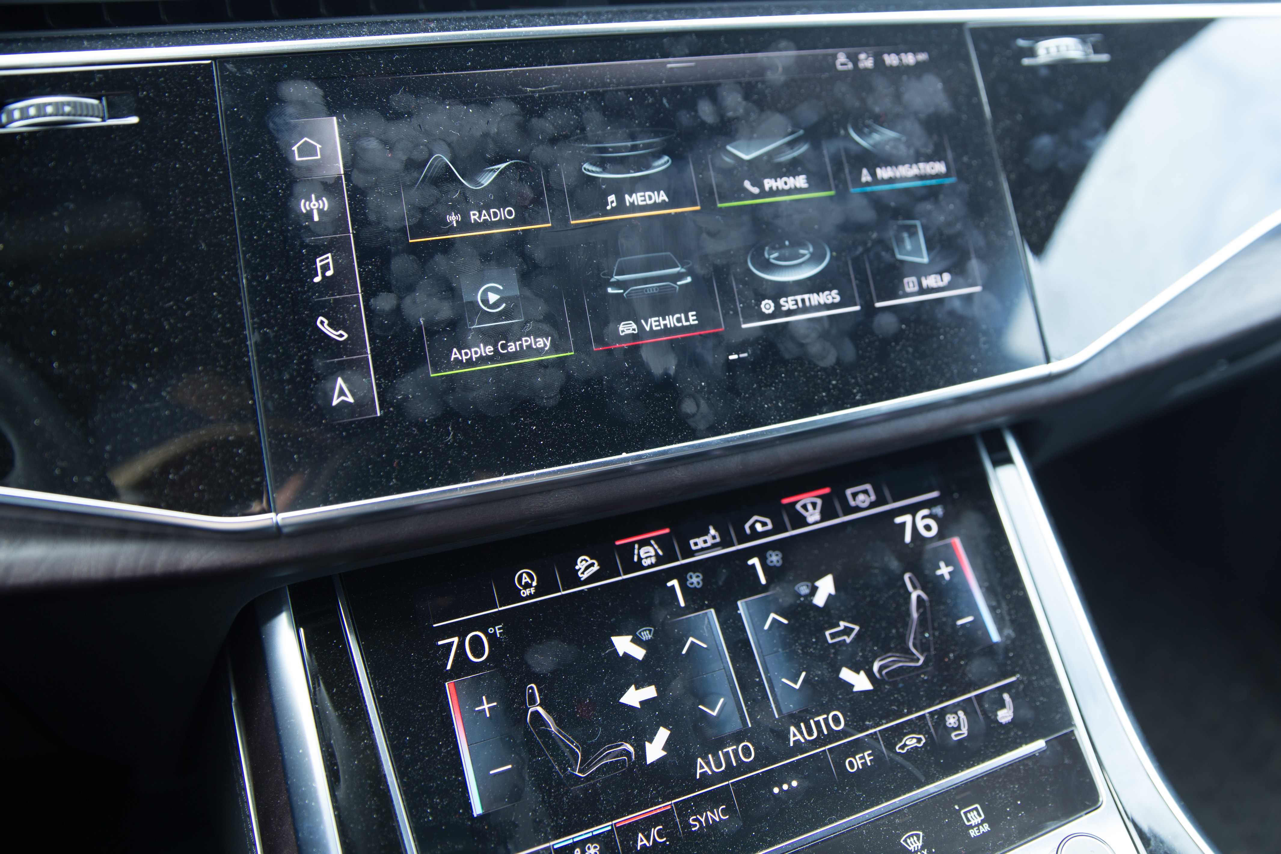
I’m spending some time in the new Audi Q8, and the car company equipped the crossover with its latest infotainment system. I love it, fingerprints, dust and all.
The grimy screens are part of the story. I could have cleaned up the screens for the photos, but I thought it was essential to show the screens after a couple of weeks of use.
There are two screens placed in the center stack of the Q8. The top one features controls for the radio, mapping system and vehicle settings. The bottom screen is for climate controls and additional controls like garage door opener and the vehicle’s cameras. Both have haptic feedback, so the buttons feel nearly real.
Both screens are tilted at the right angle, and the shifter is built in a way that provides a handy spot to rest your wrist, steadying it as you hit the screens.
Car companies are turning to touchscreens over physical buttons. It makes sense on some level, as screens are less expensive and scalable across vehicles. With screens, car companies do not need to design and manufacture knobs, buttons and sliders but instead create a software user interface.
Tesla took it to the next level with the debut of the Model S in 2012. The car company stuck a massive touchscreen in the center stack. It’s huge. I’m not a fan. I find the large screen uncomfortable and impractical to use while driving. Other car companies must agree, as few have included similar touchscreens in their vehicles. Instead of a single touchscreen, most car makers are using a combination of a touchscreen with physical knobs and buttons. For the most part, this is an excellent compromise, as the knobs and buttons are used for functions that will always be needed, like climate control.

Audi is using a similar thought in its latest infotainment system. The bottom screen is always on and always displays the climate control. There’s a button that reveals shortcuts, too, so if the top screen is turned off, the driver can still change the radio to a preset. The top screen houses buttons for the radio, mapping and lesser-used settings.
The user interface uses a dark theme. The black levels are fantastic, even in direct sunlight, and this color scheme makes it easy to use during the day or night.
The touchscreens have downsides but none that are not present on other touchscreens. Glare is often an issue, and these screens are fingerprint magnets. I also found the screen to run hot to the touch after a few minutes in the sun.
Apple CarPlay remains a source of frustration. The Q8 has the latest CarPlay option, which allows an iPhone to run CarPlay wirelessly. It only works sometimes. And sometimes, when it does work, various apps like Spotify do not work in their typical fashion. Thankfully, Apple just announced a big update for CarPlay that will hopefully improve the connectivity and stability.
The infotainment system is now a critical component. Automakers must build a system that’s competent and feels natural to the driver and yet able to evolve as features are added to vehicles through over-the-air updates. Automakers must build a system that works today and continues to work years from now.
Audi’s latest infotainment system is impressive. It does everything right: it’s not a distraction, it’s easy to use and features fantastic haptic feedback.

