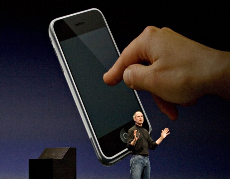

The iPhone turns 10 today, at least if you start counting from the day it was announced. So why not take a few minutes to relive that day, with all its excitement and the palpable pride taken by Steve Jobs in both the product and presentation? Come on, you know you want to.
I watch this video, particularly the first half hour or so, every year or two — even though I’ve never owned an iPhone myself. It’s easily the best example of the type of presentation we all have to sit through dozens of times a year — Jobs didn’t invent the stage pitch, but he sure understood it better than anyone else around. So it’s worth watching not just for nostalgia purposes, but to see how Jobs manipulates the crowd, like any good magician, building an illusion by controlling their attention with pinpoint accuracy.
I didn’t want to make this a listicle, but here are my favorite three moments in this announcement.
Actually, here it is, but…
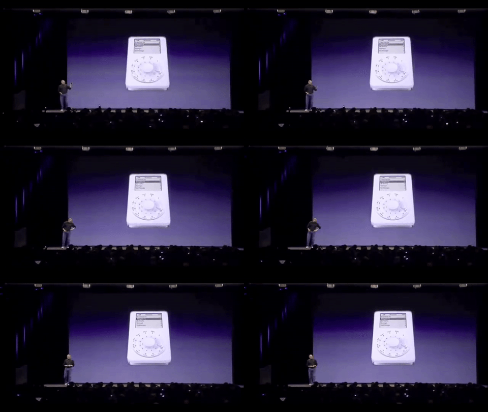
Jobs has been gradually increasing tension from the beginning of the presentation: by admitting he himself is excited, by expanding the scope of the announcement (three devices) and then expanding it further (all one device) — and then he dissipates that tension with humor: “And here it is!”
The fake iPhone is an eyeroll-worthy gag, and everyone laughs not because it’s actually funny, but because they’re so keyed up, and have to release that energy somehow. It’s like feeling the adrenaline rush into your body when you hear something in the bushes near you, and you think it’s a tiger — but then realize it’s just a cat, and laugh at your own foolishness.
But then Jobs does the great thing. He shows you the tiger. In direct violation of all presentation logic, when everyone is thinking “well of course he wouldn’t show us right off the bat,” he just casually pulls the actual iPhone out of his pocket — “Actually, here it is, but we’re gonna leave it there for now.”
 It’s so unexpected, and the flash of the device so brief, that no one in the audience can even process it. But it’s so tantalizing that they’re immediately on the hook again. It’s here! It’s in the room! They’d have walked over hot coals at that point to get a closer look. But Jobs just needs them to pay very close attention for the next 20 minutes.
Isn’t that cool?
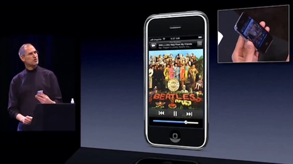
The choice to start the demo portion off with the iPod part of the iPhone wasn’t arbitrary. For one thing, people are already familiar with the iPod interface, so the audience has something to compare it with — but in addition to this, it lets Jobs show off how much the touch interface changes and improves an existing product.
Not only that, but the colorful album art shows off the screen, and the app (although it wasn’t called that at first) offers opportunities to show off three other important gestures: the home button, touch-scrolling and switching to landscape mode.

Throughout, Jobs seems genuinely impressed with Apple’s ingenuity. “You want to see that again?” he asks after showing slide to unlock for the first time, eliciting sighs of admiration from the audience. And then, when showing scrolling in the artist list, he makes sure no one fails to notice details like the rubber banding. “Isn’t that cool?” he repeatedly quips.
Using the home button over and over, he shows not just how simple the phone is to operate, but how smooth the animations are. People see this and understand without needing to be told that the phone is polished and user-friendly.
Not too shabby
People of course use their phones for calling, but at this point in time smartphones were, as Jobs points out, pretty bad at being phones. Contact management was certainly made easier on the iPhone, largely thanks to the simple touchscreen interface, but the thing that popped out to me occurs in the demo.
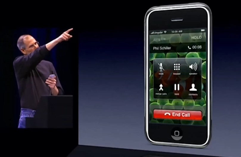
Jobs calls Jony Ive, then Phil Schiller picks this moment of all moments to call Jobs. What are the chances, right? But this gives Jobs an opportunity to show off both the inherent flexibility of the interface and the foresight with which they designed it.
 When Schiller calls, Jobs notes that a “merge call” button has appeared — replacing the “add call” button, which would be odd to keep around when you already have multiple calls going. The calls are merged, to the audience’s delight, but that’s not all. Immediately a related interface appears that lets you manage the conference call just as easily as it was begun.
By taking the most basic everyday functionality and showing it working seamlessly with a bunch of, in retrospect, no-brainer features, Jobs shows that no aspect of the phone experience is being overlooked. At the same time, this shows how much others have overlooked for years and years. It’s a big point to score, yet subtly made.
Okay, that’s probably enough cheerleading for now. I just have a great appreciation for this kind of thing and think that, 10 years on, it’s still the most effective tech announcement ever — even though it didn’t convince me. Happy 10th birthday, iPhone.
Featured Image: Eric Slomanson/Bloomberg News

