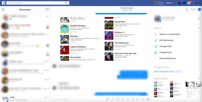

Just under two years ago, Facebook introduced a web interface for its private chat application, Messenger. Now, Facebook is integrating that same web app into the desktop version of Facebook, where it replaces the older messaging experience.
The change has been spotted by a number of users in multiple markets – including TechCrunch staff in the U.S. and Europe – which hinted it was more than a small-scale “test.”
Facebook did not make a formal announcement about the change. However, in the comments of a post by Facebook head David Marcus, he’s responding to a lot of feedback about the new upgrade to Messenger within Facebook, and summarized Facebook’s response in this comment.
Some users, of course, are demanding the old Inbox be returned. (After all, it seems like every Facebook change must be rebelled against at launch.)

If you’ve been upgraded to the new Messenger interface on Facebook.com, you’ll notice a few subtle changes to the user interface, when accessed from the desktop.
For starters, the previous inbox icon has been replaced with the Messenger icon in the blue navigation bar at the top of the screen.
When clicked, you’re taken to a revamped inbox that looks like what you’d see if you had visited Messenger.com directly.
Here, the left side of the screen reads “Messenger” above the list of those friends you had recently chatted with, while the center of the now three-paned interface will display the content of the currently selected chat session.

The right-hand side of the screen introduces something new, too, as it displays the name of your friend in the selected chat, when they were recently active, and provides access to other Messenger features.
This includes the ability to search the conversation, edit nicknames, change the chat’s color, change emoji, and mute notifications. There’s also a link to the person’s Facebook profile, for easy access, and below that, are the photos you and the friend have shared in Messenger.
Meanwhile, at the top-right of the screen, there are buttons to initiate a call, video call, as well as an “i” icon in a rounded blue button that will hide the right-hand informational panel from the screen.

Other Messenger options are tucked away under the Settings icon on the top-left, including access to your “Message Requests” (the replacement for that hard-to-find “Other” inbox), Archived threads, a list of Active Contacts, and more.

Facebook has long approached Messenger with a different strategy on mobile, than it has on the web. On mobile devices, it pushed users away from the web version of Messenger and to the dedicated mobile app.
But on the desktop, the web version of Messenger was designed as a complementary counterpart to Facebook’s top-ranking mobile Messenger application. It offered a way to keep up with your friends without being distracted by Facebook’s News Feed and other notifications. (Facebook has even dabbled with building a native Mac app for Messenger.)
The change to Facebook.com’s messaging experience comes on the same day that Facebook’s David Marcus made a series of announcements about what we can expect from Messenger over the course of 2017.
The service, which now has over a billion users, has seen a number of updates in recent months, the post noted, including the addition of visual and expressive features to rival Snapchat, like masks, effects and stickers, as well as the addition of Group Video Chat, Games, a platform for businesses, and more.
As for what’s next, Marcus was light on specifics, but noted that the company planned to launch a directory of bots and would help developers build on top of the Messenger platform using technologies like A.I. Overall, the post implies Facebook wants to make Messenger thought of as more than a chat app, but a social network of its own.

