Apple is always trying to position the iPhone as a pro-grade camera. Whether it’s the quality of the camera itself, or by adding tricks like low-light capability and Portrait Mode.
Apple’s very good at using computational power to overcome the limitations of the camera hardware that is built into a smartphone.
A good example of this is Portrait Mode. This is a feature that emulates the shallow depth of field and that soft out-of-focus Bokeh that a wide-aperture lens on a traditional camera can pull off. The camera in the iPhone can’t do this, so Apple throws a lot of technical wizardry at the photo to fake the look.
It’s good, but it’s far from perfect. This is why hair or tree branches or leaves or your cat’s whiskers can look weirdly out of focus in these shots.
And there’s no way to massage the feature.
It either works or it doesn’t.
Ever since the beginning of digital photography, we’ve been using software to try to recreate what film cameras did, even going as far as capturing things like vignetting and grain, which were initially limitations of the lenses and film stock.
Now let’s take a look at the new Cinematic Mode feature that was introduced yesterday. Even at a casual glance during the event, I noticed that it looked rough in Apple’s own footage.
Here, take a look for yourself (the Cinematic Mode coverage begins at 46 minutes 59 seconds). Apple uses a scene from a short film it shot to highlight how Cinematic Mode looks.
But it doesn’t look right.
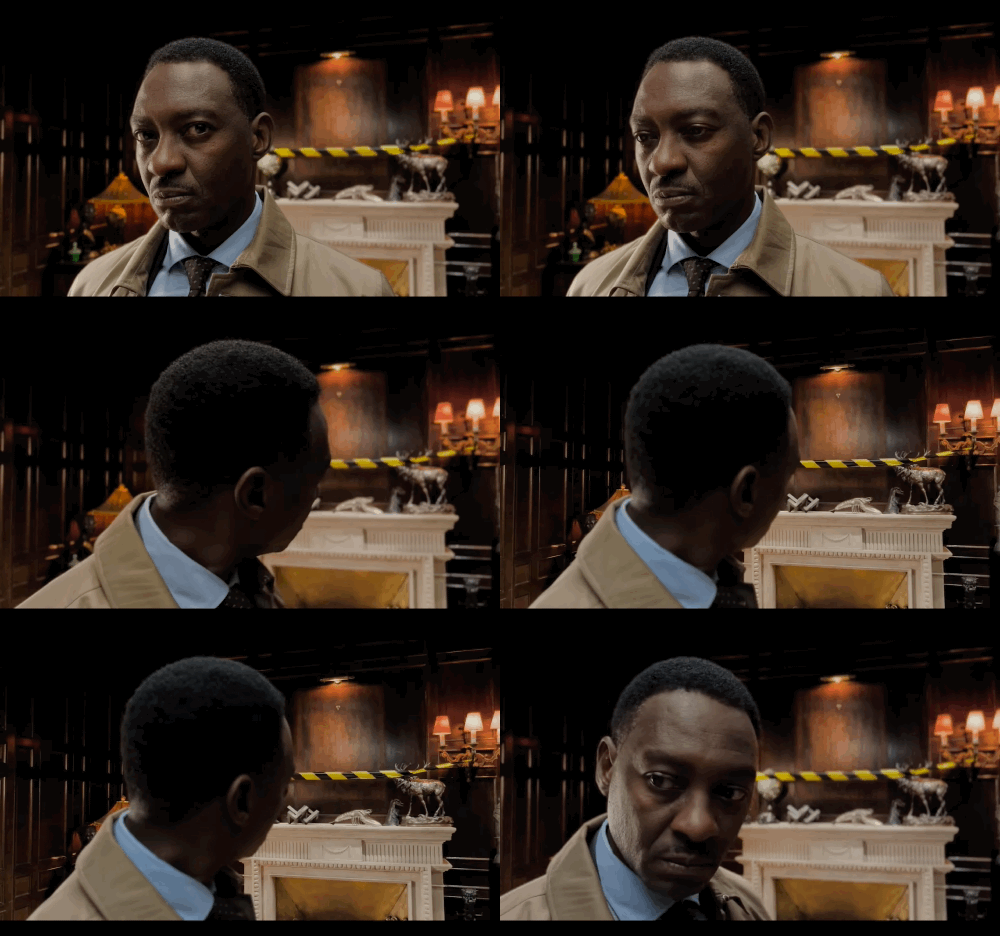
In the shot where the actor looks away from the camera towards the mantlepiece, you can clearly see the iPhone hunting for focus during the first focus shift — it looks like the image is breathing.

Focus breathing can be seen in Cinematic Mode
The second focus change is much smoother.
This doesn’t happen with racking focus because the process is mechanical — you lock two points of focus on the lens, and it moves from one to the other.
It’s a smooth transition.
It takes planning, a lot of skill, and expensive equipment.
Apple’s software solution is good, but in that first example of Cinematic Mode that Apple shows us, we can see that it’s not perfect.
Now, who knows, maybe in a decade, Apple’s way of racking focus will become what’s accepted because we’re used to it (much like Portrait Mode), and we’ll become attached to the limitations much in the same way we’re still attached to things like vignetting and film grain.
And it’s good enough for most people.
And this is what Apple knows.
Apple sells millions of iPhones, and almost all of them fall into the hands of people who “just want to shoot a little video.” They’re not Hollywood directors, they’re not even professional filmmakers.
They’re just people taking video that’s going to be shared on social media with people who have short attention spans, and glimpsed on tiny screens as a twitchy thumb scrolls to the next thing.
Cinematic Mode is more than good enough for 99.99 percent of iPhone users.

