The dessert naming scheme was one of the best-loved legacies from Google past (though some were notably better than others). Every time the company got ready to release a new version of the mobile operating system, speculation would mount about which sweet foodstuff on which the company would ultimately settle. But while P offered confections a plenty, Q has been far less straightforward.
Quiche was questionable, at best — ditto for quesadillas and quinoa. With that giant question mark waiting for it with the next release, the company’s opted instead to abandon the beloved naming scheme. Of course, Google’s reasoning is far more diplomatic than, “we couldn’t think of anything that started with ‘Q.’”

Instead, it says that the desserts simply weren’t universal enough for the 2.5 billion active devices it has deployed around the world.
[W]e’ve heard feedback over the years that the names weren’t always understood by everyone in the global community. For example, L and R are not distinguishable when spoken in some languages.
So when some people heard us say Android Lollipop out loud, it wasn’t intuitively clear that it referred to the version after KitKat. It’s even harder for new Android users, who are unfamiliar with the naming convention, to understand if their phone is running the latest version. We also know that pies are not a dessert in some places, and that marshmallows, while delicious, are not a popular treat in many parts of the world.
Of course, universality is an unclear concept in the online age. And hey, look at Apple, which has gone far more regional with its California-themed desktop OSes. Honestly, however, it may be better to avoid the letter Q altogether in the a political climate that reads like the backdrop to a back spy novel. It’s just too bad the company had to take Raisinettes, Skittles and Twizzlers with it.
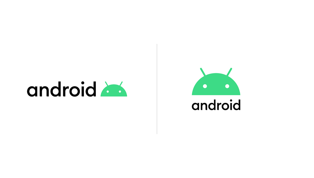
Also new is a slight rebrand of Android itself, with the text shifting from Android Green to black. “It’s a small change, but we found the green was hard to read, especially for people with visual impairments,” the company writes. “The logo is often paired with colors that can make it hard to see—so we came up with a new set of color combinations that improve contrast. “

