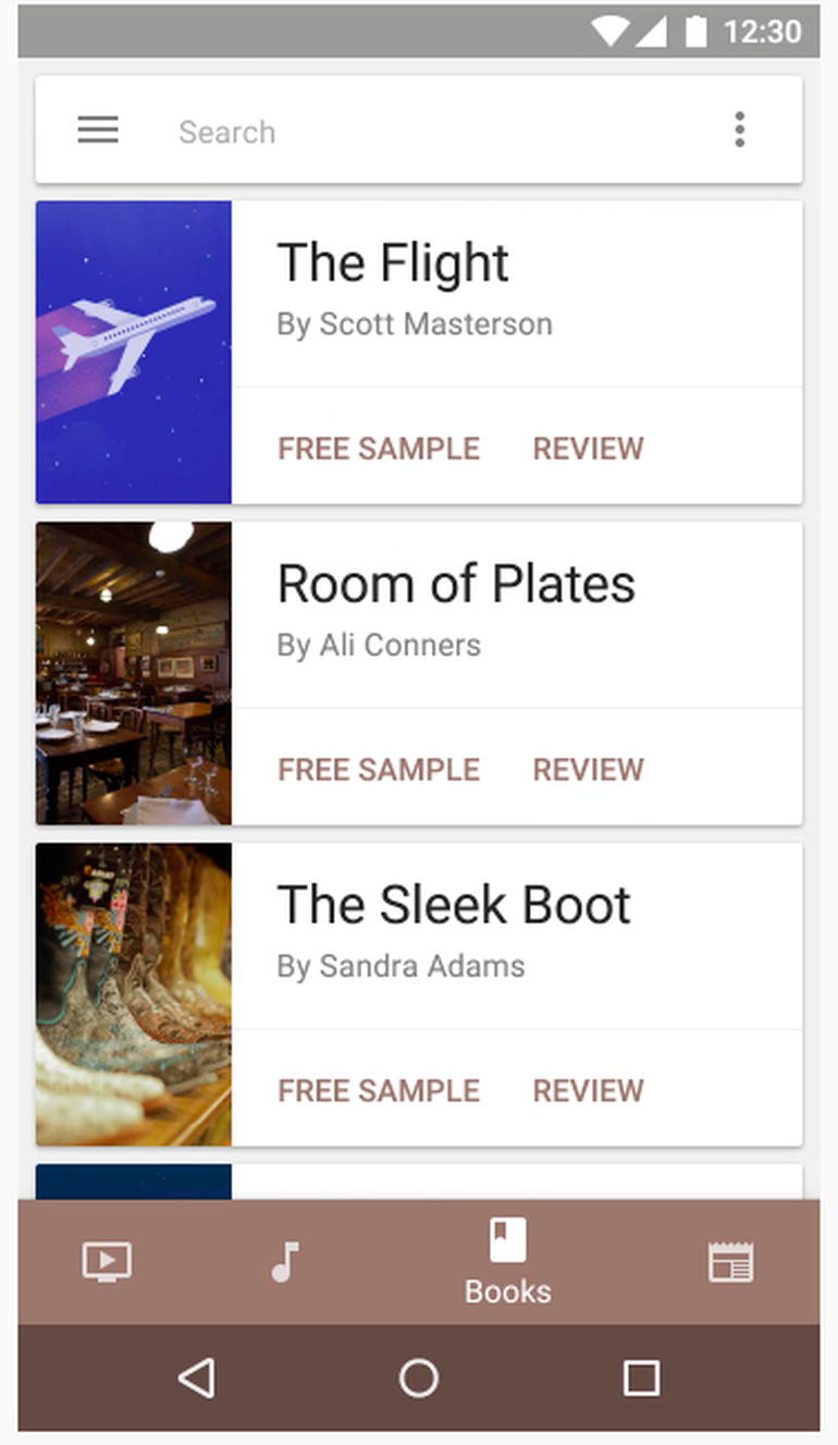
Expect to see more Android smartphone apps with a new dynamic bottom navigation bar.
Image: Google
Android apps could soon start looking more like iOS ones, with Google introducing ‘bottom-bar navigation’ to its Material Design specs for smartphone displays.
Bottom-bar navigation has appeared in recent updates to Google+ and Photos on Android, and its introduction in Google’s design guidance should result in its becoming more of a standard across all Android apps on smartphones.
The bottom navigation bar houses a row of icons that lead users to key destinations in an app and is meant to be always available to hop between views.
According to Google, the bottom nav bar is more efficient than a so-called ‘hamburger menu’, the three-line icon at the top left of many Android apps that when tapped opens a slide-out navigation drawer.
“Bottom navigation bars make it easy to explore and switch between top-level views in a single tap,” Google says.
There’s a healthy discussion on Reddit about the merits of the bottom navigation bar, which Android watchers have been monitoring since Google introduced it to Google+ on Android.
The bottom bar is meant for apps on smartphones and should be employed when there are three to five important destinations that users need to be able access directly from anywhere in the app.
Anything above five key destinations in the bottom bar would be too cramped. So Google recommends using the slide-out navigation drawer in these instances. It’s also outlined a number of other rules regarding color, design, and text, to prevent the bar becoming cluttered and unsightly.
For tablets and desktops, Google wants developers to retain the hamburger menu or an always-seen navigation drawer.
While Google’s new bottom navigation bar employs a similar method to that used by iOS apps, one key difference is that Android navigation bars can dynamically vanish or appear, depending on whether the user scrolls up or down.
This feature is probably designed to allow developers to protect scarce screen real estate for content, rather than having a portion of the screen permanently occupied by navigation tools.


