iOS has been around for 10 years. It’s hard to keep innovating after so many iterations. And yet, in many ways, iOS 11 feels like a completely new beast on the iPad. For the first time in years, it feels like Apple is taking risks with its operating system update.
I’ve been playing with a beta version of iOS 11 on a 10.5-inch iPad Pro for the past few weeks. While the final version of iOS 11 is not coming until later this fall, Apple just launched the public beta. Here’s a preview of what you can expect.
If you’re using an iPad, get ready to be disoriented by the update because the iPad simply doesn’t work the same way. Apple has completely changed the user experience with a big emphasis on multi-tasking. Everything seems more fluid and connected. For instance, you can drag and drop app files between multiple apps, drag an icon from the newly introduced dock to open a windowed app on top of your full-screen app and more.
More importantly, if you were using an iPad a few years ago and you’ve abandoned it in favor of your smartphone and laptop, iOS 11 is a fresh start and you should plug your old iPad and try it out.
I’m not going to list all the new features in iOS 11. You can go on Apple’s website to see them all. Instead, I’m going to focus on some of the most important changes.
With iOS 11, you’re going to end up holding your finger on a file, pulling up the dock with your other hand and use your iPad like you’re in Minority Report
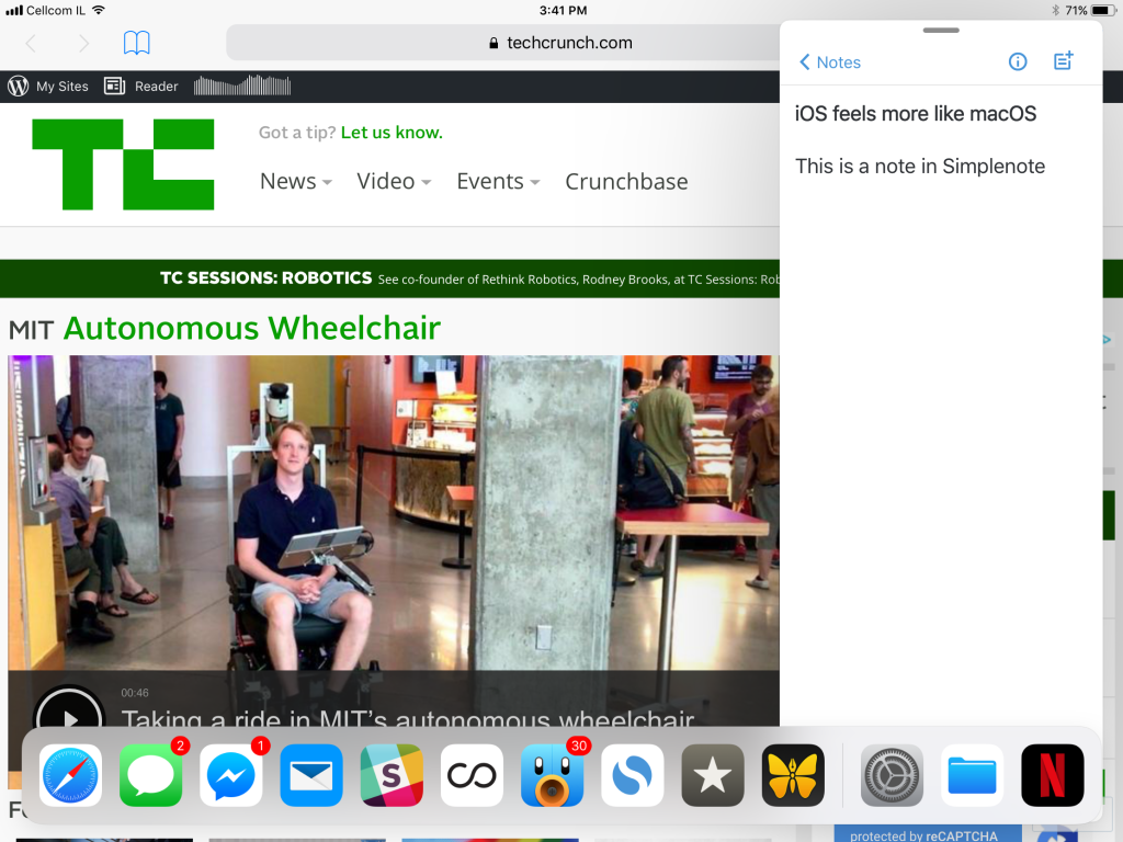
When you install iOS 11, the first thing you’re going to notice is that the bottom row on your screen has been replaced by a macOS-like dock. You can put a dozen apps in that dock, and you can pull up that dock by swiping your finger from the bottom edge of the screen. It works even if you’re using an app already.
You can tap on an app icon and drag it on the side of the screen to open a narrow version of it. For instance, you can tap and drag the Messages icon to open up the Messages app. Once you’re done checking your new messages, you can dismiss the app and go back to your full-screen app. It works just like Slide Over in iOS 9 and iOS 10, but with a new presentation.

And if you need to use two apps at the same time, you can still open both of them using split view. You can easily replace one of the apps by dragging an icon from the dock and dropping it on one side of the screen.
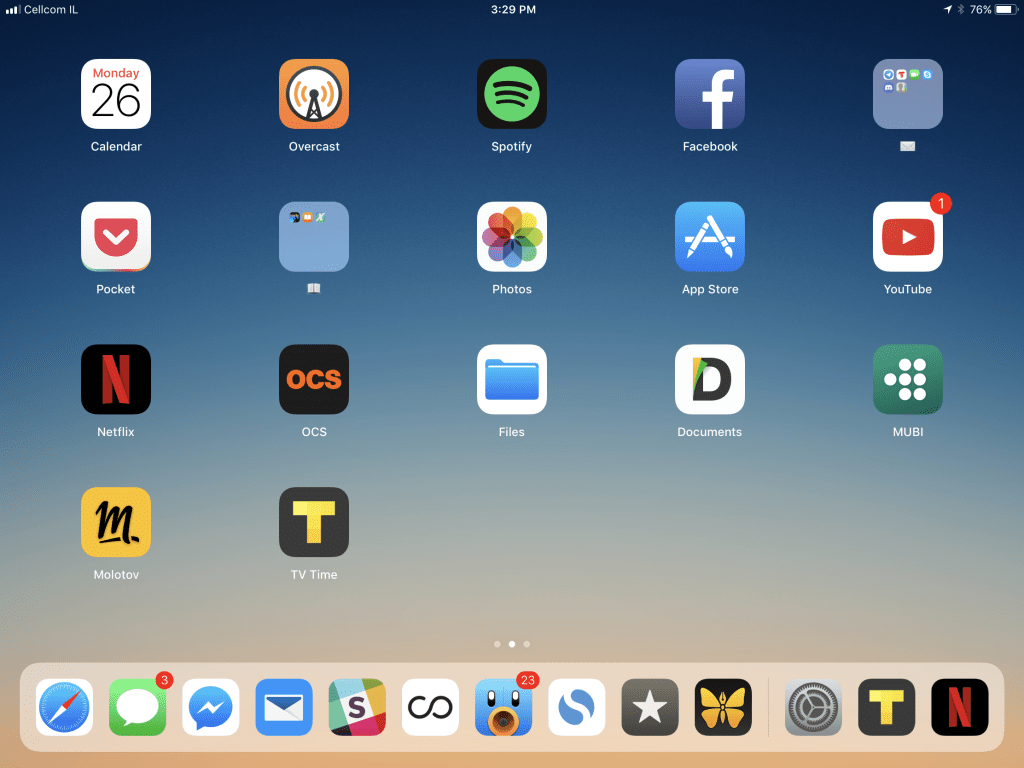
With this new dock metaphor, you rarely go back to the home screen. It feels more like using a computer as you don’t go back to the desktop to open an app — you switch between apps using Cmd-Tab, the dock or the task bar.
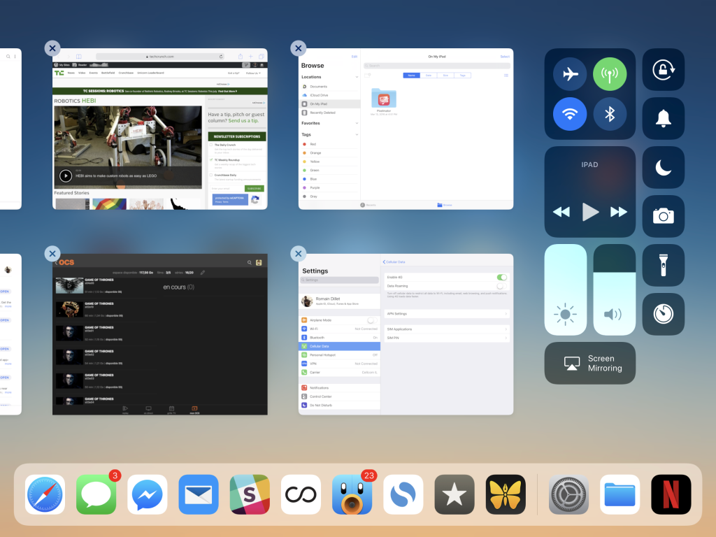
The other massive change is the new app switcher. If you drag your finger from the bottom edge of the screen even more, you get an Exposé-like view with thumbnails of your most recent apps and spaces. For instance, you can switch between a space with Safari and Tweetbot opened side by side and a space with Ulysses filling up the screen.
This new app metaphor is just an example of a much bigger change under the hood. Apple has implemented a system-wide drag-and-drop gesture that lets you drag files and app icons from one place to another. Folders, app icons and menu items are all spring-loaded. While we’ll have to wait until the fall to see how it really works with third-party apps, it’s already quite impressive to see it in action. For instance, you can drag a photo from the Photos app, hover over the Notes app icon, navigate to a specific note while holding the photo and then drop it.
I can’t stress this enough. With iOS 11, you’re going to end up holding your finger on a file, pulling up the dock with your other hand and use your iPad like you’re in Minority Report.
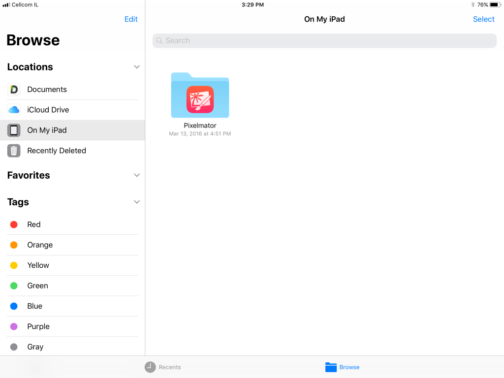
And you can see that Apple is willing to switch things up as the company finally introduced a proper Files app. It’s going to support cloud services, such as Dropbox, Box and iCloud Drive.

Let’s list some of the other smaller changes. You can access numbers and punctuation on the main iPad keyboard by swiping down on keys. The Notes app feels more like Evernote because you can now scan documents. Your handwriting is also indexed so that you can search for it later and more.
I’m not going to lie to you. It takes time to get used to those new gestures. I’m not there yet, and I often find myself thinking about what I’m supposed to do to pull up Spotlight, look at my Today widgets and find an app that I don’t use very often.
iOS 9 introduced Split Screen and Slide Over. It was the first time Apple introduced new features for the iPad in particular. But with iOS 11, the company is going one step further and finally considers the iPad as a capable device that can be so much more than a bigger iPhone.
The iPhone learns new tricks
If you don’t have an iPad and don’t ever plan to get one, this year is a different update. While there are a few user-facing features, the most promising changes are going to take time. Developers will have to embrace new frameworks.
But first, let’s start with the main difference with iOS 10. Control Center has been completely redesigned. Instead of having two or three different cards, everything is now on one screen. Some shortcuts, such as volume control and AirDrop are tucked away. You need to use 3D Touch to expand controls and access these features.
Control Center is now also configurable, or at least a bit. For instance, you can add a shortcut to Low Power Mode or the Notes app.

The second thing you’re going to end up using a lot is the new annotation feature. When you capture a screenshot, iOS shows you a thumbnail in the corner so that you can use this screenshot instantly. You can crop it, draw stuff and share it right away. When you’re done, you can instantly delete the screenshot from your photos so that it doesn’t clutter your pretty photo library.
But the major changes are under the hood, starting with ARKit. Your iPhone camera just got much smarter. This augmented reality framework can detect a table and project a 3D object on this table. You can move around, put your phone closer and the 3D object reacts just like you’re looking at a real object. There is a ton of potential for games and apps. iOS developers have become AR experts overnight thanks to this framework.
Core ML is the other big technological update. Apple has been working on smart features for the Photos app for years. The company has turned that work into a general purpose framework so that you can build and execute machine learning models on the device.
All the other small and big changes
With this preview post, I’m just scratching the surface of the new features in iOS 11. So here are everything else you didn’t know but you actually want to know:
- The notification screen has been redesigned and looks like the lock screen. It’s confusing at first.
- There’s a new app drawer in the Messages app. I’m not a fan of the new design as there hasn’t been any killer iMessage app so far. But you can now send money to your friends using Apple Pay in a conversation thread.
- Siri has a more natural voice. More importantly, you can type your query if you’re in a loud environment or it’s late at night and everybody is asleep.
- The Photos app now supports GIFs! You can even create GIF-like looping videos and Boomerang-like videos. The Memories tab and face detection are getting a big update.
- If you have an iPhone 7 or an iPhone 7 Plus, you’re going to capture photos and videos in HEIF and HEVC. It means that you’ll be able to store a ton more photos and videos on your device. If you share something, iOS will convert the file to JPG or H.264 (unless you’re sharing it with someone running iOS 11).
- There will be indoor maps for airports and malls in Apple Maps. The company is slowly adding those maps right now.
- You can’t test AirPlay 2 just yet as there isn’t any speaker with AirPlay 2 support. But it still works the same way — your phone sends lossless audio to your speaker using your Wi-Fi network. Apple has improved latency, added multi-room support and phone calls are no longer going to interrupt your music.
- The redesign of the App Store looks great. But let’s see if it improves discovery and developers are happy about it.
- If you’ve enabled iCloud, the iMessage database automatically gets uploaded to iCloud — your messages stay encrypted. Some users have 5GB or 10GB of messages, photos and videos, so it should free up some space. But iOS backups are still not end-to-end encrypted on iCloud. Apple still has the key.
- Similarly, if you don’t have a ton of space on your phone, iOS can automatically purge your unused apps. Your settings and data stay on your device. But the next time you’re going to open a purged app, your device is going to re-download it first.
- If somebody tries to join your Wi-Fi network and has an iOS device, you get a prompt asking if you want to share your Wi-Fi password.
It’s hard to cover everything about iOS 11 in just one post as your experience with this update is going to be very different if you’re using an iPad or just an iPhone. On the iPad, iOS 11 feels like a brand new operating system. Some things will need to be revisited and adjusted, but it’s an encouraging step for the tablet space.
On the iPhone, you’ll get a ton of small refinements. But the most promising changes are going to come from third-party developers taking advantage of new frameworks.
While iOS started as a constrained operating system with each app living in its own sandbox, Apple has been opening it up to third-party developers. It’s never been easier to build an app that competes directly with one of Apple’s default apps. Eventually, iPhone and iPad users benefit from Apple’s open approach.


