Before it got into the smart screen market with the Nest (nee Home) Hub, Google opted to let its hardware partners do the heavy lifting. Last year at CES, it announced a trio of devices from JBL, LG and Lenovo. All three were built around the same smart home user experience, but Lenovo was the clear standout.
The company knows how to make a nice piece of hardware — it’s probably not a coincidence that Facebook’s Portal unit looked an awful lot like the Smart Display. Nor should it be a surprise that Google once again enlisted the company when it came time to create a device designed to showcase Assistant’s prowess as an alarm clock.
For its own hardware, Google is primarily focused on being a smart home hub and all that entails. This year’s I/O found the company moving away from the compact form factor with the 10-inch Nest Hub Max. The Lenovo Smart Clock, meanwhile, is aimed firmly at the market currently monopolized by the Echo Spot.

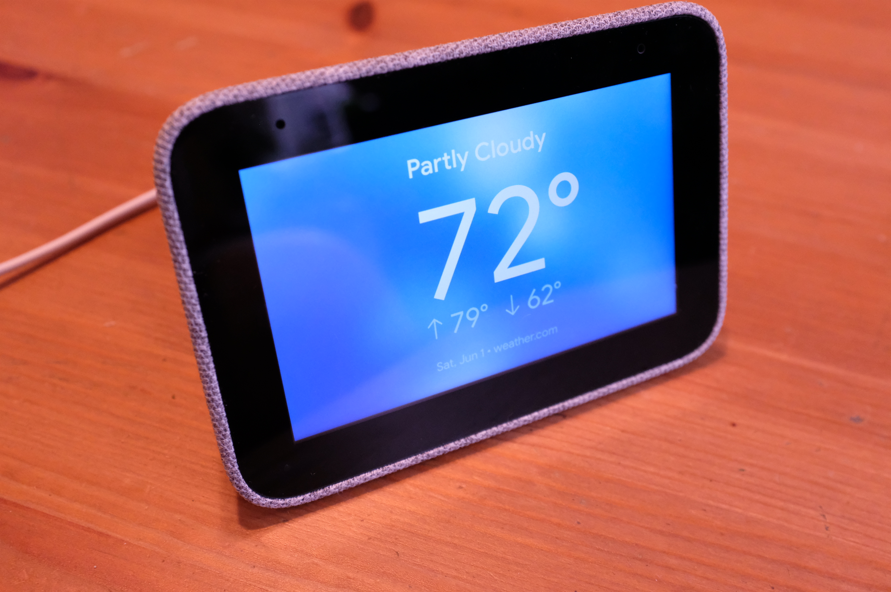
Lenovo’s approach is more subdued than the one it took with the Smart Display. The subtle, gray cloth-covered sides fit the aesthetic of the rest of Google’s Home line. The four-inch screen size, too, feels about right for a bedside display. The trick is getting it large enough to see the time from the other side of the room, without going too big and bright for bedtime.
The Smart Clock does feel oddly bulky, given its small screen size, thanks in part to some pretty bezels. That last bit is due in part to the fact that the company’s jammed some functionality into the top black bar, with an ambient light sensor flanked on either side by a pair of far-field microphones for Assistant functionality.
Like the original Home/Nest Hub, there’s no camera here. That was a bit of a surprise on Google’s device, but on a product designed to live by your bed, it seems like a no-brainer. Privacy is always at the front of mind with these sorts of home products, and the addition of a camera in this case seems like a lot more trouble than it’s worth, for Lenovo and consumers alike. Sure, the company could have gone the route Amazon took with the like-minded Echo Show 5, which sports a built-in lens cap, but honestly, why bother?

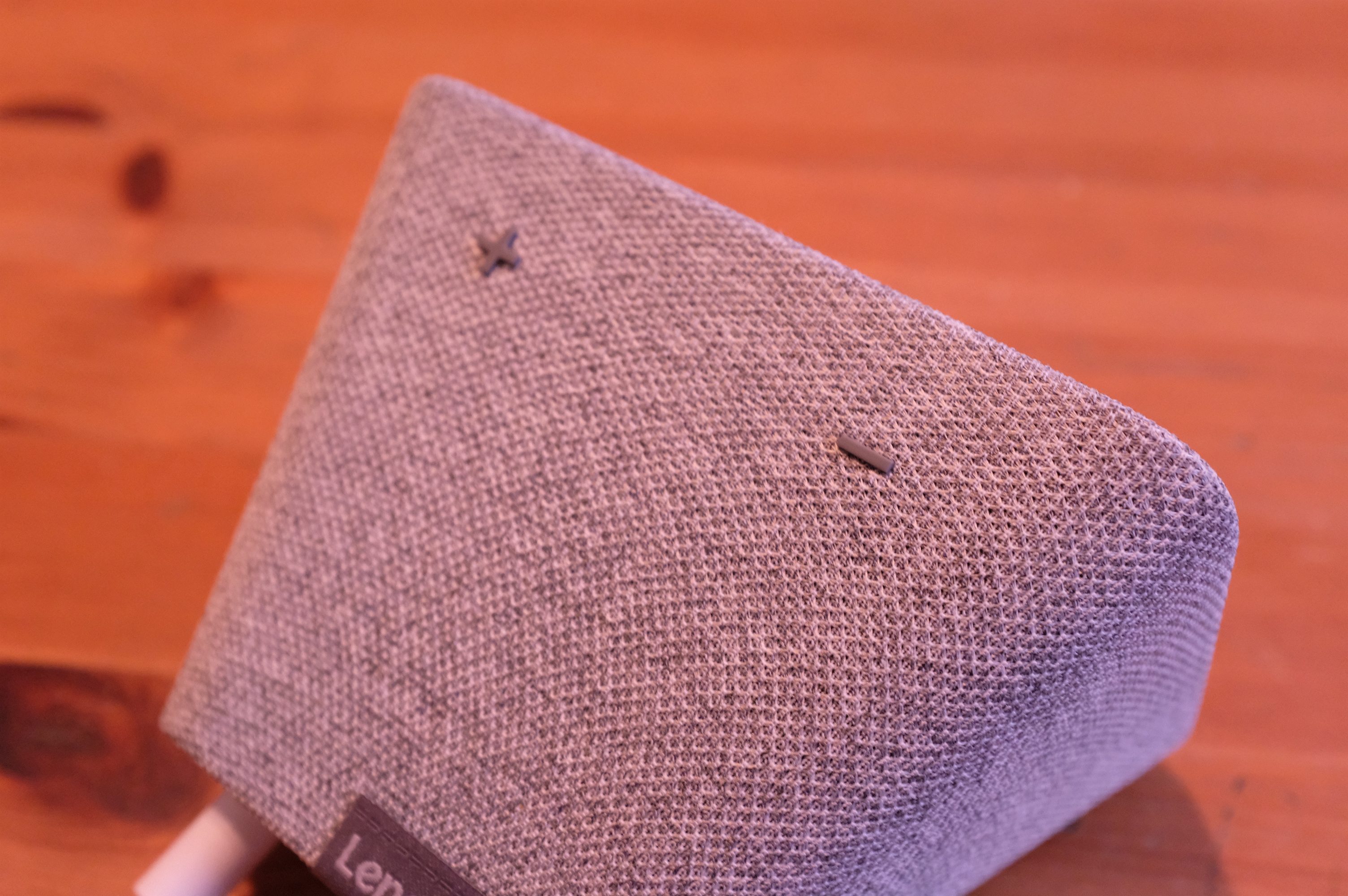
On the angled top are a pair of volume buttons designated by a large Plus and Minus, which should be pretty easy to locate in the dark. You can always use your voice for the same effect, but buttons are a hell of a lot easier in a pinch. Tapping the top of the device will snooze or stop the alarm, depending on your settings. It’s an either/or situation. It’s a clever feature, but something like single-tap to snooze, double to dismiss would be a nice addition.
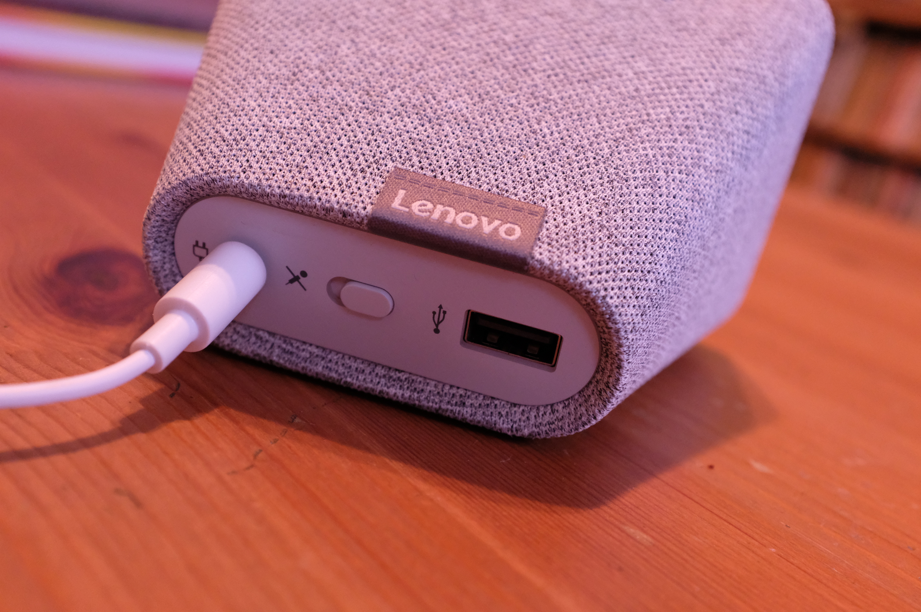
There are a pair of nice features around back, as well. There’s a USB 2.0 port for easy phone charging access. A USB-C port might have future-proofed the clock a bit, but I suspect most customers will have full USB cables lying around for some years to come. There’s also a large switch for muting the microphone — a nice feature to have on any always listening smart home device, but again, doubly so for one designed to live next to the bed.
The display itself is 480×800 — which is to say, nothing to write home about. But these aren’t smart home specs we’re talking about. The main qualification is that it be easy to read, and it succeeds on that front, coupled with a wide range of clear clock faces that can be accessed by touching and holding the display.

Other touch gestures will prove familiar to anyone who’s interacted with a Google smart screen (though given the price point here, odds are decent that this will be many people’s first). Swiping left will bring up the next card, swiping right will show the last one. Swipe up from the bottom edge and you’ll get settings, brightness and volume. Swipe down from the bottom for quick settings.
Among others, the latter includes a Dark Mode setting, which inverts the colors of the interface based on room brightness. That’s a nice one to have one by default.
I won’t break down all of the Google Assistant functions in full detail here — they’re the same you’ll get with any of the smart displays, but for obvious reason, alarms do deserve some attention here. You can set an alarm with your voice or by tapping the screen. You can also rely on Google’s smarts (and terrifying knowledge of everything about you) to let it suggest the alarm time based on upcoming events. Probably best not to leave that up to chance, though. Google offers up a bunch of different options here to customize the experience.
You can choose how often it repeats and adjust the tone. The Sunrise Alarm is a nice feature that gradually brightens the screen for a sunlight-style effect, with the tone gradually rising, as well. The speakers, incidentally, get surprisingly loud, but aren’t great as you’d likely expect. They’re fine for flash alerts and alarm tones, but you’re not going to want to make this a primary music speaker.

Good Morning Routines are a handy feature that bring together some of the clock’s best points. Once the alarm goes off, Google will give you the time, local traffic (including commute) time, flash news and weather. It’s a nice snapshot of the day for those who don’t immediately spring out of bed.
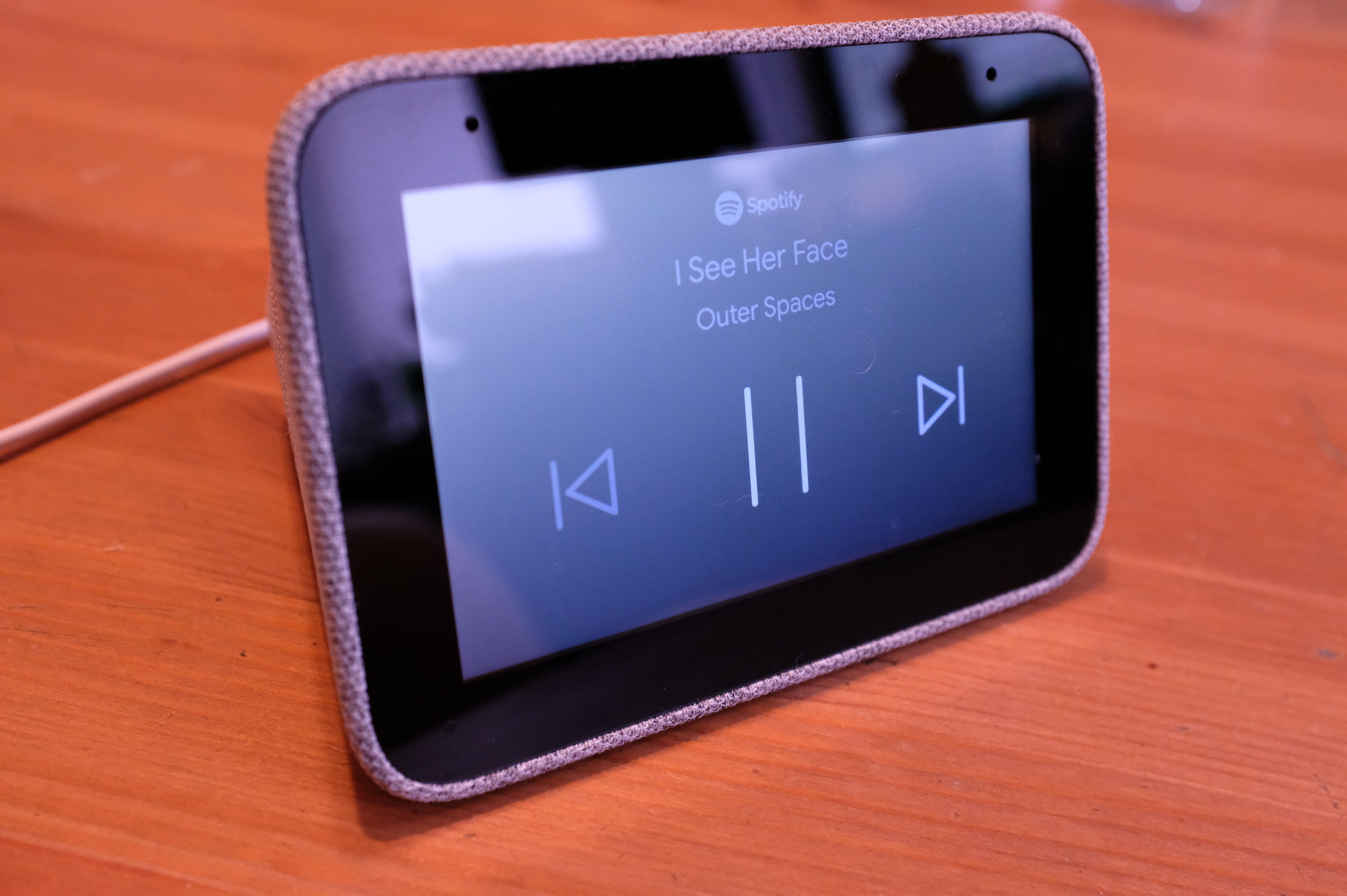
Like other Home devices, the Smart Clock works with a wide range of smart home products, accessible through the app. The setup process also lets you choose default news and music services, so you can, say, make Spotify your default, rather than relying on Google.
At $80, the Smart Clock is priced significantly below the Home Hub and Echo Spot ( both $129). It’s also just a bit less than the Echo Show 5 ($90), though it’s got the smallest display of the bunch. It fits the bill nicely for anyone who’s been eyeing a smart screen, with an alarm clock-first approach and a few nice features thrown in.

