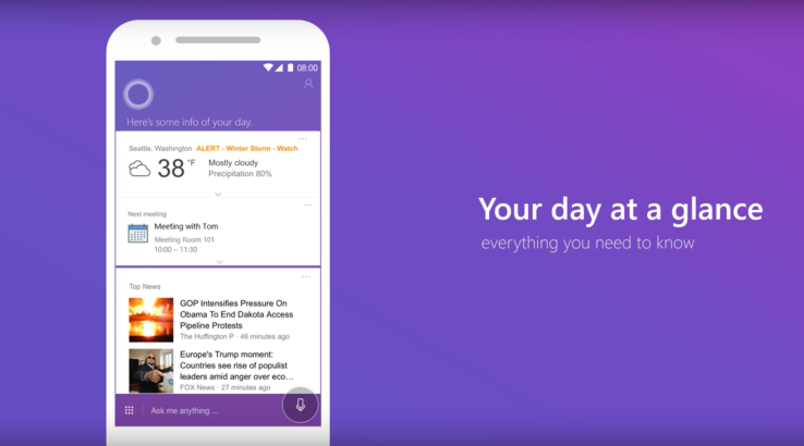

In the battle of the virtual assistants, Alexa, Siri, Google Assistant and Microsoft’s Cortana, the latter hasn’t had much success off the Windows 10 platform — its iOS app is ranked No. 1,295 on the top charts, for example. In an effort to give its assistant broader appeal, Microsoft is today announcing a redesign of its smartphone application, which is now focused on making it quicker and easier to perform tasks and get information.
The revamp was announced alongside the debut of the Cortana app in the U.K.
When Cortana first launched last year on iOS and Android, it sported a black-and-white user interface that didn’t really look all that different from the PC version. You could set reminders, search the web, track flights and perform the same voice-powered searches that Cortana could handle on Windows 10, among other things.
The larger goal with Cortana, of course, has been to connect your Microsoft account, including your Notebook, personal interests and other settings, across all your devices. But Cortana can also operate like a more bare-bones alternative to Google’s assistant, which was just updated this week within the Google Search app, in fact.
Cortana doesn’t offer the breadth of features that Google does, but it can track your missed calls, help you manage your schedule, remind you to do things and look up information. On Android, you can even kick off searches by saying “Hey Cortana.”

Above: old Cortana
In the older version, Cortana’s circular blue logo would hover above the home screen’s main feed of news, weather and other personal updates, like your commute time.
To take a specific action — like setting a reminder or sending a text, for example — you would tap a button to the left of the search box.
With Cortana’s makeover, the more popular “quick actions,” as they’re called, have been given a more prominent position. While you still access them with a tap from the main screen, those things you do the most — like viewing your day, viewing or setting reminders, checking meetings and reading the news — have moved to the front of the experience.

Gone, too, is the black-and-white theme in favor of a very purple one. This is the most noticeable change, in terms of the made-over app.
When you ask Cortana for information, it’s now presented in a cleaner layout, with full-page answers for easier consumption, the company says.

And, under the hood, Microsoft has made speed improvements so the app feels faster than before.
The update is rolling out now on Android, while the iOS app update will follow in the weeks ahead.

