Laptop users have been focused for a very long time on whether the iPad Pro is going to be forced upon them as a replacement device.
Depending on who you believe, Apple included, it has at one point been considered that, or a pure tablet with functions to be decided completely by the app development community, or something all its own.
But with the iPad Pro, the Smart Keyboard and the new version of Apple’s Pencil, some things are finally starting to become clear.
The new hardware, coupled with the ability and willingness of companies like Adobe to finally ship completely full-featured versions of Photoshop that handle enormous files and all of the tools and brushes of the desktop version, are opening a new door on what could be possible with iPad Pro — if Apple are ready to embrace it.
Pencil
Does the double-tap gesture feel natural? Yep. I’ve been using electronic drawing surfaces since the first generation Wacom that had a serial port connector. Many of them over the years have had some sort of “action button” that allowed you to toggle or click to change drawing modes, invoke erasers or pallets and generally save you from having to move away from your drawing surface as much as possible.
That’s the stated and obvious goal of the Apple Pencil’s new double tap as well. Many of the internal components are very similar to the first-generation Pencil, but one of the new ones is a capacitive band that covers the bottom third of the pencil from the tip upwards. This band is what enables the double tap and it is nicely sensitive. It feels organic and smooth to invoke it, and you can adjust the cadence of tap in the Pencil’s control panel.
The panel also allows you to swap from eraser to palette as your alternate, and to turn off the “tap to notes” feature, which lets you tap the pencil to your screen to instantly launch the Notes app. When you do this it’s isolated to the current note only, just like photos. One day I’d love to see alternate functions for Pencil tap-to-wake, but it makes sense that this is the one they’d start with.

I never once double tapped it accidentally and it felt great to swap to an eraser without lifting out of work mode — the default behavior.
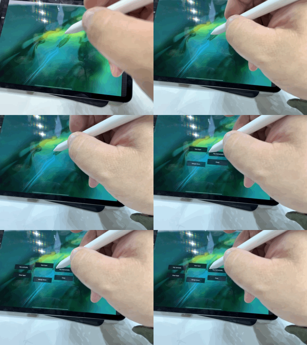
But Apple has also given developers a lot of latitude to offer different behaviors for that double tap. Procreate, one of my favorite drawing apps, offers a bunch of options, including radial menus that reflect the current tool or mode and switching between one tool and another directly. Apple’s guidelines instruct developers to be cautious in implementing double tap — but they also encourage them to think about what logical implementations of the tool look like for users.
The new Pencil does not offer any upgrades in tracking accuracy, speed or detection. It works off of essentially the same tracking system as was available to the first Pencil on previous iPad Pros. But, unfortunately, the Pencil models are not cross-compatible. The new Pencil will not work on old iPad Pros and the old Pencil does not work on the new model. This is due to the pairing and charging process being completely different.
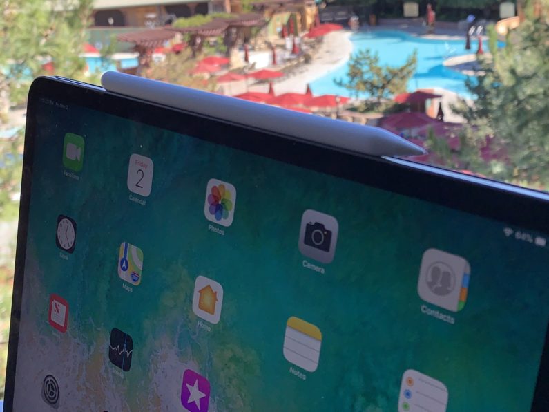
Unlike the first one, though, the new Pencil both pairs and charges wirelessly — a huge improvement. There is no little cap to lose, you don’t have to plug it into the base of the iPad like a rectal thermometer to charge and the pairing happens simultaneously as you charge.
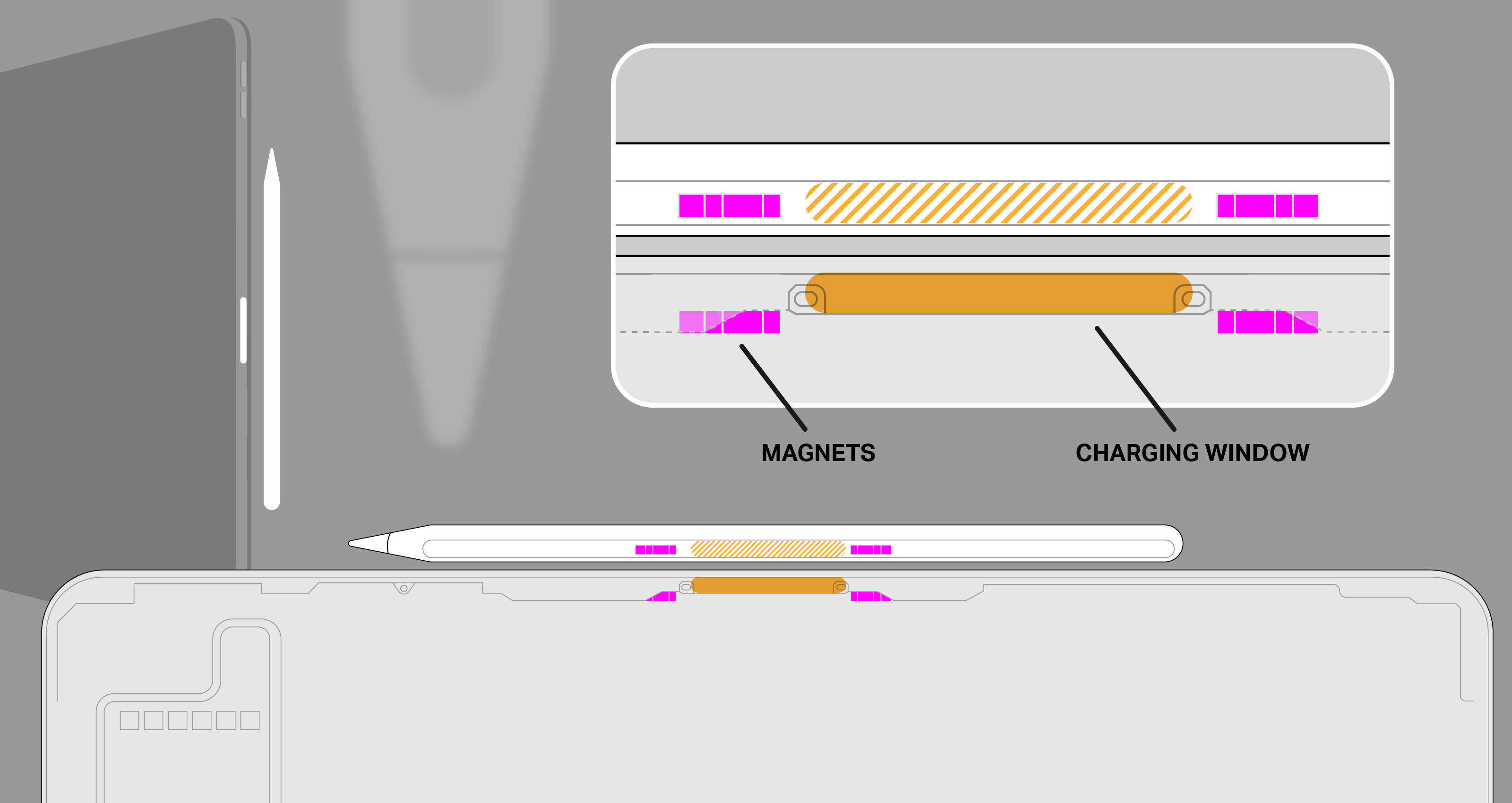
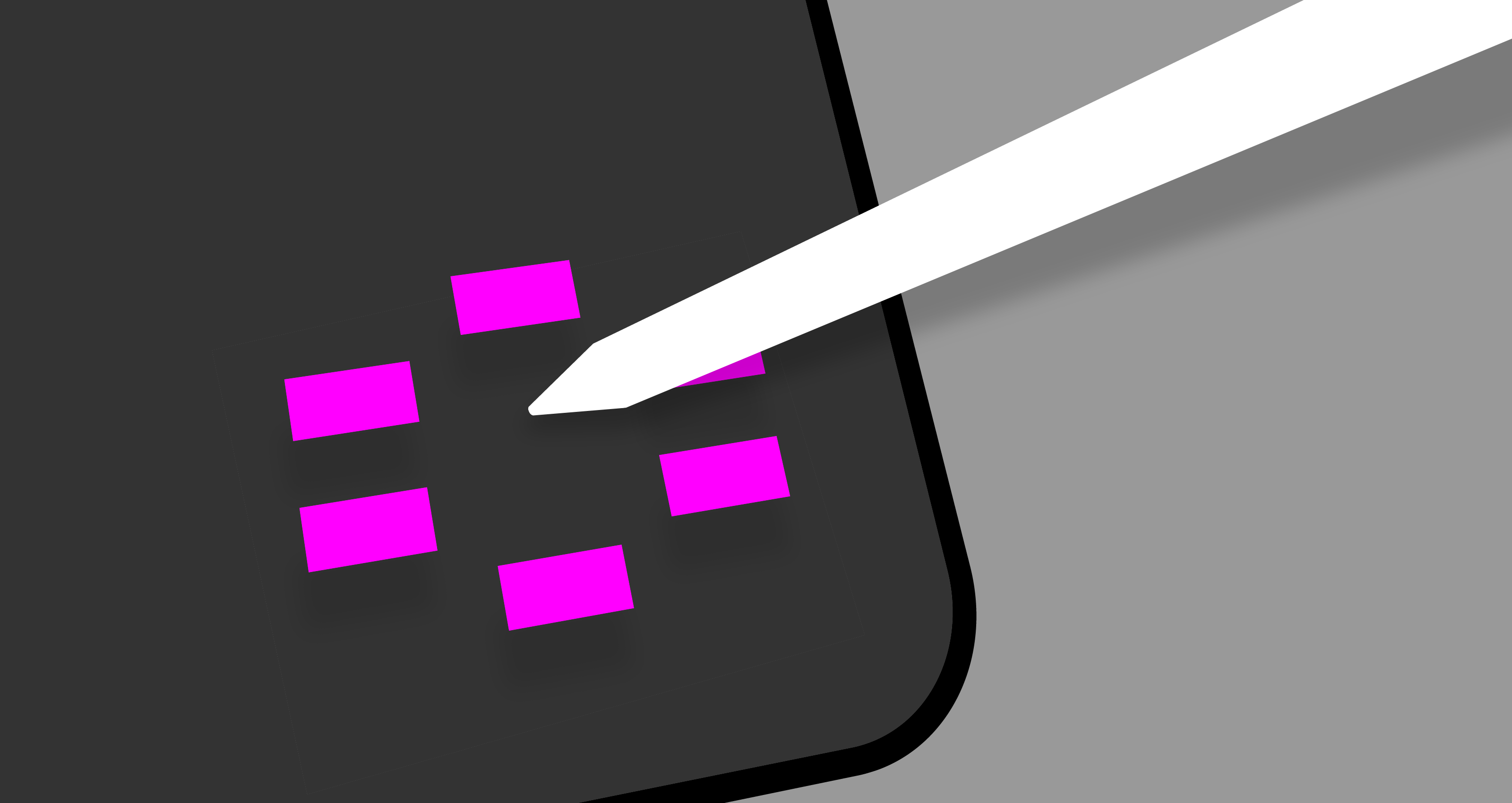
The “top” (for lack of a better term) edge of the iPad Pro in horizontal mode now features a small opaque window. Behind that window are the charging coils for the Pencil. Inside the Pencil itself is a complementary coil, flanked by two arrays of ferrite magnets. These mate with magnetic Halbach arrays inside the chassis of the iPad. Through the use of shaped magnetic fields, Apple pulls a bit of alignment trickery here, forcing the pencil to snap precisely to the point where the charging coils are aligned perfectly. This enables you to slap the pencil on top quickly, not even thinking about alignment.
The magnetic connection is tough — almost, but not quite, enough to hold the larger iPad Pro in the air by the pencil — and it should hold on well, but it’s fairly easy to knock off if you come at it from the side, as you would when pulling it off from the front.
There’s also a pleasant on-screen indicator now that shows charge level.
When the Pencil launched, I brought it to my Dad, a fine artist who sketches more than anyone I know as a part of his creative process. He liked the tracking and the access to digital tools, but specifically called out the glossy finish as being inferior to matte and the fact that there was no flat edge to rest against your finger.
The new Pencil has both a matte finish and a new flat edge. Yes, the edge is there to stop the pencil from rolling and also to allow it to snap to the edge of the iPad for charging, but the ability to register one edge of your drawing instrument against the inside of your control finger is highly under-valued by anyone who isn’t an artist. It’s hugely important in control for sketching. Plenty of pencils are indeed round, but a lot of those are meant to be held in an overhand grip — like a pointing device that you use to shade, for the most part. The standard tripod grip is much better suited to having at least one flat edge.
Your range of motion is limited in tripod grip, but it can provide for more precision, where the overhand grip is more capable and versatile; it’s also harder to use precisely. The new Pencil is now better to use in both of these widely used grips, which should make artists happy.
These fiddly notions of grip may seem minor, but I (and my drawing callous) can tell you that it is much more than it seems. Grip is everything in sketching.
The Pencil is one of the most impressive version 2 devices that Apple has ever released. It scratches off every major issue that users had with the V1 — a very impressive bit of execution here that really enhances the iPad Pro’s usability, both for drawing and quick notes and sketches. The only downside is that you have to buy it separately.
Drawing and sketching with the new Pencil is lovely, and remains a completely stand-out experience that blows away even dedicated devices like the Wacom Cintiq and remains a far cut above the stylus experience in the Surface Pro devices.
Beyond that there are some interesting things already happening with the Pencil’s double tap. In Procreate, for instance, you can choose a different double-tap action for many different tools and needs. It’s malleable, depending on the situation. It’s linked to the context of what you’re working on, or it’s not, depending on your (and the developer’s) choices.
One minute you’re popping a radial menu that lets you manipulate whole layers, another you’re drawing and swapping to an eraser, and it still feels pretty easy to follow because it’s grounded in the kind of tool that you’re using at the moment.
Especially in vertical mode, it’s easy to see why touch with fingers is not great for laptops or hybrids. The Pencil provides much-needed precision and delicacy of touch that feels a heck of a lot different than pawing at the screen with your snausages trying to tap a small button. Reach, too, can be a problem here, and the Pencil solves a lot of the problems in hitting targets that are 10” away from the keyboard or more.
The Pencil is really moving upwards in the hierarchy from a drawing accessory to a really mandatory pointing and manipulation tool for iPad users. It’s not quiiiite there yet, but there’s big potential, as the super flexible options in Procreate display.
There’s an enormous amount of high-level execution going on with Pencil, and by extension, iPad. Both the Pencil and the AirPods fly directly in the face of arguments that Apple can’t deliver magical experiences to users built on the backs of its will and ability to own and take responsibility of more of its hardware and software stack than any other manufacturer.
Speakers and microphones
There are now five microphones, though the iPad Pro still only records in stereo. They record in pairs, with the mics being dynamically used to noise cancel as needed.
The speakers are solid, producing some pretty great stereo sound for such a thin device. The speakers are also used more intelligently now, with all four active for FaceTime calls, something that wasn’t possible previously without the five-mic array due to feedback.
Let’s talk about ports, baby/Let’s talk about USB-C
I’m not exactly an enormous fan of USB-C as a format, but it does have some nice structural advantages over earlier USB formats and, yes, even over Lightning. It’s not the ideal, but it’s not bad. So it’s a pleasant surprise to see Apple conceding that people wanting to use an external monitor at high-res, charge iPhones and transfer photos at high speed is more important than sticking to Lightning.
The internal and external rhetoric about Lightning has always been that it was compact, useful and perfect for iOS devices. That rhetoric now has an iPad Pro-sized hole in it and I’m fine with that. A pro platform that isn’t easily extensible isn’t really a pro platform.
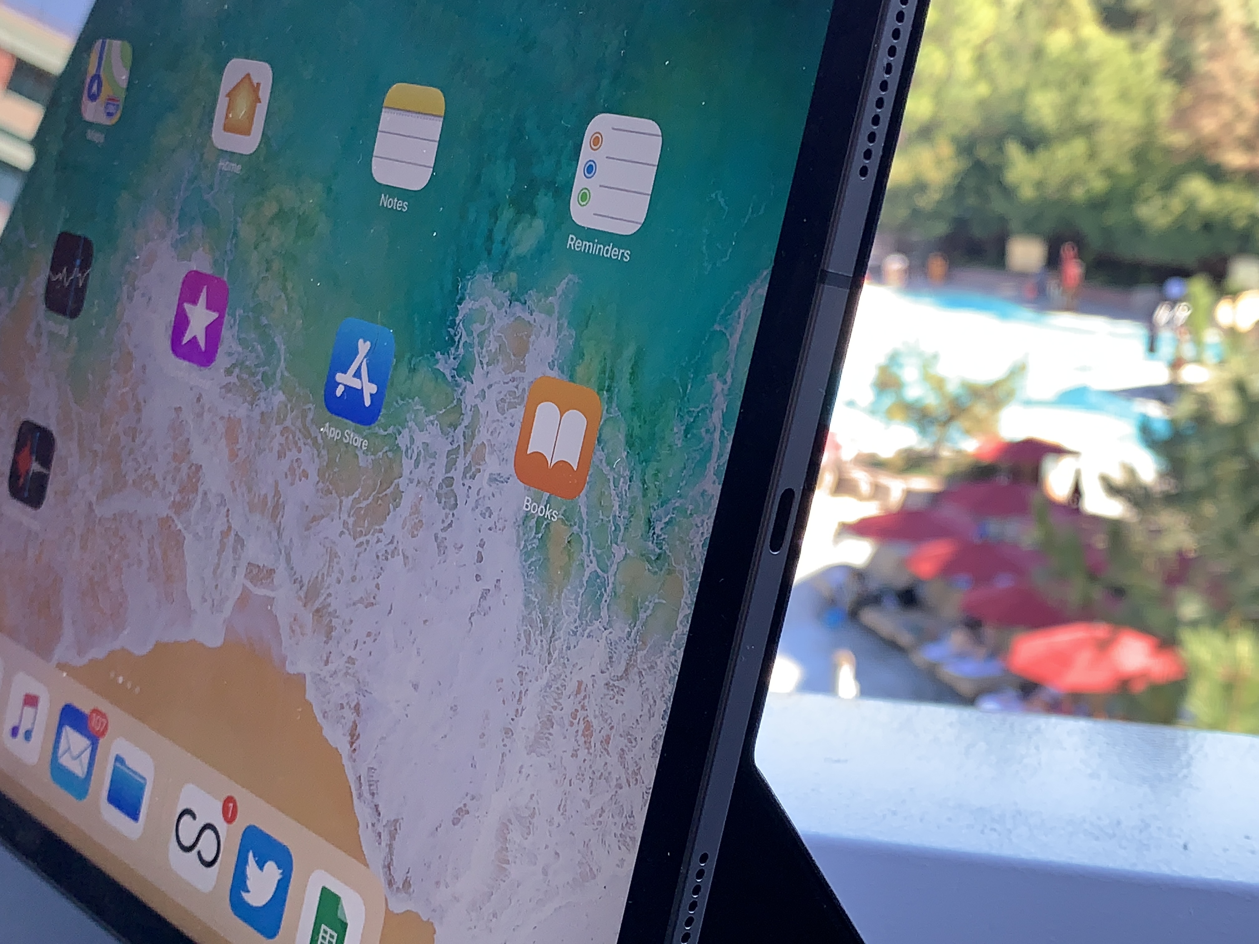
It’s not a coincidence that Apple’s laptops and its iPad Pro devices all now run on USB-C. This trickle down may continue, but for now it stems directly from what Apple believes people will want from these devices. An external monitor was at the top of the list in all of Apple’s messaging onstage and in my discussions afterwards. They believe there is a certain segment of Pro users that will benefit greatly from running an extended (not just mirrored) display up to 5K resolution.
In addition, there are a bunch of musical instruments and artist’s peripherals that will connect directly now. There’s even a chance (but not an official one) that the port could provide some externally powered accessories with enough juice to function.
The port now serves a full 7.5W to devices plugged in to charge, and you can plug in microphones and other accessories via the USB-C port, though there is no guarantee any of them will get enough power from the port if they previously required external power.
Pretty much all MacBook dongles will work on the iPad Pro, by the way. So whatever combos of stuff you’ve come up with will have additional uses here.
The port is USB 3.1 gen 2 capable, making for transfers up to 10GBPS. Practically, what this means for most people is faster transfer from cameras or SD Card readers for photos. Though the iPad Pro does not support mass storage or external hard drive support directly to the Files app, apps that have their own built-in browsing can continue to read directly from hard drives and now the transfer speeds will be faster.
There is a USB-C to headphone adapter, for sale separately. It also works with Macs, if that’s something that excites you. The basic answer I got on no headphone jacks, by the way, is that one won’t even fit in the distance from the edge of the screen to the bezel, and that they needed the room for other components anyway.
The new iPad Pro also ships with a new charger brick. It’s a USB-C power adapter that’s brand new to iPad Pro.
A12X and performance
The 1TB model of larger iPad Pro and, I believe, the 1TB version of the smaller iPad Pro, have 6GB of RAM. I believe, according to what I’ve been able to discern, that the models that come with less than 1TB of storage have less than that — around 4GB total. I don’t know how that will affect their performance because I was not supplied with those models.
The overall performance of the A12X on this iPad Pro though, is top notch. Running many apps at once in split-screen spaces or in slideover mode is no problem, and transitions between apps are incredibly smooth. Drawing and sketching in enormous files in Procreate was super easy, and I encountered zero chugging across AR applications (buttery smooth), common iPad apps and heavy creative tools. This is going to be very satisfying for people who edit large photos in Lightroom or big video files in iMovie.
The Geekbench benchmarks for this iPad are, predictably, insane: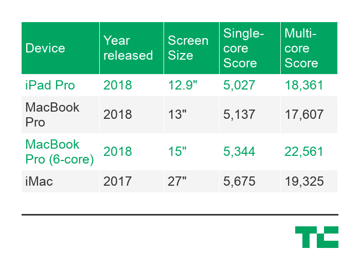
As you can see, the era of waiting for desktop-class ARM processors to come to the iPad Pro is over. They’re here, and they’re integrated tightly with other Apple-designed silicon across the system to achieve Apple’s ends.
There have basically been two prevailing camps on the ARM switch. One side is sure Apple will start slowly, launching one model of MacBook (maybe the literal MacBook) on ARM and dribbling it out to other models. I was solidly in that camp for a long time. After working on the iPad Pro and seeing the performance, both burst and sustained, across many pro applications, I’ve developed doubts.
The results here, and the performance of the iPad Pro, really crystallize the fact that Apple can and will ship ARM processors across its whole line as soon as it feels like it wants to.
There are too many times where we have ended up waiting on new Apple hardware due to some vagary of Intel’s supply chain or silicon focus. Apple is sick of it; I’ve heard grumbling for years about this from inside the company, but they’re stuck with Intel as a partner until they make the leap.
At this point, it’s a matter of time, and time is short.
Camera and Face ID
The camera in the iPad Pro is a completely new thing. It uses a new sensor and a new five-element lens. This new camera had to be built from the ground up because the iPad Pro is too thin to have used the camera from the iPhone XR or XS or even the previous iPads.
This new camera is just fine, image quality-wise. It offers Smart HDR, which requires support both from the speedy sensor and the Neural Engine in the A12X. It’s interesting that Apple’s camera team decided to do the extra work to provide a decent camera experience, rather than just making the sensor smaller or falling back to an older design that would work with the thickness, or lack thereof.
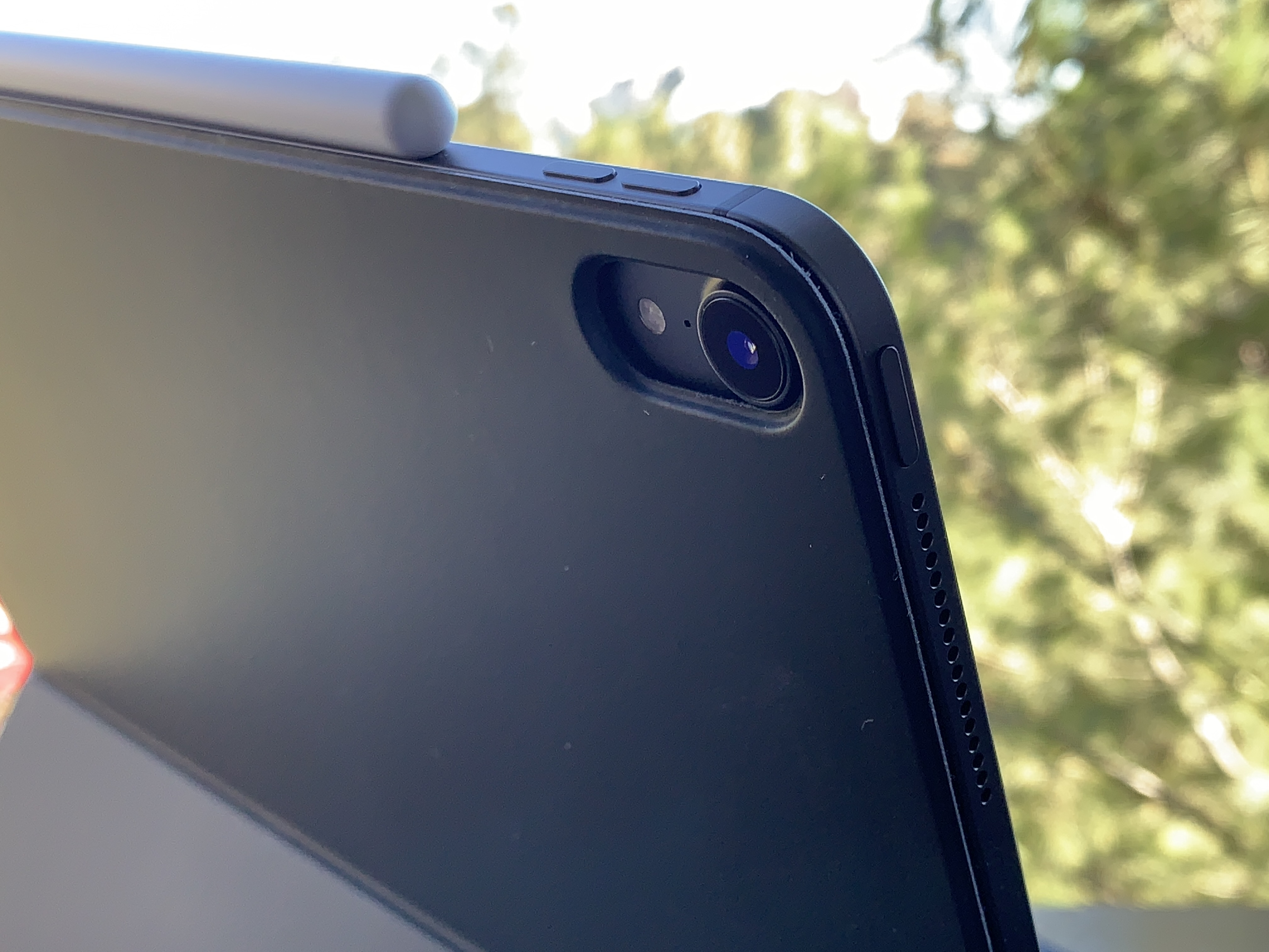
Interestingly, this new camera system does not deliver portrait mode from the rear camera, like the iPhone XR. It only gives you portrait from the True Depth camera on front.
iPad photography has always gotten a bad rap. It’s been relegated to jokes about dads holding up tablets at soccer games and theme parks. But the fact remains that the iPad Pro’s screen is probably the best viewfinder ever made.
I do hope that some day it gets real feature-for-feature parity with the iPhone, so I have an excuse to go full dad.
Of similar note, both hardware and software updates have been made to the True Depth array on the front of the iPad Pro in order to make it work in the thinner casing. Those changes, along with additional work in neural net training and tweaking, also support Face ID working in all “four” orientations of the iPad Pro. No matter which way is up, it will unlock, and it does so speedily — just as fast as the iPhone XS generation Face ID system, no question.
I also believe that it works at slightly wider angles now, though it may be my imagination. By nature, you’re often farther away from the screen on the iPad Pro than you are on your phone, but still, I feel like I can be much more “off axis” to the camera and it still unlocks. This is good news on iPad because you can be in just about any working posture and you’re fine.
Keyboard
Like the Pencil, the Smart Keyboard Folio is an optional accessory. And, like the Pencil, I don’t think you’re really getting the full utility of the iPad Pro without it. There have been times where I’ve written more than 11,000 words at a stretch on iPad for very focused projects, and its ability to be a distraction-free word production machine are actually wildly undersung, I feel. There are not many electronic devices better for just crashing out words without much else to get in the way than iPad with a good text editor.
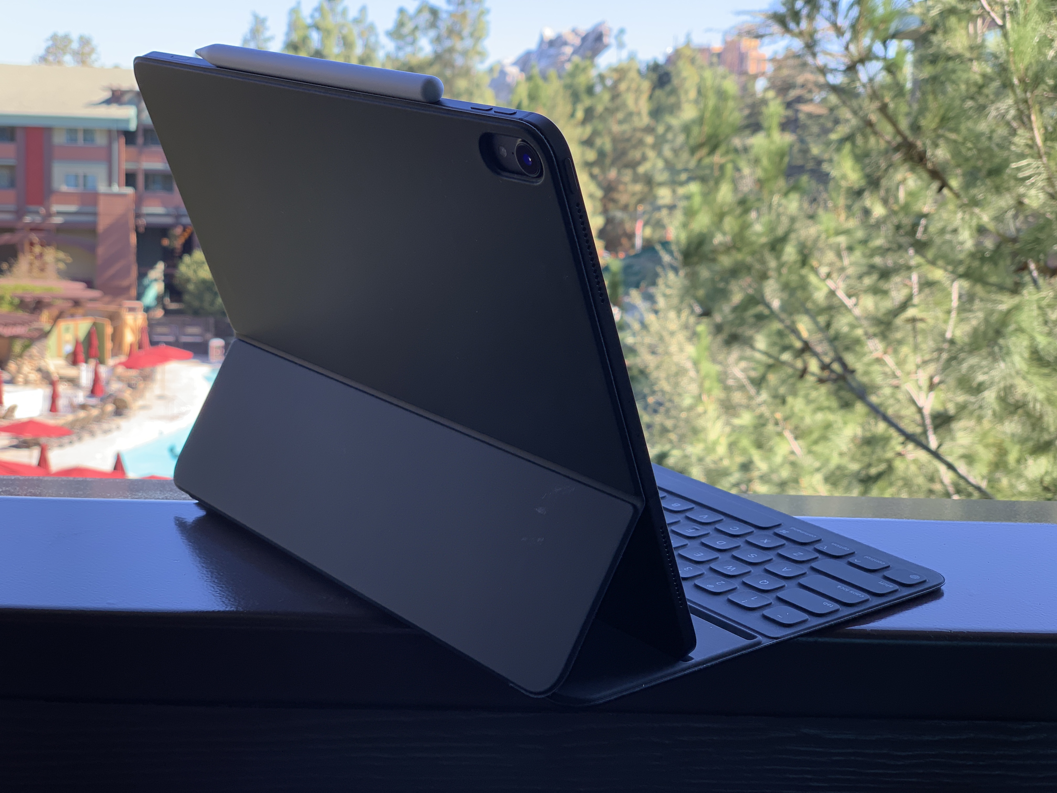
Editing, however, has always been more of a mixed bag. I’m not sure we’re quite there yet with the latest iPad Pro, but it’s a far better scenario for mixed-activity sessions. With the help of the Pencil and the physical keyboard, it is becoming a very livable situation for someone whose work demands rapid context switching and a variety of different activities that require call-and-response feedback.
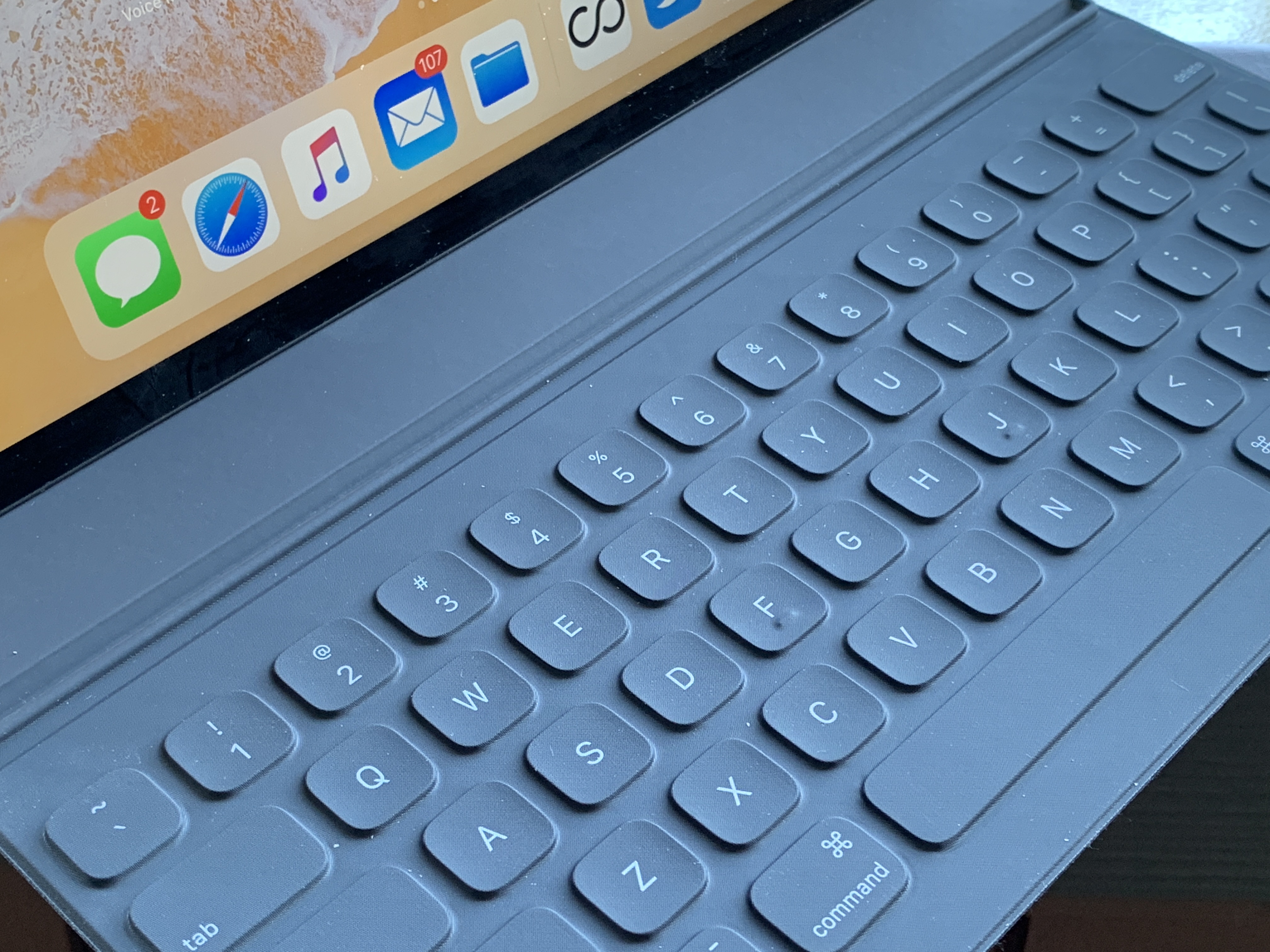
The keyboard itself is fine. It feels nearly identical to the previous keyboard Apple offered for iPads, and isn’t ideal in terms of key press and pushback, but makes for an OK option that you can get used to.
The design of the folio is something else. It’s very cool, super stable and shows off Apple’s willingness to get good stupid with clever implementation.
A collection of 120 magnets inside the case are arranged in the same Halbach arrays that hold the pencil. Basically, sets of magnets arranged to point their force outwards. These arrays allow the case to pop on to the iPad Pro with a minimum of fuss and automatically handle the micro-alignment necessary to make sure the the contacts of the smart connector make a good connection to power and communicate with the keyboard.
The grooves that allow for two different positions of upright use are also magnetized, and couple with magnets inside the body of the iPad Pro.
The general effect here is that the Smart Keyboard is much, much more stable than previous generations and, I’m happy to report, is approved for lap use. It’s still not going to be quite as stable as a laptop, but you can absolutely slap this on your knees on a train or plane and get work done. That was pretty much impossible with its floppier predecessor.
One big wish for the folio is that it offered an incline that was more friendly to drawing. I know that’s not the purpose of this device specifically, but I found it working so well with Pencil that there was a big hole left by not having an arrangement that would hold the iPad at around the 15-20 degree mark for better leverage and utility while sketching and drawing. I think the addition of another groove and magnet set somewhere on the lower third of the back of the folio would allow for this. I hope to see it appear in the future, though third parties will doubtlessly offer many such cases soon enough for dedicated artists and illustrators.
Design
Though much has been made about the curved corners of the iPad Pro’s casing and the matching curved corners of its screen, the fact is that the device feels much more aggressive in terms of its shape. The edges all fall straight down, instead of back and away, and they’re mated with tight bullnose corners.
The camera bump on the back does not cause the iPad to wobble if you lay it flat on a counter and draw. There’s a basic tripod effect that makes it just fine to scribble on, for those who were worried about that.
The overall aesthetic is much more businesslike and less “friendly” in that very curvy sort of Apple way. I like it, a lot. The flat edges are pretty clearly done that way to let Apple use more of the interior space without having to cede a few millimeters all the way around the edge to unusable space. In every curved iPad, there’s a bit of space all the way around that is pretty much air. Cutting off the chin and forehead of the iPad Pro did a lot to balance out the design and make it more holdable.
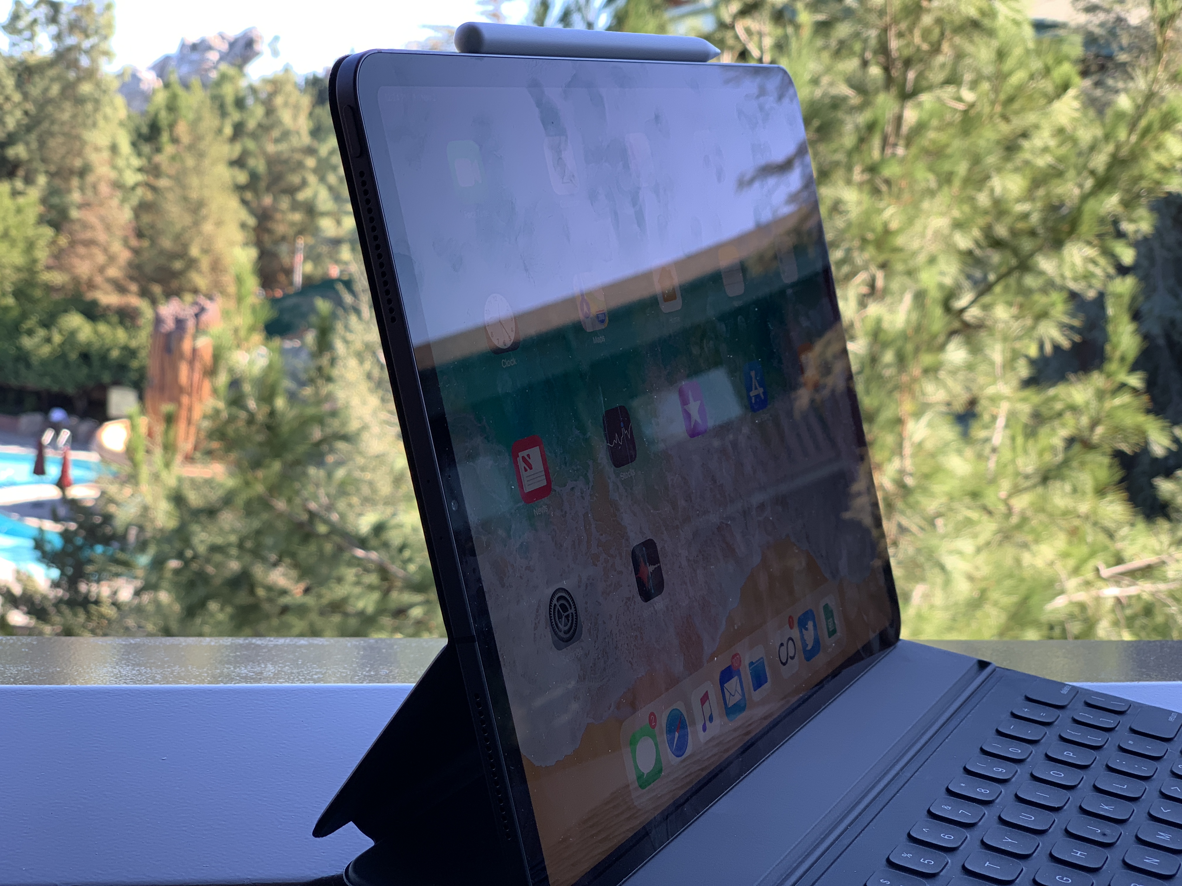
There will likely be, and I think justifiably, some comparisons to the design of Microsoft’s Surface Pro and the new blockier design. But the iPads still manage to come in feeling more polished than most of its tablet rivals, with details like the matching corner radii, top of the line aluminum finish and super clever use of magnets to keep the exterior free of hooks or latches to attach accessories like the Smart Keyboard.
If you’re debating between the larger and smaller iPad Pro models I can only give you one side of advice here because I was only able to test the new 12.9” model. It absolutely feels better balanced than the previous larger iPad and certainly is smaller than ever for the screen size. It makes the decision about whether to move up in size a much closer one than it ever has been before. Handling the smaller Pro in person at the event last week was nice, but I can’t make a call on how it is to live with. This one feels pretty great though, and certainly portable in a way that the last large iPad Pro never did — that thing was a bit of a whale, and made it hard to justify bringing along. This one is smaller than my 13” MacBook Pro and much thinner.
Screen
The iPhone XR’s pixel masking technique is also at work on the iPad Pro’s screen, giving it rounded corners. The LCD screen has also gained tap-to-wake functionality, which is used to great effect by the Pencil, but can also be used with a finger to bring the screen to life. Promotion, Apple’s 120hz refresh technology, is aces here, and works well with the faster processor to keep the touch experience as close to 1:1 as possible.
The color rendition and sharpness of this LCD are beyond great, and its black levels only show poorly against an OLED because of the laws of physics. It also exhibits the issue I first noticed in the iPhone XR, where it darkens ever so slightly at the edges due to the localized dimming effect of the pixel gating Apple is using to get an edge-to-edge LCD. Otherwise, this is one of the better LCD screens ever made in my opinion, and now it has less bezel and fun rounded corners — plus no notch. What’s not to like?
Conclusion
In my opinion, if you want an iPad to do light work as a pure touch device, get yourself a regular iPad. The iPad Pro is an excellent tablet, but really shines when it’s paired with a Pencil and/or keyboard. Having the ability to bash out a long passage of text or scribble on the screen is a really nice addition to the iPad’s capabilities.
But the power and utility of the iPad Pro comes into highest relief when you pair it with a Pencil.
There has been endless debate about the role of tablets with keyboards in the pantheon of computing devices. Are they laptop replacements? Are they tablets with dreams of grandiosity? Will anyone ever stop using the phrase 2-in-1 to refer to these things?
And the iPad hasn’t exactly done a lot to dispel the confusion. During different periods of its life cycle it has taken on many of these roles, both through the features it has shipped with and through the messaging of Apple’s marketing arm and well-rehearsed onstage presentations.
One basic summary of the arena is that Microsoft has been working at making laptops into tablets, Apple has been working on making tablets into laptops and everyone else has been doing weird-ass shit.
Microsoft still hasn’t been able (come at me) to ever get it through their heads that they needed to start by cutting the head off of their OS and building a tablet first, then walking backwards. I think now Microsoft is probably much more capable than then Microsoft, but that’s probably another whole discussion.
Apple went and cut the head off of OS X at the very beginning, and has been very slowly walking in the other direction ever since. But the fact remains that no Surface Pro has ever offered a tablet experience anywhere near as satisfying as an iPad’s.
Yes, it may offer more flexibility, but it comes at the cost of unity and reliably functionality. Just refrigerator toasters all the way down.
THAT SAID. I still don’t think Apple is doing enough in software to support the speed and versatility that is provided by the hardware in the iPad Pro. While split-screening apps and creating “spaces” that remain in place to bounce between has been a nice evolution of the iPad OS, it’s really only a fraction of what is possible.
And I think even more than hardware, Apple’s iPad users are being underestimated here. We’re on eight years of iPad and 10 years of iPhone. An entire generation of people already uses these devices as their only computers. My wife hasn’t owned a computer outside an iPad and phone for 15 years and she’s not even among the most aggressive adopters of mobile-first.
Apple needs to unleash itself from the shackles of a unified iOS. They don’t have to feel exactly the same now, because the user base is not an infantile one. They’ve been weaned on it — now give them solid food.
The Pencil, to me, stands out as the bright spot in all of this. Yes, Apple is starting predictably slow with its options for the double-tap gesture. But third-party apps like Procreate show that there will be incredible opportunities long term to make the Pencil the mouse for the tablet generation.
I think the stylus was never the right choice for the first near decade of iPad, and it still isn’t mandatory for many of its uses. But the additional power of a context-driven radial menu or right option at the right time means that the Pencil could absolutely be the key to unlocking an interface that somehow blends the specificity of mouse-driven computing with the gestural and fluidity of touch-driven interfaces.
I’m sure there are Surface Pro users out there rolling their eyes while holding their Surface Pens — but, adequate though they are, they are not Pencils. And more importantly, they are not supported by the insane work Apple has done on the iPad to make the Pencil feel more than first party.
And, because of the (sometimes circuitous and languorous) route that Apple took to get here, you can actually still detach the keyboard and set down the Pencil and get an incredible tablet-based experience with the iPad Pro.
If Apple is able to let go a bit and execute better on making sure the software feels as flexible and “advanced” as the hardware, the iPad Pro has legs. If it isn’t able to do that, then the iPad will remain a dead-end. But I have hope. In the shape of an expensive-ass pencil.

