
Samsung’s never shied away from going big. Big phones, big TVs, big watches. In fact, that was one of the defining characteristics for the first few generations of the Gear line, the first few of which were really more wrist-worn tablet than smartwatch.
Things thankfully mellowed out a bit last year with the introduction of the S2, a more minimalist approach to wrist-worn computing that married clever functionality with a refined OS and a design that actually looked like an honest to goodness watch.
But 2016 marked a return to big. Samsung was all about pushing things close to the breaking point this year, and in at least one notable instance, well beyond. The Gear S3 marks a return to big. As ever, the company’s jam-packed the watch with features — which might feel like they were overflowing were the watch not so darn big in the first place. In many ways, the new watch feels like the Galaxy Note strategy applied to the wrist — albeit without all of the baggage that has recently become associated with that line.
Big time

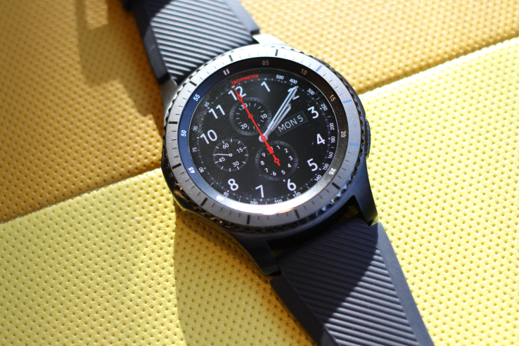
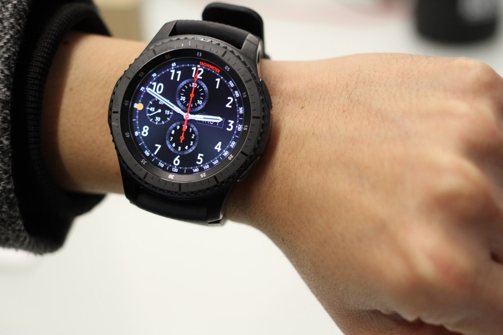
This really needs to be mentioned right off the bat — there’s really no way around it — the S3 is really, really big. Really, really. Sure, it’s not quite Galaxy Gear huge, but it’s distractingly big. I’m roughly six feet tall and possess what I assume to be average-sized wrists for a male individual of my height, and the Gear S3 still felt big. Just for the sake of conversation, I asked two 5’4″ coworkers to try it on, and the wearable looked downright comical.
When the device first launched at IFA, I asked a rep about the thought process behind releasing such a large watch, and he chalked it up to fashion, citing the popularity of 42mm watches. Perhaps, but coupled with the added case depth required for a smartwatch’s electronics and battery, and you’ve got a device that could serve to cut out a large portion of the populace by size alone.
The S3 weighs in at 63 grams, owing in no small part to its stainless steel casing. That’s around 13 grams heavier than the new Apple watch (which was itself heavier than its predecessor). And at 12.9 millimeters thick, it’s not really made for wearing with long sleeves. My sweater managed to pull over it (albeit with a visible bump), but my button-up shirt had a bit more trouble making it over.
And forget trying to sleep with the thing on. It’s hard to understand why the company didn’t, at the very least, offer the watch in two different sizes. After all, it’s available in two different configurations. As such, Samsung has alienated all but a small sliver of the smartwatch-buying audience.
Big wheel keep on turning

The S3 Frontier also marks an aesthetic departure from its predecessor, with a steel case that takes on a more classic design that its sporty (some might have said “plasticky”) predecessor. It’s certainly a classier and more versatile look than many other smartwatches and fitness bands. With the right band, it can fit in comfortably in, say, an office setting, which isn’t something that can be said for many of the neon colored wearables out there.
The rubber strap that ships with the Frontier version is a marked step down from the design of the watch itself. It’s designed to play alongside the watch’s rugged focus, lending itself to outdoor excursions and sweat-addled workouts. Of course, the upside of the standardized 22mm strap is that you’ll never want for options on that front. Samsung actually teamed with a pair of designers to create bands specifically for the watch — but save yourself some cash and just pick up a regular old strap.
The S2’s best feature has, thankfully returned. And it’s even better than before. The rotating bezel was a terrific addition to that last device. At 1.3 inches, the display isn’t super small, so far as smartwatches go, but as with Apple’s offering, additional input is needed for quickly moving through screens.
The wheel does the job fantastically and even more intuitively than Apple’s option. This steel version is smooth, zipping through menus, though the small articulation gap between bezel case is a bit of a magnet for lint and other small particles that could require the occasional blast of canned air for maintenance. The watch does sport a pair of buttons, as well — back and power — which sit fairly flush with the watch casing.
Saving face

The 1.3-inch display is a touch larger than the S2’s, but still doesn’t cover the same ground as the Apple Watch’s 1.65. At 278ppi, it’s also a bit less pixel dense, but it’s plenty bright and sharp. Samsung’s Tizen icons are clear and bright, even in daylight. The device features an Always On mode, to make it function more like an analog watch, though that’s turned off by default and hidden under the Style menu in settings, for reasons the battery-life warning make clear.
That’s packed behind the latest version of Gorilla Glass, making the watch shatter and scratch resistant. That, coupled with a big steel frame, makes for an extremely rugged wearable. It’s listed as MIL-STD-810G Military Grade Rating, which protects it from drops up to 4.9 feet and IP68, which puts its water rating at up to five feet for 30 minutes. It’s also protected from extreme temperatures, making the Frontier every bit as rugged as its name implies.
Wearable hardware

The battery has been upgraded to 380 mAh, a marked bump over the Apple Watch’s 273 mAh. The company rates life at around three days, but I was able to get closer to two days with Always On mode off — owing likely in no small part to the onboard LTE on the Frontier. You’ll find yourself charging it less often than the Apple Watch, but you’re still not getting near fitness band territory here.
The LTE is a great option, the usefulness of which depends entirely upon how you interact with your watch. If you have your phone on you all or most of the time, it’s probably not worth the added cost, which breaks down to an extra $10 a month in addition to an existing data plan or $40 for a brand new one on AT&T. If, however, you’re looking to the wrist as a temporary liberation from the watch for, say, long cross-country runs, it’s a terrific feature.
Either way, it’s a solid addition to the smartwatch that seemingly already has everything, delivering quick data directly to the watch without needing to be tethered to a handset at all times. And there’s always the bonus ability of using the built-in speaker to make wrist-based phone calls, finally fulfilling the long-awaited Dick Tracy promise.
The S3 also brings built-in GPS to the watch (previously only available on the specialty 3G version of the S2), another big bonus for the wearable’s outdoorsy functionality, and brings a lot to the table on the fitness tracking front, particularly for hikers and runners who like to go long distance.
Tizen time

Among other things, Samsung’s got the decided benefit of several generations of smartwatches under its belt. The company switched from Android to Tizen between the Galaxy Gear and Gear 2, and really hit its stride with last year’s S2. The software experience is smooth and customizable — holding down on an icon, for instance, lets you customize and re-order screens.
The app selection is still limited compared to the competition, but you’ve got some key ones here, including Uber and Flipboard, along with the recent (and important) addition of Spotify. You can add a select number of apps directly onto the watch or flip over to the phone to view more and get the full app store experience.
For the most part, I found my engagements limited to Samsung’s own apps; the company has done a good job building up its own ecosystem. The company’s S Health has become quite robust over the last few generations, making the most of onboard sensors like GPS and heart rate, and Samsung Pay brings added utility of paying by scanning your wrist near a card reader.
Final Frontier

Samsung’s had a few generations more than much of its competition to refine its smartwatch experience. Last year the company finally hit upon a winning formula with the S2, a great combination of design, functionality and software refinement.
And while the S2 is getting a good number of software upgrades to bring it up to speed, the $350 S3 Frontier offers some key hardware bumps over its predecessor. Those largely feel iterative, but welcome. The new size, on the other hand, is a big misfire for Samsung. The smartwatch space is already a marginalized one, and making a massive device like the S3 further restricts the product from too many wrists.

