![]()
I want to start this off by saying two things: one, this isn’t a review or hands-on impressions as I have not used the computer (PetaPixel’s hands-on coverage is forthcoming) and two, I am an Apple power user and have been since I was indoctrinated in high school.
I love Apple, and even when they don’t produce a product I’m 100% happy with, odds are very high I’ll buy it anyway. The “why” to that is long and complicated and a story for another day, but suffice it to say I just love the ecosystem.
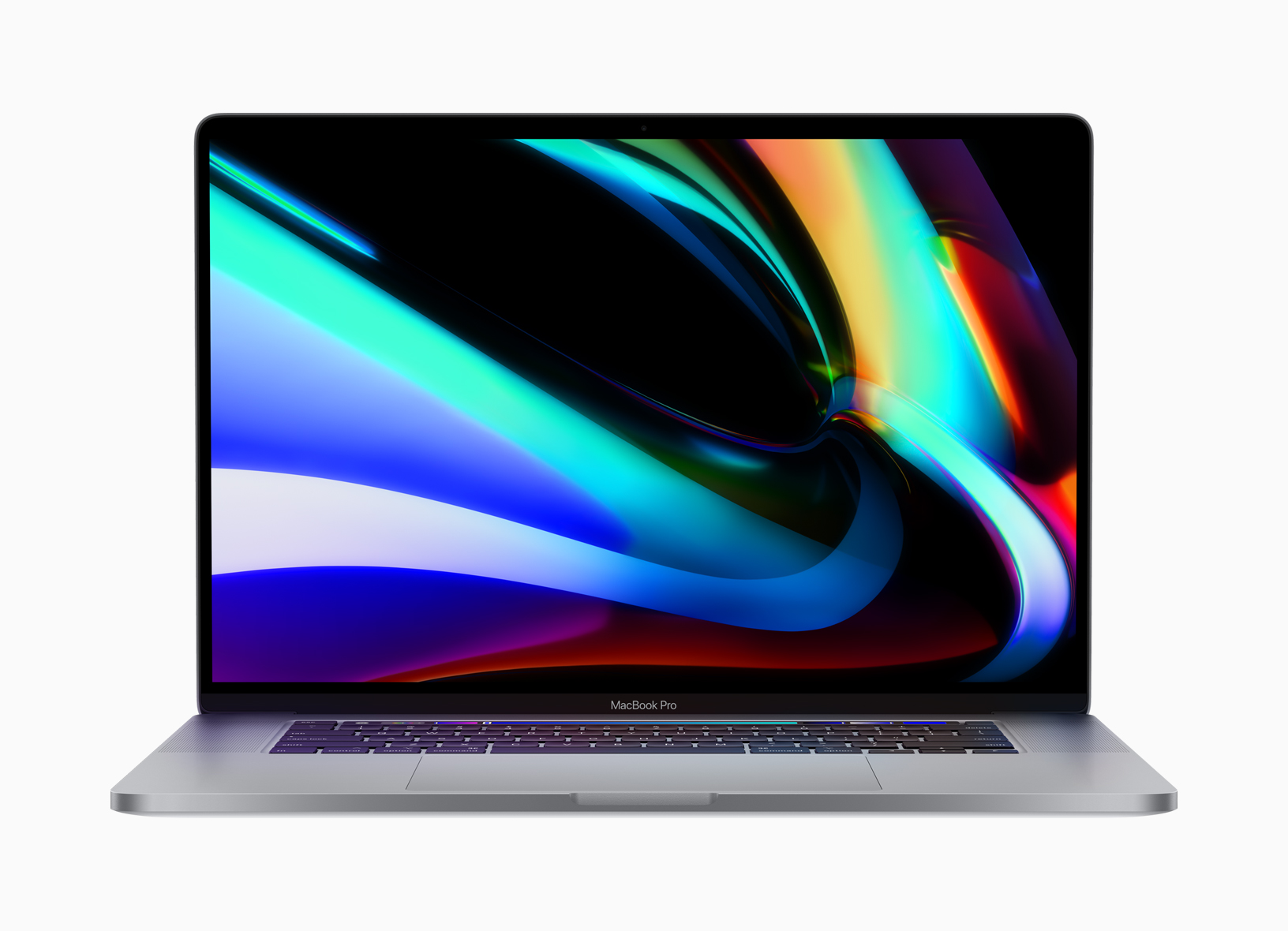
But just because I love Apple doesn’t mean I think they are immune to criticism. For as much as they appear to get right about the new MacBook Pro, I think there are a couple of places that could use some innovation, or in one case de-innovation, to bring it back into the forefront as an uncontested excellent creator’s tool.
We Need an SD Card Port
I will freely admit I was an Apple apologist when the original MacBook Pro with Touch Bar came out and didn’t include a built-in SD card port. I made excuses about how it wasn’t a big deal, about how finding a dongle would be easy and remembering to bring it would be second nature. I was certain it wouldn’t matter.
Boy was I wrong.
I am still using that first-generation MacBook Pro with Touch Bar and the number of times I was really, really screwed by not having a built-in SD card port are nearly innumerable. Given the mobile nature of this computer, there are hundreds of times that I have just grabbed it and nothing else, jammed it into my backpack and run out the door to a job only to later realize I had zero flexibility to do anything until I got back home and found my damned dongle.

One time I was in Sedona and had to ask everyone I ran into if they had a dongle I could borrow. One time I was working a job in the San Francisco bay area and needed to get copies of files from my second shooter, and instead had to take all his memory cards home with me and mail them back to him afterward. Another time I was in Hawaii camera testing and had to borrow a dongle off a friend because I had yet again neglected to bring mine. I could go on, and on, and on with these examples.
Eventually, I bought enough of these stupid SD dongles to keep one in every room of my house and one in every backpack and roller bag I owned. That ended up being the only solution to this problem: everywhere I could possibly be with my computer, I had to have a dongle nearby. I’m only barely exaggerating when I say I put one in the pocket of every jacket I owned so it would be impossible for me to not have one on me.
The point I’m making, and I’m sure I’m preaching to the choir at this point, is that an SD card reader in your laptop computer is not a luxury or a “nice to have” feature. It’s a must, and Apple needs to de-innovate its design and just give it back to us. There is plenty of room on the side of the computer, and if they’re concerned about aesthetics, they could design a way for the port to be covered and seamless. They’re really good at that kind of thing.
The Touch Bar Needs to be Reworked
There are a few people whose opinions I’ve read in the comments section here on PetaPixel and on other sites who defend the Touch Bar as helpful when using specific apps. Though no one I’ve ever spoken to in person has ever defended the Touch Bar, I am willing to admit it works for some.
But I don’t think that working for some is good enough. I think ideally, you would create something that actually revolutionizes how we work and advances on it. Right now, typing on my MacBook Pro with Touch Bar in the Pages app, I have some options for formatting this document on my Touch Bar. I can tell you that I have never once used the Touch Bar to do any of these actions. If I want to bold, italicize or underline, I know the keyboard shortcuts for that. If I want to adjust formatting and alignment, I find it easier to use the sidebar than to keep looking up and down from my hands to the screen to see if the formatting did what I wanted. In this example, the Touch Bar doesn’t enhance the experience — it complicates it and acts redundantly.
That point about having to look down at my hands is also, in my opinion, the biggest flaw with the Touch Bar. Growing up learning typing, it was drilled into my head to avoid looking at my hands when I typed or worked. I’m sure some of you can remember the keyboard covers that computer teachers would put over your keys so you couldn’t look at what letters you were typing. Not looking down at your hands is ingrained heavily into the computer experience for me now, so having to change that on just this one computer feels awkward and wrong.
And yeah, I do wish I had my F keys back. There are some shortcuts in Photoshop I just can’t do on this computer.

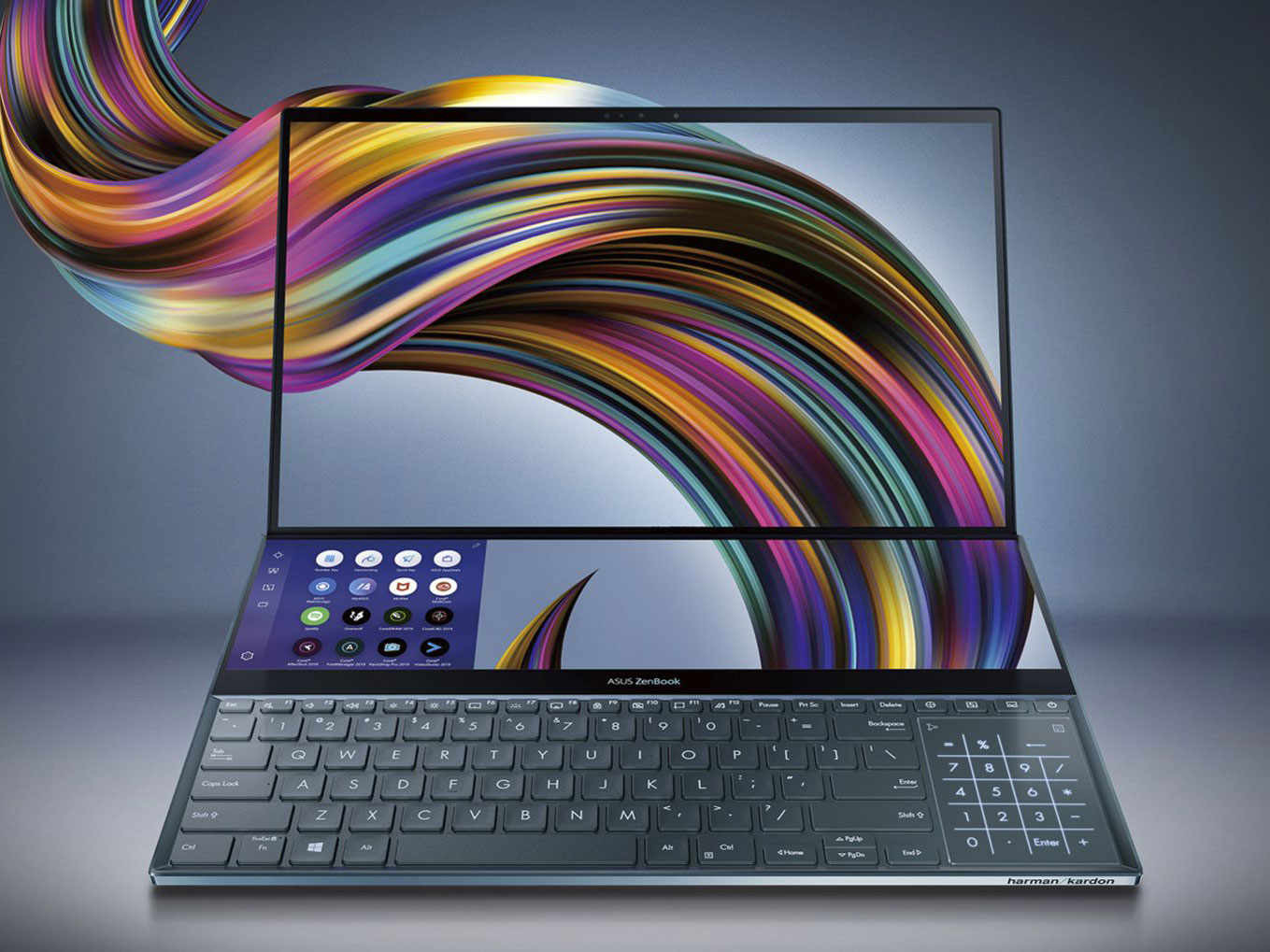
I don’t know what the answer is to the Touch Bar. Get rid of it, change it, enhance it, do something, but all I know is that in its current state, it’s not helping more than it’s sort of just doing nothing for a lot of users. Maybe the answer is dramatically expanding it like on the ZenBook Pro Duo from Asus. There are those who don’t like this implementation either, but it’s much harder to say this design doesn’t add to the experience, and they don’t even have to sacrifice that top keyboard row to get it.
Apple is Coming Around
I want to applaud Apple for adding the Escape key back to the newest MacBook Pro. That key is very important, and should always be a physical button. I was ecstatic that the raw power of the computer jumped as well, and seeing them innovate a better cooling system is also really great.
Most importantly, Apple listened to user complaints about the keyboard which, as I type on the original right now, is a godsend. I have a friend who actually carries around a second wireless keyboard and lays it on top of the built-in one on his MacBook Pro with Touch Bar because he hates the built-in one so much. That is just embarrassing from a design standpoint, and I’m so happy Apple is righting that ship.
We should be cheering that Apple is listening to feedback and making appropriate changes. I certainly am. It’s important to tell them they’re doing the right thing and encourage this kind of response for future products. I just really hope they can do more with these last two features that really need some attention when they work on their next iteration of this laptop line.

