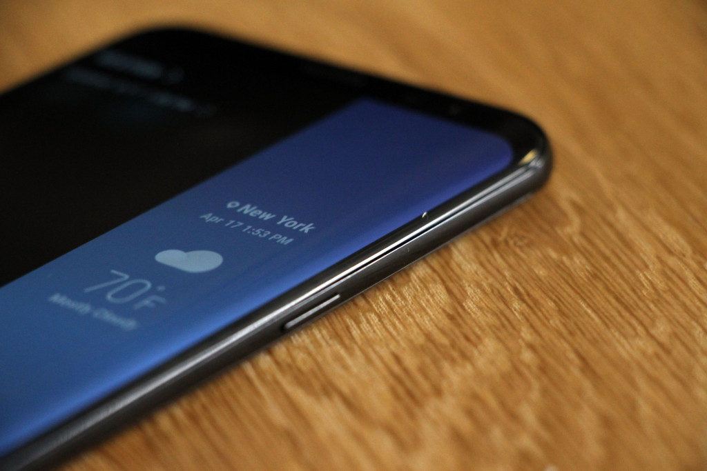
The Samsung Galaxy S8 is a strange beast. All at once it seems like both the culmination of several generations’ worth of solid smartphone evolution, while feeling like a still-incomplete peek at the company’s grand plans moving forward. It’s a beautifully crafted piece of hardware with some cool software tricks that is less of the revolution that Samsung promised than it is an insight into a unified Galaxy theory that will likely define generations of the company’s devices to come.
When Samsung took the stage last month, it offered, “Not just the launch of a great device, but the beginning of a new way to experience the world.” A months-long apology tour following what had been an utterly dismal year for its public image gave way to the promise of the next key moment in mobile communication history.
The reality of the S8 is a solid device that furthers the company’s valiant quest to vanquish the bezel. Samsung’s building upon several generations of great phones with a mostly iterative but worthy follow up. The advent of the company’s brand new smart assistant Bixby, meanwhile, points the way forward for Samsung’s upcoming ecosystem play.
But the company still needs to thread the needle on that front. The experience isn’t fully fleshed, lending an air of disappointment to the company’s big new comeback device.
Infinity and beyond
One thing Samsung has unquestionably perfected: making big phones seem small. It was one of the remarkable feats the company managed on the Note 7, and it’s on full display with the S8 and S8+. Matter of fact, the first time I got hands-on time with the S8+ at a press event, I could’ve sworn I was holding the smaller version.
I’ve been carrying the phone around for a few days now, and it fits in my pocket every bit as comfortably as the 5.5-inch iPhone 7+. And you’re able to operate that phone with a single hand, so this device will be no problem.
The larger handset doesn’t feel its full 6.2 inches, owing to a taller form factor and what the company has enticingly deemed its “Infinity Display.” The curved screen continues the company’s multi-generational war on bezels, exemplified by last year’s S7 Edge and Note 7. They’re not gone entirely, but they’re tucked away far enough to make previous generations look bulky by comparison.

The promise of an all-screen phone is still likely a couple of generations off (due in part to the persistent popularity of the selfie-camera), but Samsung has done yeoman’s work attempting to eradicate edges from the Earth. This is helped along immensely by the elimination of the front home button — the most striking design change on a phone that otherwise retains much of the design language of its predecessor.
The familiar oval button has been replaced by a virtual counterpart that sits under the screen in roughly the same spot. It’s been coupled with a haptic engine that offers the same rough approximation of a physical click as the latest iPhone. For unlocking purposes, a fingerprint reader has been moved to the back, just to the right of the camera. It’s an odd design choice.
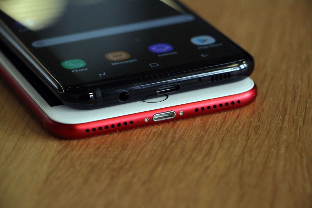
It’s hard to access with a single hand — even when compared to the mid-phone placement on the Pixel, and it’s basically asking you to run your greasy fingerprints all over the camera as you fumble to find it (the entire back of the black version is one giant fingerprint magnet). Thankfully, there’s no want for different ways to unlock the phone with various body parts, though facial unlock, while cool, is pretty hit or miss in low light.
The birth of Bixby
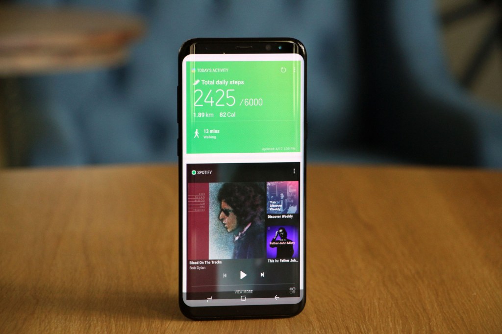
It’s time to streamline the Galaxy software experience. And Bixby may well be the smart assistant to do it. For now, however, the AI is a bit of a hot mess. There are brilliant flashes here and there, but Samsung’s semi-homebrewed assistant feels more like a promise of what’s to come than a truly useful software feature. This is due in no small part to the fact that not all of the promised Bixby features will be available to Galaxy S8 buyers at launch.
Samsung confirmed with us via email that the handset is launching without Bixby Voice. That’s set to come at some point later this spring. For now, it feels like a gaping hole in the company’s plan to take on Siri, Alexa and Google Assistant head-on. Without it, the experience feels undercooked, and I can’t avoid the sneaking suspicion that the company rushed it into existence a mere five or so months after purchasing Viv in order to attempt to have one more key feature for its first post-Note 7 flagship.
The company even went so far as giving ol’ Bixby its own devoted button on the side of the phone, even as it killed the only physical button on the front of the device. Let’s all reconvene in six months or a year to see if the company’s delivered on some grand promises like uniting its smart home play. Meantime, there are some useful features present, most notably Bixby Vision.
Looking forward with Bixby Vision
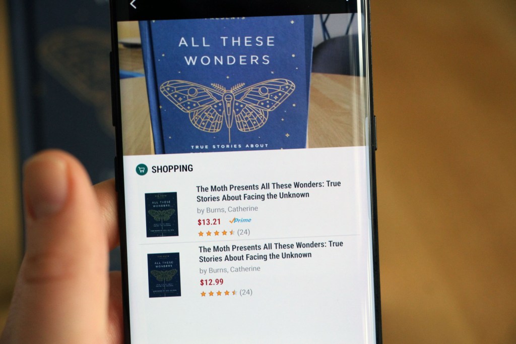
Samsung always introduces a smattering of interesting software features designed to distinguish itself from the pack of Android also-rans. Bixby Vision is without question one of the most compelling in recent memory, taking advantage of the on-board camera for a number of different activities like shopping and text translation.
The former should be familiar to anyone who has seen or used Amazon Flow, the fascinating app launched in 2014 that undoubtedly gave millions of brick and mortar store owners minor heart attacks. It uses image recognition to scan bar codes and the front of images. Once it’s recognized them, both apps pull up a list of Amazon shopping results.
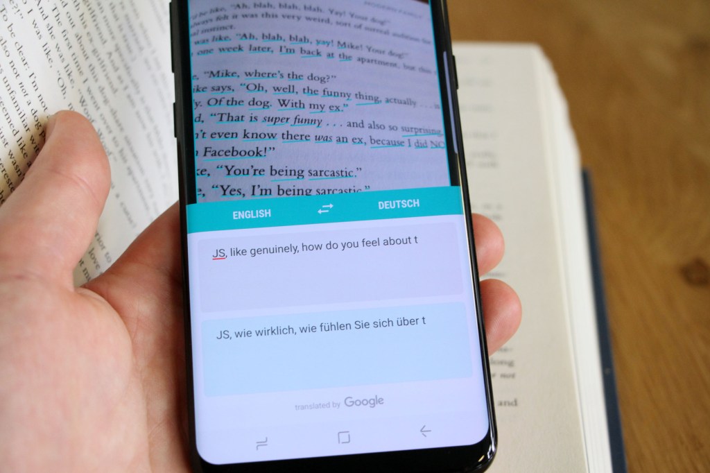
It’s admittedly not much more useful than downloading Amazon’s app, but will likely help fuel the massive portal of contextual information that Samsung’s compiling to help build a more useful Bixby experience. Vision also does a great job recognizing text on products. You can translate these into a number of different languages by highlighting them. Certainly a potentially useful feature, moving forward.
Where the heart is
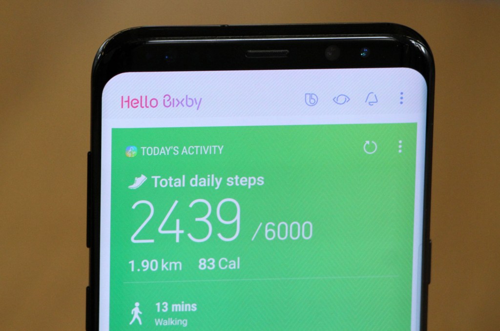
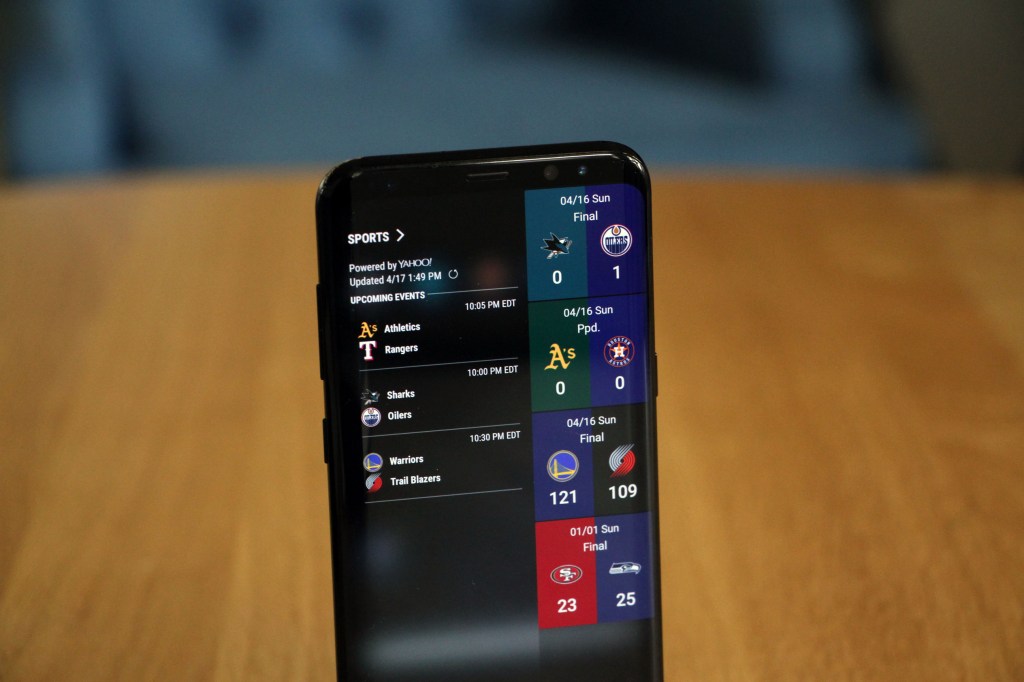
Home is Bixby’s most forward-facing feature. It’s the thing that pops up when you give the devoted button a short press (down the road a longer one will bring up Voice). At first glance, it looks like any number of content hubs that Android hardware makers have plopped on top of the operating system. After using the phone for a week, mine displays recently played Spotify songs, my daily step count, reminders and the weather, among others.
As with Bixby’s underlying technology, Home is designed pull in more and more contextual information over time, potentially becoming more helpful along the way. For the moment, however, it’s hard to see it as much of anything beyond a standard content hub. Not a bad thing, mind, but not nearly revolutionary.
Add voice, the promised third-party support and a clear connected home strategy, and Bixby starts to look like a truly compelling smart assistant. It could well end up being the connective tissue that finally unites generations of features laid a top of Android — and what helps truly distinguish its software offering from the competition. For now, however, it feels rushed out in order to make the S8 deadline.
Camera action
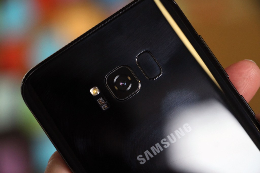
As far as specs go, Samsung hasn’t done much to update the rear-facing camera. And that’s perfectly fine. It’s been a major focus over the past few generations, and the result is one of the best smartphone camera experiences money can buy. There have been a few software tweaks, like enhanced image processing, which makes the camera’s already solid low-light image capture even better.
Interestingly, most of the big camera updates are aimed at making the S8 more of a social machine, following in the footsteps of upgrades from Chinese manufacturers like Huawei.
The front-facing camera has been bumped up to eight megapixels and now sports faster auto-focus and better facial recognition. So, you know, lots more better selfies. Samsung’s also loaded the camera app with a few dozen filters and animated stickers, bringing a taste of Snapchat to the device itself. The software has also been tweaked for easier one-handed picture-taking.
Really, few of the upgrades here are focused on “serious” picture taking. Samsung’s software offerings are often aimed at productivity and security. Given how the company seeded review units of the S8 to YouTube reviewers early on, it’s clear that Samsung is looking to broaden its appeal with a younger demographic.
A strong foundation
Taken alone, none of the new additions are nearly as groundbreaking as Samsung would like you to think. But what the S8 and S8+ do have going for them is several generations of advancements, and, taken together, it’s one of the most fully featured Android phones out there. Like their predecessor, the phones are rated IP68, so you can get caught in a downpour or even dunk them in a bucket of water with no problem.
They once again support expandable memory and wireless fast charging.
The battery on the S8 is the same size as its predecessor (and a bit bigger, naturally on the Plus). I was able to get about a day and a half of normal use. Samsung, understandably, wasn’t looking to push the envelope
The processor has seen a big bump, which is as much about future-proofing the device as anything. You likely won’t see a big difference in day-to-day usage, but as the company pushes further and further into more complex tasks like VR, it will begin to make that much more of a difference.
Reach higher

The S8 was bound to be a tightrope walk for Samsung. At recent events, the company has tested out slogans like “reach higher,” while striking an apologetic tone for past issues. The S8 feels a bit like the real-world manifestation of that mental chess, with solid hardware and a software experience that points the way toward something better — the unified ecosystem the company has always striven for, but never fully executed.
At $725 for the S8 and $825 for the S8+, the device is, as ever, a premium product with a premium price tag. Indeed, with the Infinity display, next-gen processor and already solid camera experience, there’s plenty to like, keeping Samsung toward the front of the Android handset race.
Offerings like Bixby could well be the key to taking the phone to the next level, finally tying all of Samsung’s various software offerings into a unified experience. The seeds are all there. Now all Samsung has to do is let them grow.

