Video: For the iPhone X, the price is a whole lot more than the sum of the parts
Remember when Microsoft made radical user interface changes in Windows 8, only to have to make more tweaks and backtracking in response to criticism, causing unnecessary hassles for end users?
Looks like Apple is having a similar problem with iOS.
Must read: Is your iPhone’s battery life terrible on iOS11.1? Here’s a temporary workaround
With iOS 11, Apple made a change in how the Control Center worked. Buttons that had previously turned off Wi-Fi and Bluetooth now only prevented new connections, keeping the radios switched on so that features such as AirDrop, Personal Hotspot, and Handoff continue to work, and the Apple Watch and Apple Pencil continue to work.
What’s more, turning off Wi-Fi and Bluetooth using Control Center was only temporary, and would turn back on under the following conditions:
Wi-Fi:
- Wi-Fi is switched back on in Control Center
- You connect to a Wi-Fi network using Settings > Wi-Fi
- You walk or drive to a new location
- It’s 5 AM local time
- The iOS device is restarted
Bluetooth:
- Bluetooth is switched back on in Control Center
- You connect to a Bluetooth accessory in Settings > Bluetooth
- It’s 5 AM local time
- The iOS device is restarted
Permanently turning off Wi-Fi and Bluetooth involves going into the Settings app ( Settings > Wi-Fi and Settings > Bluetooth) and toggling the relevant buttons.
As you can imagine, this caused a lot of user confusion, especially since the only place where Apple had documented this change was on a support page that average users are never going to see.
As is the norm with poorly thought out user interface changes, Apple’s plan to improve on this change is now to pepper iOS with popups and text cues. And these changes have appeared in the recently released beta 3 of iOS 11.2.
Here are the changes.
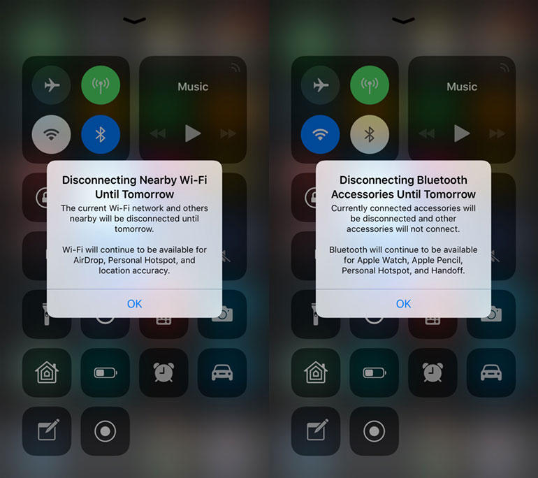
First, the one-off popup (close it without reading it properly and it’s gone and doesn’t come back):

Wi-Fi/Bluetooth popups in iOS 11.2 beta 3
After the popup, you get a small notification at the top of the Control Center screen:

Wi-Fi/Bluetooth notifications in iOS 11.2 beta 3
If you have to have a popup and screen text to explain how something works, then you’ve failed in creating an easy-to-use user interface. The popup is especially shoddy because it’s easy to dismiss. Also, it doesn’t fully explain how the interface works, and leaves out circumstances under which Wi-Fi and Bluetooth will be reenabled.
I understand what Apple is trying to do here, but it’s a hack. A better option would be for Apple to have a three-way option on the buttons (on, off, soft off) or put an option into the Settings app to change the behavior of the Control Center buttons.
Just changing how something works and then plastering a popup over the top of that change is a terrible user interface experience.
It’s not something that I would expect from Apple.
See also:

