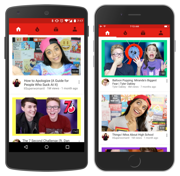

Next time you open the YouTube app on your iOS or Android phone, you’ll be greeted by a new homepage experience.
Before, YouTube would show you a list of recommended items with small thumbnails, followed by a few more lists of recommended videos about topics you’ve recently shown interested in. Now, you’ll see a single feed of recommended videos that are all presented with large thumbnails (so large that you’ll only see maybe two recommended videos on even a large a phone without scrolling). With this, the design of the home feed now pretty much looks exactly like the one you can already find in YouTube’s ‘trending’ tab.
YouTube’s VP of product management Johanna Wright tells me that the company tested this single ranked list, which is driven by an improved recommendations algorithm, with a small group of users over the last few weeks and they typically watched more videos and stayed with them for longer.
“We have made so many changes and we are getting so much better that we can now remove the grouping,” Wright said. “Our experiments show that users really like this design. We are a very data-driven group and all these changes run through A/B tests.”
Wright notes that Google’s improved recommendations algorithm, which uses deep neural networks at its core, is now also able to recommend fresher content, including videos uploaded within the last hour.
“We want YouTube to communicate this feeling that it understands you,” Wright said. So while you may see slightly fewer recommended videos in the mobile app now, those videos will (hopefully) be more relevant to you. The system will also keep adding recent videos from channels you have subscribed to as well, so it’ll be interesting to see what (if any) effect this change will have on YouTube Creators.

